


Cadbury’s Battle for Purple: Can a Brand Own a Specific Color Palette?
Table of Contents
ToggleColour Branding: 9 Powerful Lessons from Cadbury's Purple
How Colour Psychology, Brand Recognition, and Trademark Strategy Turned a Simple Shade of Purple into a Powerful Business Asset
Colour Branding: When a Colour Becomes a Brand Asset
In branding, a colour is never just a colour. It is an identity, an emotion, and sometimes, a competitive advantage.
Think of a deep purple chocolate wrapper. Even without seeing the logo, many consumers may immediately associate it with Cadbury. This is the power of consistent visual branding and colour branding.
For decades, Cadbury has built a strong connection with its signature purple shade, transforming it into one of the most recognisable elements of its brand identity. But this raises an interesting question:
Can a company legally own a colour? And how far can a brand go to protect a shade that consumers associate with its products?
Cadbury’s battle for purple offers a fascinating lesson in brand strategy, intellectual property, and the commercial value of visual consistency.
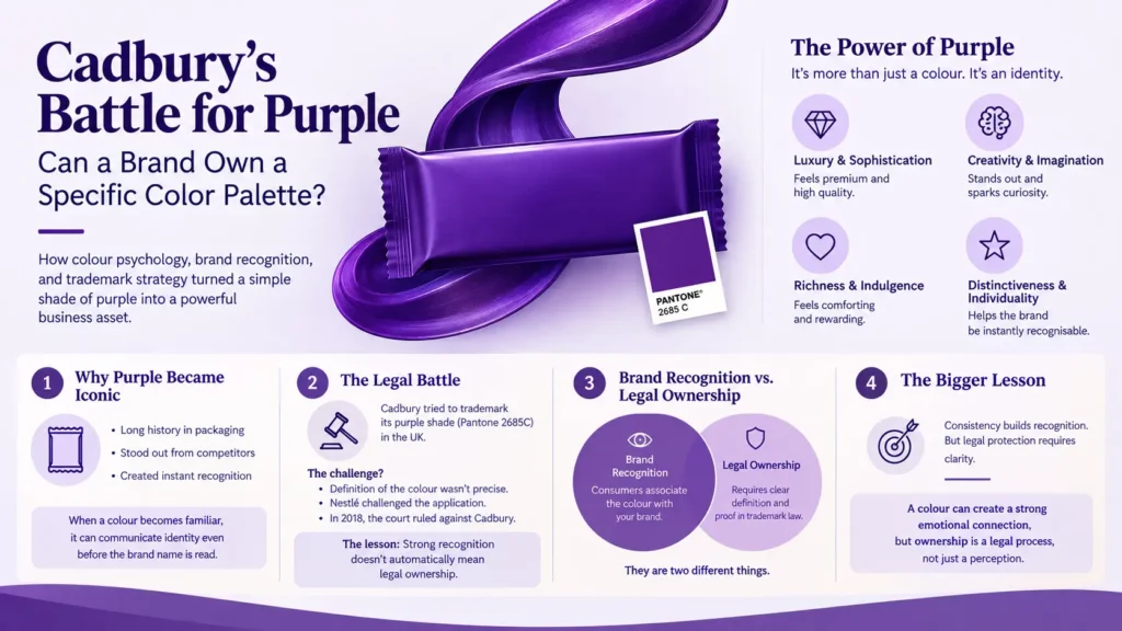
1. Why Purple Became More Than a Packaging Choice
Cadbury’s association with purple dates back to the early 20th century. The colour became an integral part of its packaging identity, helping distinguish its chocolate products from competitors.
Over time, the distinctive purple packaging became a familiar visual signal in supermarkets, convenience stores, and advertising campaigns.
Rather than relying entirely on logos or product names, Cadbury developed a visual identity that consumers could recognise almost instantly.
This is an important branding principle:
When a colour becomes strongly associated with a brand, it can communicate identity even before consumers read the name.
For Cadbury, purple represents more than packaging. It has become part of the brand’s emotional and commercial language.
This demonstrates the power of colour branding when a visual element is used consistently over time.
2. The Psychology Behind Cadbury’s Purple
Colour psychology plays a significant role in consumer perception.
Purple is commonly associated with:
- Luxury and sophistication
- Creativity and imagination
- Richness and indulgence
- Distinctiveness and individuality
These associations make purple an interesting choice for a chocolate brand.
Chocolate is not simply a food product. It is also connected with gifting, celebration, comfort, and personal indulgence.
Cadbury’s visual identity uses its signature colour consistently across products, advertisements, and packaging to strengthen these emotional associations.
However, colour psychology does not operate independently. The meaning of a colour depends on cultural context, product category, consumer experience, and repeated brand exposure.
Cadbury’s success demonstrates how consistent branding can gradually create a unique meaning around a particular colour.
This is one of the core principles behind effective colour branding.
3. The Legal Battle: Can a Brand Trademark a Colour?
One of the most interesting aspects of Cadbury’s branding journey is its attempt to protect its distinctive purple shade through trademark law.
In the United Kingdom, Cadbury pursued legal protection for its purple colour, commonly identified through the Pantone reference 2685C.
The central legal question was whether a colour could function as a trademark and distinguish one company’s products from those of its competitors.
Under trademark principles, a colour may receive protection when it has acquired distinctive character through use and consumers associate it with a particular commercial source.
However, protecting a colour is not as straightforward as registering a logo.
A trademark application must clearly define the colour, the goods or services covered, and the circumstances in which the colour is used.
Cadbury’s case became particularly significant because it highlighted the challenges of defining colour ownership within trademark law.
What happened in the UK?
Cadbury’s efforts to secure protection for its purple packaging encountered legal difficulties.
In 2013, the UK Intellectual Property Office initially accepted a trademark application relating to the purple colour used on Cadbury’s chocolate packaging.
However, the registration was challenged by Nestlé.
In 2018, the UK Court of Appeal ruled against Cadbury’s particular trademark application because its description was insufficiently precise. The wording covered a broader range of uses than the court considered acceptable.
The decision did not establish that colours can never be trademarked. Instead, it demonstrated that the precise definition of a colour mark is critical to its legal protection.
The key lesson: A brand may build strong recognition around a colour, but commercial association alone does not automatically guarantee exclusive legal ownership.
For businesses, this is an important consideration when developing a long-term colour branding strategy.
4. Brand Recognition vs. Legal Ownership: Understanding the Difference
A common misconception in branding is that if consumers strongly associate a colour with a company, that company automatically owns the colour.
In reality, brand recognition and trademark rights are two different concepts.
For example, consumers may associate a particular shade of purple with Cadbury. However, that does not mean Cadbury can prevent every other business from using purple.
Trademark protection is generally specific to particular commercial contexts and jurisdictions.
This distinction is essential for businesses investing in distinctive visual identities.
A successful colour branding strategy should therefore consider both consumer recognition and intellectual property protection.
5. Why Colour Ownership Matters in Modern Branding
In an increasingly competitive marketplace, brands are fighting for attention within seconds.
Consumers encounter hundreds of visual messages every day, making instant recognition a valuable business advantage.
A distinctive colour palette can help brands:
Improve Brand Recall: Repeated exposure to consistent colours makes visual recognition easier.
Create Emotional Connections: Colours can reinforce the feelings and experiences associated with a product.
Differentiate from Competitors: A distinctive colour strategy can help a brand stand out in crowded markets.
Strengthen Brand Consistency: Using the same colour palette across packaging, digital platforms, advertisements, and retail environments creates a unified identity.
Build Long-Term Brand Equity: A recognisable colour can become an intangible business asset that contributes to brand value.
For established brands, changing a signature colour can be risky because consumers may struggle to recognise the product immediately.
This is why visual consistency is not merely a design preference. It is a long-term strategic decision.
Strong colour branding can therefore become an important part of long-term brand recognition.
6. What Other Brands Teach Us About Colour Ownership
Cadbury is not the only brand that has explored the commercial and legal significance of colour.
Several international brands have developed strong associations with specific colours.
Tiffany & Co. – The Power of Blue
Tiffany Blue has become a central part of the luxury jewellery brand’s identity.
Its distinctive blue packaging demonstrates how a carefully protected colour can become an important symbol of exclusivity and gifting.
Coca-Cola – The Power of Red
Coca-Cola’s red branding has remained a consistent element of its identity for generations.
The colour is reinforced through advertising, packaging, retail displays, and promotional campaigns.
Christian Louboutin – The Red Sole
Christian Louboutin’s red-soled footwear illustrates how a specific visual feature can become a recognisable brand identifier and the subject of trademark disputes.
These examples demonstrate that colour-related branding is not simply about selecting attractive shades.
It involves creating distinctive visual associations that consumers can identify and competitors cannot easily replicate without legal or commercial consequences.
Together, these examples demonstrate how colour branding can extend beyond simple design choices.
7. The Strategic Lessons for Businesses and Startups
Cadbury’s experience offers several valuable lessons for companies developing their own visual identities.
Lesson 1: Choose Your Brand Colours Strategically
Do not select colours only because they look attractive.
Consider your target audience, industry, brand personality, product positioning, and competitive environment.
A strong colour branding strategy begins with understanding what the colour should communicate.
Lesson 2: Maintain Visual Consistency
A brand cannot build strong colour recognition if its visual identity changes constantly.
Use a clearly defined colour system across all customer touchpoints.
Lesson 3: Build Consumer Association Over Time
A colour becomes valuable when consumers repeatedly encounter it in connection with your brand.
Consistent packaging, marketing campaigns, and digital experiences help strengthen this relationship.
Lesson 4: Understand Intellectual Property Protection
Before investing heavily in a distinctive colour identity, businesses should explore trademark availability and registration requirements.
The legal protection of colour marks varies between countries, making professional intellectual property advice important.
Lesson 5: Think Beyond the Logo
A strong brand identity is not limited to a logo.
Packaging colours, typography, visual patterns, product design, and advertising style can collectively create a recognisable brand experience.
Together, these elements make colour branding part of a complete visual identity system.
8. Can Small Businesses Own Their Own Signature Colour?
Absolutely, but building recognition and obtaining legal protection are two separate journeys.
A startup does not need an international advertising budget to establish a memorable colour identity.
It needs consistency, clarity, and a distinctive visual strategy.
Imagine a skincare brand using a specific sage green across its packaging, website, product labels, and social media.
Over time, customers may begin associating that shade with the brand.
However, the business must also consider whether the colour is distinctive enough, whether competitors commonly use it, and whether it qualifies for trademark protection in its relevant market.
The goal should not simply be to choose an unusual colour.
The real goal is to make that colour meaningful to your customers.
This is where consistent colour branding can help a smaller business build recognition.
9. The Future of Colour Branding in the Digital World
As brands expand across websites, mobile applications, social media, e-commerce platforms, and physical packaging, colour consistency has become even more important.
Digital branding introduces additional challenges.
The same colour can appear differently across screens, printing technologies, and lighting conditions.
Brands must therefore establish clear colour specifications, including:
- Pantone references for print consistency.
- CMYK values for professional printing.
- RGB values for digital applications.
- HEX codes for websites and digital interfaces.
A well-defined colour system ensures that a brand maintains visual consistency across different platforms.
As digital competition increases, distinctive colour identities may become even more valuable in helping consumers recognise brands quickly.
A consistent colour branding system can help maintain this recognition across both digital and physical environments.
Cholanadu Takeaway
When a Colour Becomes a Brand Asset
Cadbury’s battle for purple reveals an important truth about modern branding: the smallest visual elements can carry significant commercial value.
A colour that initially appears to be a simple design decision can gradually become an important part of a company’s identity, emotional connection, and market differentiation.
However, building recognition does not automatically mean securing exclusive legal ownership.
The real challenge lies in balancing creative branding, consumer perception, and intellectual property protection.
For businesses, the lesson is clear:
Don’t just choose a colour for your brand. Build an identity around it.
Because in a crowded marketplace, a memorable colour may speak to customers even before your logo does.
How Cholanadu Helps Brands Build Distinctive Identities
At Cholanadu, we believe that effective branding goes beyond attractive visuals. It is about creating meaningful identities that connect with audiences, communicate business values, and establish long-term recognition.
From strategic colour selection to logo development and complete brand identity systems, every visual decision should contribute to a larger business objective.
Because great brands are not just seen. They are remembered.
External DoFollow links
UK Intellectual Property Office — anchor text: UK trademark protection
https://www.gov.uk/government/organisations/intellectual-property-office
WIPO — anchor text: trademark protection
https://www.wipo.int/trademarks/en/
Pantone — anchor text: Pantone colour system
Internal links
Anchor: branding services in Chennai → Cholanadu Branding Services
Anchor: brand audit → Cholanadu Brand Audit Case Study
Anchor: logo design and brand identity → Cholanadu Logo Design Services
