


Coca-Cola’s Contour Bottle: How Unique Packaging Design Creates Instant Recall
Table of Contents
TogglePackaging Design: 9 Powerful Lessons from Coca-Cola’s Iconic Bottle
When packaging becomes more than a container and turns into a brand signature.
Packaging design can become much more than a container. It can become a visual signature that helps people recognise a brand instantly.
Imagine seeing a familiar silhouette from a distance.
You cannot read the logo.
You cannot see the label.
Yet, you instantly know what it is.
That is the power of Coca-Cola’s Contour Bottle.
For more than a century, Coca-Cola has demonstrated how packaging design can become an essential part of brand identity. The distinctive curved bottle is not simply designed to hold a beverage it has become a visual asset capable of communicating the brand even without words.
This is where great packaging design becomes great branding.
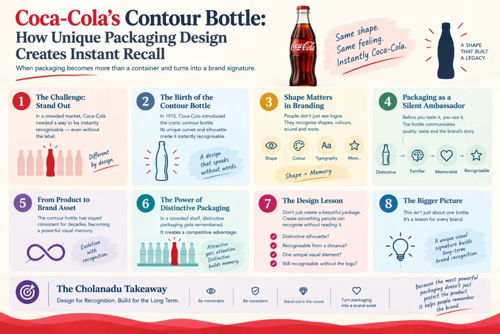
The Challenge: Creating a Bottle People Could Recognize
In the early days of Coca-Cola, soft drinks were commonly sold in straight-sided bottles.
As the beverage market became increasingly competitive, Coca-Cola needed a way to make its product stand out.
The challenge was simple:
How can consumers recognize Coca-Cola even when they cannot see the label?
The answer came through packaging design.
Coca-Cola pursued a distinctive bottle design that could be recognized through its shape alone.
This transformed the bottle from a functional object into a brand recognition tool.
The Birth of the Contour Bottle
In 1915, Coca-Cola introduced the now-famous Contour Bottle, created following a design competition among glass manufacturers.
The design was inspired by the desire to create a bottle that was so distinctive that consumers could identify it by touch or in the dark.
Its flowing curves, narrow waist, and distinctive proportions created a silhouette unlike the typical bottles of the period.
The result was more than an attractive package.
It was a recognizable brand asset.
Coca-Cola’s own historical material states that the contour bottle was patented in 1915 and was developed to make the package distinctive enough to be recognised even without relying on the label.
Why Shape Matters in Branding
Most people think branding begins with a logo.
But strong brands often operate on multiple visual levels.
A brand can be recognized through:
- Logo
- Colour
- Typography
- Sound
- Shape
- Packaging
- Symbols
- Design language
Coca-Cola’s contour bottle demonstrates the power of shape-based recognition.
Even when the famous red label is removed, the silhouette can still communicate Coca-Cola.
That is an extraordinary branding advantage.
Think about it:
Logo → You see it.
Colour → You recognize it.
Shape → You remember it.
The strongest brands often combine all three.
This shows why packaging design can become an important part of a wider visual identity system.
Packaging as a Silent Brand Ambassador
A package has a job beyond protecting a product.
It communicates.
Before consumers taste a drink, they encounter its packaging. The shape, colour, typography, material, and proportions can influence their perception of the product.
Coca-Cola understood this principle remarkably well.
The contour bottle communicates several ideas simultaneously:
Distinctive → Familiar → Memorable → Recognizable
It essentially becomes a silent salesperson sitting on a shelf.
No advertising message is required for the bottle itself to create recognition.
Strong packaging design can therefore communicate before the consumer reads a single word.
The Psychology of Instant Recall
Why does distinctive packaging work so effectively?
Because our brains are constantly processing visual patterns.
When a particular shape is repeatedly associated with a brand, the brain begins to connect the two.
Over time:
Shape → Recognition → Brand Association
This is why unique visual assets can become incredibly valuable.
A consumer may encounter hundreds of products in a supermarket. But a distinctive silhouette can help a brand break through the visual noise.
The Coca-Cola bottle is a classic example of this principle.
Effective packaging design can therefore contribute to visual memory and brand recall.
From Product Packaging to Brand Asset
One of the most important lessons from Coca-Cola is that packaging does not have to remain a secondary element of branding.
It can become a brand asset in its own right.
The contour bottle has appeared across different eras, materials, formats, and marketing campaigns while maintaining its recognizable identity.
That consistency creates something extremely valuable:
Visual Memory.
When consumers repeatedly see the same distinctive design element, it becomes embedded in their memory.
This means Coca-Cola does not always need to introduce itself.
Its packaging can do part of the work.
The Coca-Cola Company has continued to describe the contour bottle as a distinctive visual asset, while its history shows how the design has evolved across different formats while retaining its recognisable identity.
Consistency Makes Recognition Stronger
Great branding is not necessarily about changing everything frequently.
Sometimes, it is about knowing what should never be lost.
Coca-Cola has evolved its packaging, advertising, typography, and visual communication over the years. Yet, the contour silhouette has remained an important part of its visual identity.
This creates a balance between:
Evolution + Recognition
A brand can modernize while protecting the visual elements that consumers already associate with it.
That is an important lesson for businesses considering a rebrand.
Consistent packaging design can help preserve recognition while allowing other elements of a brand identity to evolve.
The Power of Distinctive Packaging in a Crowded Market
Walk through a supermarket today.
Rows of products compete for attention.
Bright colours.
Large logos.
Promotional offers.
New flavours.
Limited editions.
In such an environment, brands need more than attractive packaging.
They need recognizable packaging.
There is a difference.
Attractive packaging gets attention.
Distinctive packaging builds memory.
And memory can become a powerful competitive advantage.
Coca-Cola’s contour bottle demonstrates how a unique physical design can help a product remain recognizable across generations.
This is one of the most important lessons of strategic packaging design.
The Design Lesson for Modern Brands
The biggest lesson isn’t simply:
“Create a beautiful package.”
It is:
“Create something people can recognize without needing to read it.”
That requires strategic thinking.
A business should ask:
- Does our packaging have a distinctive silhouette?
- Can customers recognize it from a distance?
- Is there one visual element that belongs uniquely to our brand?
- Would our product still be recognizable without the logo?
- Are we building long-term recognition or simply following current design trends?
These questions can completely change the way a company approaches packaging design.
Beyond Coca-Cola: Building Your Own Signature
Not every brand needs a bottle like Coca-Cola.
The principle can be applied to almost any industry.
A cosmetics brand might develop a distinctive bottle shape.
A luxury brand might create a signature box.
A technology company might develop a recognizable product form.
A food brand might create an unmistakable package structure.
The goal is not to copy Coca-Cola.
The goal is to discover your own recognizable visual signature.
This is where packaging design becomes a strategic branding decision rather than simply a decorative exercise.
Cholanadu Takeaway
Coca-Cola’s Contour Bottle proves that powerful branding doesn’t always need to shout.
Sometimes, it simply needs to be recognizable.
A logo can identify a brand.
A colour can trigger recognition.
But when a physical shape becomes inseparable from the brand itself, packaging becomes much more powerful.
The contour bottle is therefore more than a container.
It is a lesson in packaging design, consistency, visual memory, differentiation, and long-term brand building.
Because the most powerful packaging doesn’t just protect the product.
It helps people remember the brand.
External DoFollow links
Coca-Cola – 11 Facts About the Contour Bottle
Coca-Cola’s official history confirms the 1915 patent and the purpose of creating a distinctive bottle.
Coca-Cola Contour Bottle – Official History
The History of the Coca-Cola Contour Bottle
This is particularly useful for the section explaining the design competition, Root Glass Company and the development of the bottle.
The History of the Coca-Cola Contour Bottle
Coca-Cola Bottle History
Useful as a supporting external reference for the evolution of Coca-Cola packaging.
Coca-Cola Bottle History
Cholanadu internal links
Use these naturally inside the article:
brand audit → Cholanadu Brand Audit – SGR 777
brand identity → Cholanadu Jaguar Brand Audit Report
Cholanadu / contact CTA → Cholanadu Contact Us
