


The Golden Arches of McDonald’s: How Logo Design Manipulates Consumer Psychology
Table of Contents
ToggleLogo Design Secrets: 9 Powerful Lessons From McDonald's Arches
A logo design is not merely a symbol. It is a psychological shortcut. Think of two curved golden lines forming an “M.”
You probably know the brand instantly.
No restaurant name. No tagline. No explanation.
Just the Golden Arches—one of the most recognisable visual identities in the world created through strategic logo design. But why does this simple shape work so powerfully?
The answer lies far beyond graphic design. It lies in consumer psychology, memory, colour, shape, familiarity and emotional association.
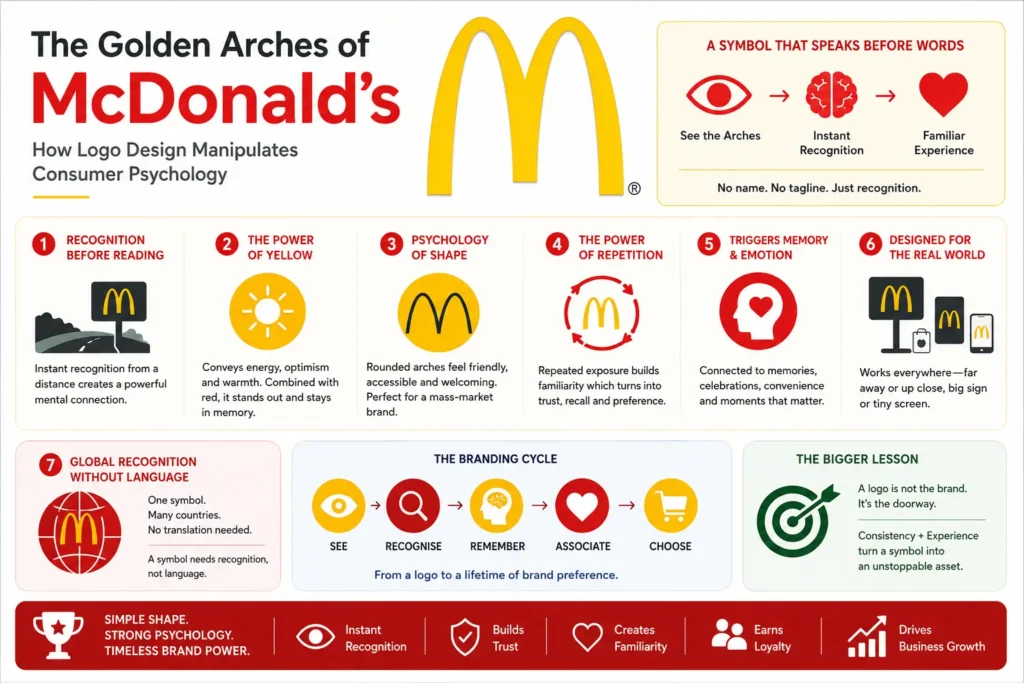
The Golden Arches Are More Than an “M”
McDonald’s could have used a traditional wordmark for its logo design.
It could have designed a complex illustration of food. Instead, the brand developed a remarkably simple visual asset: two golden arches.
That simplicity became its strength.
Over decades, consumers have repeatedly encountered the symbol on:
Restaurant signage
Packaging
Advertising
Television
Billboards
Digital platforms
Merchandise
Store interiors
Eventually, the brain no longer needs to consciously process the logo. The symbol itself becomes the brand.
The ultimate achievement of a logo design is when consumers recognise the business before reading its name.
1. Recognition Happens Before Reading
Human beings process visual information extremely quickly. A distinctive shape in logo design can trigger recognition almost immediately.
This creates an enormous advantage for a global brand like McDonald’s.
Imagine seeing the Golden Arches from a distance.
You may not yet see the restaurant name.
You may not even see the menu.
But your brain can already make the connection:
Golden Arches → McDonald’s → Fast Food → Familiar Experience
That is powerful branding.
Interactive Thought
If the word “McDonald’s” disappeared from every sign tomorrow, would you still recognise the restaurants?
That question demonstrates the strength of visual identity.
2. Why Yellow?
Colour is one of the most influential elements in effective logo design. McDonald’s Golden Arches use a bright, highly visible yellow that naturally stands out against many environments.
Yellow is commonly associated with ideas such as:
Energy • Optimism • Warmth • Visibility • Cheerfulness
Combined with the brand’s red-and-yellow visual system, the identity becomes highly noticeable.
But there is an important branding lesson here: Colour does not work in isolation.
A colour becomes powerful when consumers repeatedly experience it alongside a brand. To understand how color choices drive buyer actions, read research on Color Psychology in Branding.
Over time:
Colour → Logo → Brand → Experience
The association becomes automatic.
3. The Psychology of Shape
The Golden Arches aren’t just two random curves. Their rounded form creates a visually simple and memorable silhouette for their logo design.
Curves can often feel softer and more approachable than sharp, aggressive geometric forms.
This matters for a mass-market food brand.
McDonald’s does not want its identity to communicate: Complicated. Formal. Difficult. Exclusive.
It wants to communicate something much closer to:
Familiar. Accessible. Friendly. Quick.
The logo supports that positioning.
4. The Power of Repetition
One of the most underestimated forces in effective logo design and branding is repetition. A consumer might see the Golden Arches:
On the way to work.
During a road trip.
On a delivery app.
On a food package.
In an advertisement.
Inside a shopping mall.
Each exposure strengthens familiarity. And familiarity matters.
The more consistently people encounter a visual identity, the easier it becomes to recognise and recall.
This creates a valuable branding cycle:
SEE ↓ RECOGNISE ↓ REMEMBER ↓ ASSOCIATE ↓ CHOOSE
That is where logo design becomes a commercial asset.
5. The Logo Can Trigger Memory
A strong logo design doesn’t exist alone. It becomes connected to experiences.
For McDonald’s, the Golden Arches can become associated with:
Childhood memories
Family outings
Road trips
Birthday celebrations
Happy Meals
Familiar menu items
Convenience
Late-night food
Travel
This is called associative memory. The logo becomes a visual trigger for a much larger collection of memories.
So when consumers see the Golden Arches, they aren’t necessarily seeing only a logo.
They may be seeing years of accumulated experiences.
6. Designed for the Real World
One of the smartest aspects of the Golden Arches is their ability to work at scale. A good logo design must survive different environments.
McDonald’s identity needs to work on:
A massive roadside sign
and also on:
A tiny digital icon.
It needs to remain recognisable:
From a distance
At night
On packaging
On uniforms
On mobile screens
On advertisements
Across different countries
This is an important principle of professional identity design:
A logo should not merely look beautiful on a presentation board. It should perform in the real world.
7. Global Recognition Without Language
McDonald’s operates across different cultures and languages. But the Golden Arches don’t need translation.
You don’t need to speak English. You don’t need to read the local language.
The symbol communicates through visual recognition.
This is one of the greatest advantages of a strong global logo design.
A Word Needs Language. A Symbol Needs Recognition.
That distinction becomes increasingly important in an international and mobile-first marketplace.
8. The Logo in the Digital Age
Brand identities today must perform beyond physical stores.
They appear on:
Apps → Websites → Social Media → Delivery Platforms → Digital Advertisements → Search Results → Notifications
The consumer may interact with the brand through a screen before ever entering a restaurant.
Therefore, a modern logo design must possess digital adaptability. The Golden Arches are naturally suited to this because their silhouette remains recognisable even when reduced dramatically.
That is an important lesson for modern businesses:
Design for the smallest screen, not only the biggest billboard.
9. Is the Logo Really “Manipulating” Consumers?
The word manipulation sounds dramatic. But effective logo design and branding do influence consumer behaviour.
The objective isn’t necessarily to force someone to buy.
Instead, a powerful visual identity can influence:
Attention → Recognition → Familiarity → Trust → Recall → Consideration
When someone is hungry and sees a familiar brand, the decision-making process may require less mental effort.
The brand is already known.
The experience is already understood.
The choice feels easier.
And that is precisely why brand recognition has economic value.
The Bigger Branding Lesson
The Golden Arches teach businesses something much bigger than logo design.
A Logo Is Not the Brand.
A logo is the visual doorway into the brand.
Its real power develops through consistent repetition and experience.
Think about it this way:
LOGO ↓ RECOGNITION ↓ MEMORY ↓ MEANING ↓ EMOTION ↓ BRAND PREFERENCE
The logo starts the process. The brand experience completes it.
What Businesses Can Learn From McDonald’s
If you’re building a business, don’t ask only:
“Does my logo look attractive?”
Ask better questions.
01 — Is it memorable?
Can someone recognise it after seeing it briefly?
02 — Is it distinctive?
Does it look different from competitors?
03 — Is it scalable?
Does it work on both a billboard and a mobile icon?
04 — Is it consistent?
Will customers see the same identity everywhere?
05 — Does it support positioning?
Does the visual identity communicate the personality you want?
06 — Can it build associations?
Can repeated exposure connect the symbol with a meaningful experience?
These questions move logo design from decoration to strategy.
The Cholanadu Perspective
At Cholanadu, we believe great branding is not about creating something that simply looks beautiful. It is about creating something that means something.
A powerful identity should:
Capture Attention.
Create Recognition.
Build Familiarity.
Develop Trust.
Create Recall.
Strengthen Positioning.
The Golden Arches demonstrate what happens when visual simplicity meets strategic consistency in logo design. McDonald’s did not build the power of its logo in one day.
It built it through decades of repetition, consistency and consumer experience. Explore our specialized services at Cholanadu to build your long-term brand identity.
And that is perhaps the most important lesson of all.
Cholanadu Takeaway
The Golden Arches are deceptively simple. Two curves. One colour. One recognisable silhouette.
Yet behind that simplicity lies a sophisticated lesson in consumer psychology and strategic logo design.
The greatest logos don’t demand attention forever.
They earn a permanent place in memory.
Because when consumers recognise your symbol before they read your name, your logo has stopped being a graphic.
It has become an asset.
That is the real power of brand identity.
