


The 5-Second Test: Can Visitors Tell What Your Business Does Instantly?
Table of Contents
ToggleWebsite Clarity Score: 5 Proven Ways to Hook Visitors Instantly
The 5-Second Test: Can Visitors Tell What Your Business Does Instantly?
Five Seconds Can Change Everything
Imagine a potential customer visiting your website for the first time. They look at your homepage, scan the headline, notice the images, and make a quick judgement. Within moments, they decide whether your business is relevant to their needs or whether they should move on.
Now ask yourself an important question: Can a first-time visitor understand what your business does, who it serves, and why it matters within five seconds? Boosting your overall website clarity score ensures they do.
If the answer is uncertain, your website may be creating an invisible barrier between your business and your next customer. Optimising your website clarity score helps bridge this gap.
This is the idea behind the 5-second test, a simple way to evaluate whether your website communicates its purpose clearly and immediately to improve your website clarity score.
While five seconds is not a universal rule governing every visitor’s behaviour, it offers a useful practical challenge: make your business understandable before asking people to explore further by tracking your website clarity score.
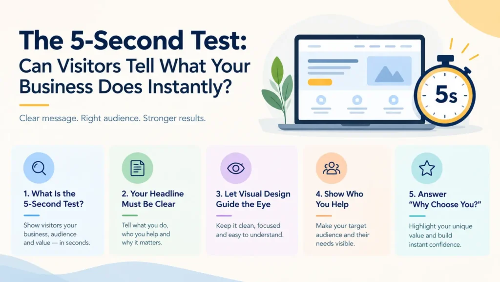
What Is the 5-Second Test?
The 5-second test is a simple usability exercise used to evaluate a website’s first impression and check its baseline website clarity score.
A person unfamiliar with your business views your homepage for approximately five seconds. The page is then hidden, and they answer a few questions to measure the website clarity score:
What does this business do?
Who is its target audience?
What makes the business useful or different?
What action would you take next?
If the answers are unclear, your website may need stronger messaging, a more effective visual hierarchy, or a clearer explanation of your offering to lift its website clarity score.
The purpose is not to force visitors to understand every detail immediately. It is to help them recognise that they are in the right place.
A successful first impression creates clarity. A confusing one creates hesitation. To check professional design and communication standards, review guidance from the AIGA Design Association
1. Your Headline Must Explain More Than Your Ambition
Many businesses use headlines such as:
Redefining Excellence.
Creating Tomorrow’s Possibilities.
Innovation Beyond Boundaries.
Your Partner in Success.
These phrases may sound polished, but they do not necessarily explain what the business actually offers or support a healthy website clarity score.
A visitor searching for a branding agency, for example, should not have to explore several pages to discover that the company provides brand strategy, logo design, and marketing services.
Your headline should communicate your core offering in language your audience immediately understands to maximise your website clarity score.
How to improve your headline: A useful formula is: What you do + Who you help + The value you provide.
For example:
Instead of: “Building Brands for a Better Tomorrow.”
Try: “We Help Growing Businesses Build Distinctive Brands Through Strategy and Design.”
The second headline explains the service, identifies the audience, and communicates the business’s purpose while driving up the website clarity score.
Your headline does not need to explain everything. It needs to give visitors a compelling reason to continue.
Interactive question: If you removed your company name and logo, would your homepage headline still explain what your business does? If not, it may be time to simplify your message.
2. Visual Design Should Support Clarity, Not Compete With It
A visually impressive website can still fail to communicate effectively if it harms the overall website clarity score. Oversized animations, decorative graphics, competing colours, multiple banners, and crowded layouts may distract visitors from the information they need most.
Premium website design is not simply about making a page look beautiful. It is about directing attention towards the right information in the right order to elevate your website clarity score.
Your website should help visitors identify three things quickly:
The headline: What does your business offer?
The supporting message: Why should the visitor care?
The call to action: What should the visitor do next?
A clear visual hierarchy makes these elements easy to recognise.
Practical design improvements:
Use a clear headline near the top of the homepage.
Choose visuals that reinforce your offering and protect your website clarity score.
Maintain readable typography and sufficient spacing.
Avoid placing too many competing messages above the fold.
Make your primary call-to-action button easy to identify.
Ensure the layout works well on mobile devices.
Remember, the goal is not to remove creativity from your website. It is to ensure that creativity strengthens communication rather than obscuring it.
3. Visitors Need to Recognise Whether Your Business Is Right for Them
Understanding what a business does is only the first step toward a high website clarity score. Visitors must also recognise whether its offering is relevant to their needs.
Consider a company that provides software solutions to small businesses. If its website only says, “Enterprise-grade technology for modern organisations,” a small business owner may not know whether the service is suitable for them.
A clearer message could explain that the company helps small businesses automate routine tasks, manage customer information, or improve operational efficiency, thereby boosting its website clarity score.
Specificity helps the right audience recognise themselves in your message.
Make your target audience visible: Your website should communicate:
The type of customer you serve.
The problems you help solve.
The products or services you provide.
The benefits customers can reasonably expect.
You do not need to appeal to everyone. You need to make the right people feel that your business understands their needs. The clearer your audience, the easier it becomes to communicate relevant value and secure a high website clarity score.
4. Your Website Must Answer "Why Should I Choose You?"
Suppose visitors understand your business perfectly. They know what you offer and who your services are designed for, reflecting an optimal website clarity score.
Why should they choose you instead of a competitor? This is where your value proposition becomes essential.
A value proposition explains the meaningful benefit your business provides and why your offering deserves consideration. It might involve specialised expertise, a distinctive approach, greater convenience, personalised service, or a solution to a specific customer problem.
However, claims such as “the best service,” “unmatched quality,” and “number one in the industry” rarely communicate meaningful differentiation without supporting evidence.
Strengthen your value proposition: Instead of relying on generic claims:
Explain what makes your approach different.
Highlight benefits that matter to your audience.
Show relevant examples of your work.
Include genuine testimonials or case studies.
Support important claims with credible evidence.
Your homepage should not merely announce that your business is excellent. It should help visitors understand why your offering may be right for them.
5. Confusing Navigation Can Destroy a Good First Impression
Even when your homepage communicates your offering clearly and maintains a solid website clarity score, visitors may struggle if the website is difficult to navigate.
Imagine landing on a website and finding menu items such as Our Universe, Possibilities, and The Journey, without understanding what they mean.
Creative labels may suit some brands, but unfamiliar terminology can make essential information harder to find and ruin your website clarity score. Visitors generally benefit from straightforward navigation that reflects their expectations.
Keep your website navigation intuitive: Use familiar labels such as:
Home
About Us
Services
Products
Portfolio
Contact Us
Choose menu items according to your business model and your customers’ needs. For service-based businesses, make it easy to explore service offerings, understand the process, and request a consultation. For e-commerce businesses, prioritise product categories, search, pricing, delivery information, and checkout.
Good navigation removes unnecessary questions from the customer journey.
A Strong Call to Action Turns Clarity Into Action
Once visitors understand what your business does—backed by a strong website clarity score—they need a clear next step.
Without an obvious call to action, even interested prospects may leave because they do not know how to proceed. A call to action should tell visitors what they can do next and what to expect when they do it.
Examples include:
Explore Our Services.
View Our Portfolio.
Shop the Collection.
Book a Consultation.
Request a Quote.
Contact Our Team.
The right call to action depends on your audience and the level of commitment you are asking for. For example, a first-time visitor researching an expensive business service may prefer to explore case studies before booking a consultation.
Make the next step obvious: Place your primary call to action where visitors can easily find it. Use clear wording, ensure the button works correctly, and avoid overwhelming visitors with multiple competing options.
A good call to action does not pressure people into acting. It makes the next step easier to understand.
How to Conduct the 5-Second Test for Your Business
You do not need an expensive research project to begin evaluating your homepage or auditing your website clarity score.
Follow these simple steps:
Step 1: Choose your participants. Ask five to ten people who are unfamiliar with your business to review your homepage. Include people who resemble your target customers where possible.
Step 2: Show them your homepage. Allow each participant to view the page for approximately five seconds. Then hide it.
Step 3: Ask four questions.
What does this business do?
Who do you think its customers are?
What do you remember most about the page?
What would you do next if you were interested?
Step 4: Look for patterns. If several participants misunderstand your offering, overlook your primary service, or cannot identify the next step, you have useful evidence of a communication problem affecting your website clarity score.
Step 5: Make targeted improvements. Refine your headline, supporting message, visual hierarchy, or call to action. Then repeat the test with new participants to see whether understanding improves.
This exercise is a practical starting point, not a statistically conclusive study. For important redesign decisions, combine it with website analytics, usability testing, and customer feedback.
Why Clarity Is a Branding Advantage
Many businesses invest heavily in logos, website development, advertising, and visual content. Yet, they sometimes overlook the most fundamental question: Does the customer understand what we are offering?
A sophisticated visual identity cannot compensate for an unclear message or a poor website clarity score. An expensive website cannot guarantee conversions if visitors struggle to understand its purpose.
Effective branding brings together visual identity, positioning, messaging, and customer experience to maximise your website clarity score. When these elements work together, your website becomes more than a digital brochure. It becomes a practical tool for helping customers understand your business, evaluate your value, and decide what to do next.
Clarity does not make a brand less creative. It makes creativity more effective.
The Cholanadu Perspective: Make Your Business Understandable Before You Make It Impressive
Your website’s first impression can influence whether visitors continue exploring or leave to consider other options.
The 5-second test offers a simple challenge: communicate your business’s purpose clearly enough that a first-time visitor can understand the essentials without searching through multiple pages to maintain a high website clarity score.
Start with a specific headline. Support it with a meaningful value proposition. Use purposeful visuals, intuitive navigation, and a clear call to action. Then test your website with real people and improve it based on what you learn.
At Cholanadu, we believe that powerful branding begins with clarity. A well-designed brand should not only look professional but also communicate its purpose, differentiate its offering, and help the right audience understand its value through an optimized website clarity score. To align your growth strategy with professional frameworks, explore our guide on Cholanadu Brand Strategy Services.
Because when visitors understand your business instantly, they have a stronger reason to explore what you offer.
A Final Question
If a potential customer visited your website for just five seconds today, would they understand why your business matters or would they have to guess?
Your answer could reveal the most important improvement your website needs.
