


AirAsia Rebranding Lessons: Mistakes to Avoid When Changing Your Visual Identity

September 17, 2026

A visual identity change can happen overnight through a logo redesign. A brand, however, cannot.

Rebranding is one of the most powerful strategic moves a company can make—and one of the easiest to get wrong when altering its visual identity.

For a global brand like AirAsia, a visual identity is not simply about a logo, colour palette, or typography. It is connected to years of recognition, customer expectations, digital experiences, aircraft, airports, advertising, and millions of customer interactions.

That makes any visual identity transformation a delicate balancing act:

How do you look new without becoming unrecognisable?

AirAsia’s branding journey offers an important lesson for businesses considering a visual identity change: rebranding should evolve brand equity, not erase it.
Visual Identity

First, What Does Rebranding Actually Change?

A common misconception is: Rebranding = New Logo

In reality, updating a visual identity can involve:

  • Logo

  • Typography

  • Colours

  • Photography style

  • Graphic language

  • Packaging

  • Website and app interface

  • Social media design

  • Advertising

  • Physical environments

  • Brand guidelines

But there is something even more important attached to your visual identity. Brand Recognition.

People should still be able to look at the new visual identity and think:

“Yes. That’s them.”

If they cannot, the company may have created a beautiful visual identity but lost valuable brand memory.

The AirAsia Lesson: Recognition Is an Asset

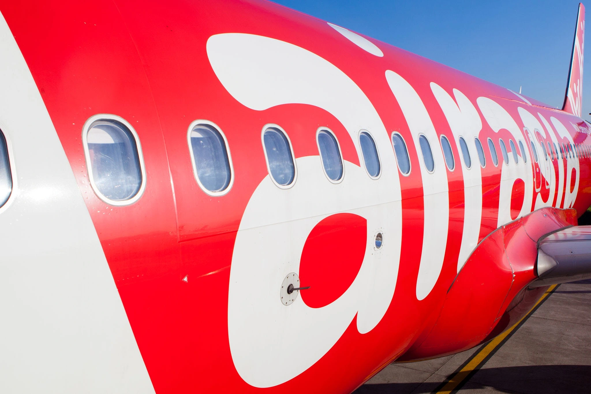
AirAsia has built strong visual associations around its distinctive red visual identity, bold typography, and highly recognisable branding across aircraft, airports, and digital platforms.

Over time, these elements become mental shortcuts. A customer may not consciously analyse the logo. They simply see the colour, typography, or visual identity language and immediately associate it with the airline.

That’s the power of accumulated brand equity in a visual identity. And this leads to the first major rebranding mistake.

Mistake 01: Changing Too Much, Too Quickly

Imagine a customer has known your visual identity for ten years. Then one morning, everything looks different.

New logo. New colours. New fonts. New photography. New tone. New website. New packaging.

Even the social media feed looks completely different. The company may feel excited. The customer may simply wonder: “Is this the same brand?”

A successful rebrand doesn’t necessarily require destroying the existing visual identity that came before.

Better Approach:

Identify the visual identity assets that already carry recognition.

Then decide: Keep → Refine → Replace Not: Delete → Rebuild → Hope

Mistake 02: Designing for Trends Instead of Longevity

Branding trends change rapidly. Minimalism becomes popular. Then gradients return. Then 3D graphics. Then flat design. Then expressive typography. Then AI-generated visuals.

A brand that rebuilds its visual identity around whatever is fashionable today may look modern for a short period but outdated again tomorrow.

A premium visual identity process should ask: “Will this identity still feel relevant five years from now?”

Not:

“Does this look trendy today?”

For a large international company, consistency over time in its visual identity is particularly important.

Mistake 03: Forgetting What the Audience Already Knows

A rebranding project often happens inside conference rooms.

Designers discuss:

  • proportions

  • colour codes

  • font weights

  • grids

  • icon systems

  • visual hierarchy

All of these matter for a visual identity.

But customers don’t experience a brand through a brand guideline document.

They experience a visual identity through:

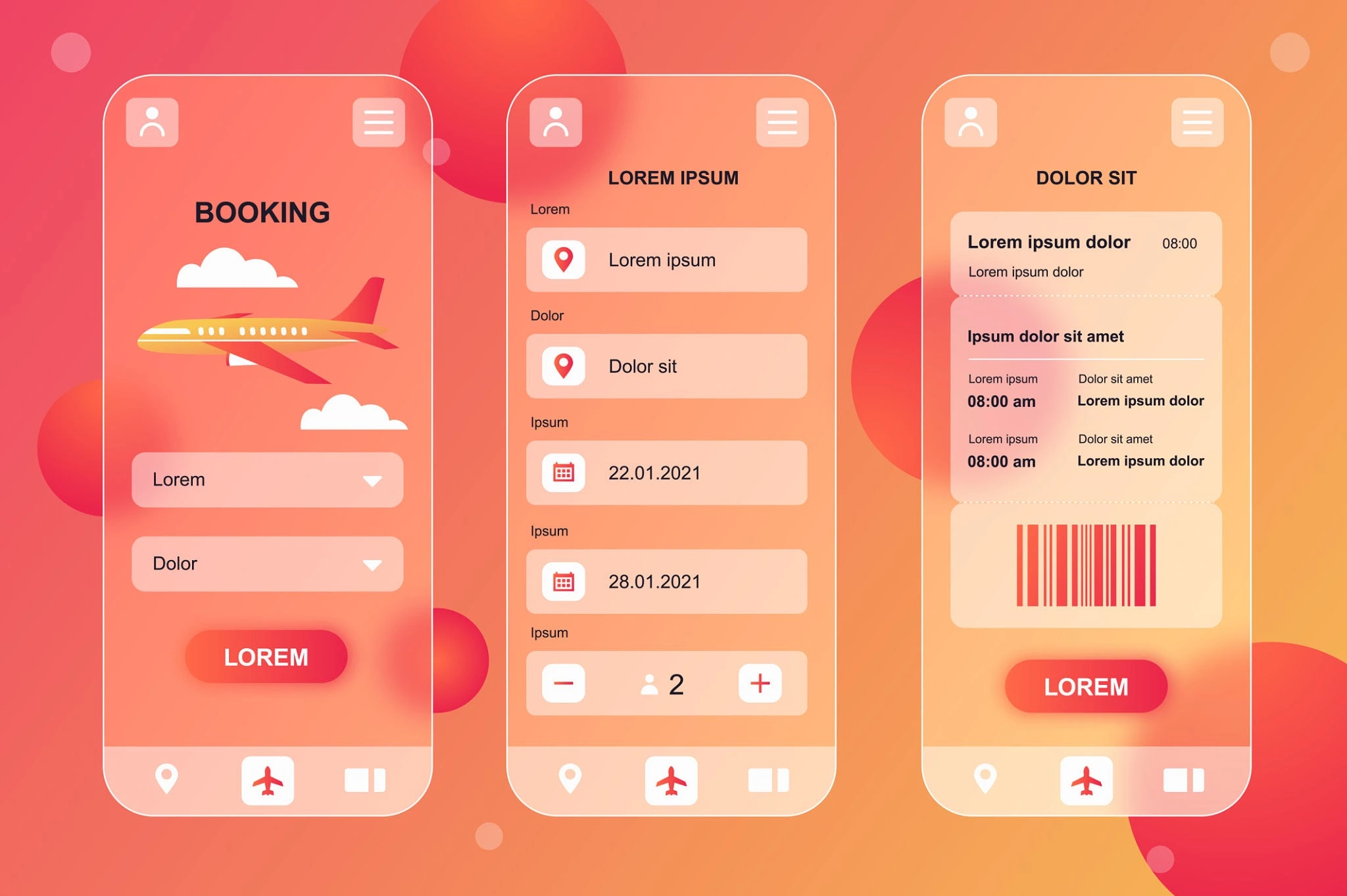
A boarding pass. An aircraft. An app. A social post. An advertisement. A booking screen. An airport sign.

The real question for your visual identity is therefore:

“How will the audience experience this identity?”

not simply:

“How does the logo look?”
visual identity

Mistake 04: Treating the Logo as the Entire Brand

A logo is a signature. It is not the whole personality. A powerful visual identity works as a comprehensive system.

For example:

Logo + Colour + Typography + Photography + Layout + Motion + Tone = Brand Experience

This becomes especially important for brands operating across multiple touchpoints.

An airline is a perfect example of an adaptable visual identity.

The visual identity must work on:

Aircraft Mobile applications Websites Tickets Airport signage Social media Advertisements Merchandise

If the visual identity works beautifully on Instagram but fails on an aircraft tail or airport sign, the system is incomplete.

Mistake 05: Ignoring Brand Heritage

Rebranding doesn’t mean pretending the past never existed. A brand’s history can actually become one of its greatest assets.

AirAsia’s visual identity has been associated with accessibility, energy, and a distinct red-led visual presence for years. That accumulated recognition in its visual identity has value. Think of heritage as an asset, not a limitation.

The challenge is to modernise the expression while protecting the visual identity associations customers already understand.

Explore our insights on Cholanadu Strategy and review framework guides at Cholanadu Brand Architecture. Learn more about global corporate design on Harvard Business Review and industry design standards on Adweek.

The Golden Rule of Rebranding

Here’s a simple framework every business can use for its visual identity:

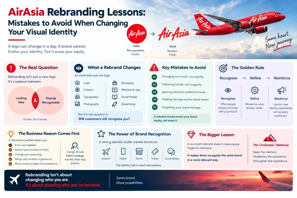
Recognise → Refine → Reinforce

01 RECOGNISE

Identify what people already associate with your visual identity.

Ask:

  • Which colours do customers remember?

  • What visual elements are distinctive in our visual identity?

  • What makes the brand instantly recognisable?

  • Which assets have emotional value?

02 REFINE

Modernise what already works in your visual identity.

Improve:

  • Typography

  • Proportions

  • Digital usability

  • Photography

  • Layout

  • Motion

  • Consistency

03 REINFORCE

Introduce the updated visual identity consistently across every touchpoint.

A rebrand becomes powerful only when people repeatedly experience its renewed visual identity.

Interactive Check: Should Your Business Rebrand?

Before changing your logo or overall visual identity, ask these five questions:

  1. Is our current visual identity genuinely outdated or are we simply bored with it?

  2. Can customers recognise our visual identity without reading our name?

  3. What elements of our visual identity already have strong brand equity?

  4. Does the proposed visual identity work across digital and physical environments?

  5. Will our customers understand why we changed our visual identity?

If these questions don’t have clear answers, the design process for your visual identity may be starting too early.

Rebranding Should Have a Reason

There are legitimate reasons for changing a visual identity.

A company may have:

  • Entered new markets

  • Expanded its product portfolio

  • Changed its positioning

  • Merged with another organisation

  • Outgrown an old visual identity

  • Shifted toward a digital-first experience

  • Needed greater visual identity consistency

The important thing is that the business reason should come before the design reason. A logo or visual identity should not change simply because management wants something “fresh.” It should change because the brand has evolved.

What Businesses Can Learn from AirAsia

The biggest lesson isn’t simply about changing or not changing a logo.

It is about understanding the value of visual memory in a visual identity.

Large brands spend years building recognition.

A rebrand of your visual identity should therefore behave more like an evolution than an eraser.

Keep the memory. Modernise the expression. Strengthen the experience.

That is where strategic visual identity design begins.

Cholanadu Takeaway

A successful rebrand doesn’t make people forget the old brand. It makes them recognise the same visual identity in a more relevant way.

Before you redesign your logo, redesign your thinking about your visual identity.

Ask:

What should change and what should never be lost in our visual identity?

Because in branding, new isn’t automatically better.

Meaningful is.

Cholanadu Perspective

At Cholanadu, we believe a visual identity is more than a collection of design elements. It is a business asset built through recognition, consistency, and strategic positioning.

The right rebranding strategy doesn’t simply make a company look different in its visual identity.

It makes the brand look more like what it has become without losing the visual identity people already know.

Leave A Comment