


Starbucks Logo Evolution: Why Timely Visual Redesigns Are Critical for Growth
Table of Contents
Toggle5 Logo Redesign Secrets: Power Lessons From Starbucks
A logo redesign is never just about changing artwork. A logo is one of the first things customers recognise, remember, and associate with a brand.
Few companies demonstrate this better than Starbucks. Over the decades, Starbucks has repeatedly evolved its visual identity not because the previous logo was necessarily unsuccessful, but because the brand itself was becoming bigger than what its original identity could communicate through a timely logo redesign.
And that raises an important branding question: When should a successful brand change a logo that already works?
The answer lies in understanding one fundamental principle: A growing brand cannot always carry an unchanged identity without executing a strategic logo redesign.
From Coffee Shop to Global Brand: The Need for Logo Redesign
When Starbucks began expanding, its identity was strongly connected to coffee.
The early Starbucks logo prominently featured a detailed siren illustration surrounded by typography that communicated the brand name and its coffee-focused positioning. It worked. But Starbucks eventually became much more than a coffee retailer.
It became associated with:
Coffee culture
Lifestyle
Community
Premium experiences
Convenience
Global recognition
The visual identity had to evolve alongside that transformation. And Starbucks gradually simplified its identity through an iterative logo redesign.
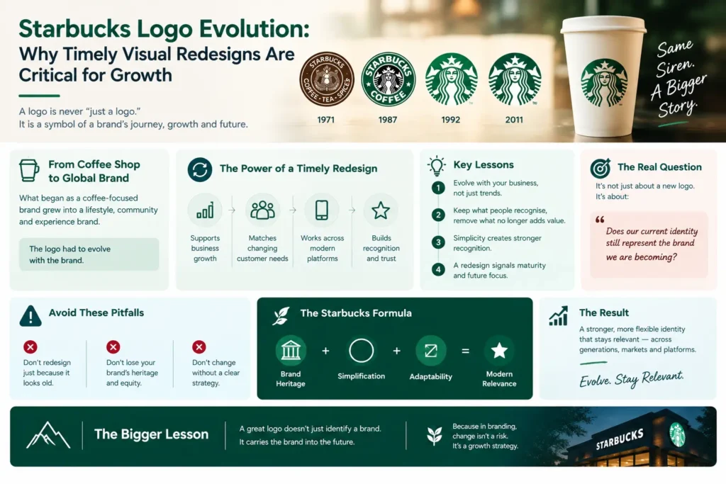
The Starbucks Logo Redesign Evolution
1971: The Beginning
The original Starbucks logo featured a highly detailed two-tailed siren surrounded by the words “Starbucks Coffee, Tea, Spices.” The design reflected the company’s early identity and product positioning.
It felt distinctive, historic and somewhat complex.
But complexity becomes increasingly difficult when a brand starts appearing everywhere without a simplified logo redesign.
1987: A Stronger Brand Identity
As Starbucks expanded, the logo became more polished and commercially distinctive. The siren remained, but the overall identity became cleaner and more recognisable.
This was an important branding shift: The brand was moving from a local coffee business toward a larger retail identity.
1992: Refinement
The next major logo redesign evolution focused on improving clarity and visual balance. The siren became more prominent, while the surrounding design was refined.
The logo was becoming increasingly memorable. But the biggest transformation was still ahead.
2011: Starbucks Removed Its Name
This was perhaps the boldest move in Starbucks’ visual logo redesign journey. The company removed the words “Starbucks Coffee” from the logo.
Only the siren remained. At first glance, this logo redesign might seem risky. Why remove the brand name from one of the world’s most recognisable logos? Because Starbucks had reached a point where the symbol itself could communicate the brand.
Think about it: Apple doesn’t need to write “Apple Computer” underneath its logo. Nike doesn’t need to write “Nike Sportswear” beside the Swoosh. And Starbucks increasingly didn’t need to write “Starbucks Coffee” around its siren. The symbol had become the brand through strategic logo redesign updates.
The Bigger Branding Lesson Behind Every Logo Redesign
Starbucks’ logo redesign evolution wasn’t simply about making the logo prettier. It reflected a much bigger business transformation.
The identity evolved because the brand evolved. This distinction is critical.
A visual logo redesign should not happen simply because:
❌ “The logo looks old.”
Instead, a logo redesign should happen when:
✅ The business has evolved
✅ The audience has changed
✅ The brand positioning has shifted
✅ The company has entered new markets
✅ The existing identity limits future growth
✅ Digital platforms demand greater flexibility
This is where many businesses get branding wrong.
Why Timely Logo Redesign Strategy Matters
Imagine a company that has been using the same identity for 15 years. Its customers have changed. Its products have changed. Its website has changed. Its social media presence has changed. Its competitors have changed. But the logo? Exactly the same. That’s when a brand can begin to look disconnected from its own business without a logo redesign.
A visual identity should represent where your brand is going, not only where it came from.
01. Your Brand May Outgrow Its Original Positioning
A business might begin with one product and eventually expand into an entire category. The original logo may communicate the old business perfectly but become restrictive as the company grows without a logo redesign.
Starbucks began with a strong coffee identity. Today, the brand represents a much broader lifestyle and experience.
Its logo redesign evolution helped create room for that expansion.
02. Simplicity Creates Recognition in Logo Redesign
Modern branding increasingly rewards simplicity. Why? Because logos now need to work everywhere.
Think about the number of places a logo appears today:
Instagram → Website → Mobile App → Packaging → Signage → Product → Video → Advertising → Merchandise
A detailed logo designed decades ago may not perform equally well across all these environments without a logo redesign.
A simplified logo redesign identity can become:
Smaller.
Cleaner.
Faster.
More recognisable.
More adaptable.
The “Small Screen” Test for Logo Redesign
Here’s a simple exercise for any brand. Take your logo.
Now shrink it until it is approximately the size of a small social-media profile icon. Ask: Can someone still recognise it instantly?
If the answer is no, your visual identity may need a logo redesign refinement. Modern branding isn’t designed only for billboards anymore. It has to work at thumbnail size.
03. Logo Redesign Signals Business Maturity
A visual logo redesign refresh can communicate something powerful: “We have grown.”
Customers often judge businesses visually before interacting with them.
A dated identity can unintentionally suggest:
Outdated processes
Old-fashioned products
Lack of innovation
Limited ambition
A strategic logo redesign can communicate the opposite: Progress. Confidence. Relevance. Evolution.
Explore our insights on Cholanadu Strategy and explore framework guides at Cholanadu Brand Architecture. Learn more about global brand evolutions on Harvard Business Review and corporate visual updates on Adweek.
⚠️ Don't Redesign Just for the Sake of Redesigning
Not every old logo needs to be replaced. Sometimes the smartest branding decision is evolution, not revolution. Starbucks didn’t throw away its most valuable asset in its logo redesign. The siren remained. Instead, Starbucks progressively refined the identity around that distinctive symbol. That’s an important lesson for established brands: Protect what people recognise. Remove what no longer adds value.
5 Lessons for Your Next Logo Redesign
The Starbucks identity evolution can be understood through a simple branding equation:
Brand Heritage + Simplification + Adaptability = Modern Relevance
The company didn’t abandon its history during its logo redesign; it distilled it. That is the difference between rebranding and redesigning.
01. Can your logo survive the next five years?
Don’t execute a logo redesign only for today’s trend. Design for the brand’s future direction.
02. Protect your core visual equity
A successful logo redesign removes clutter while accentuating your most recognisable elements.
03. Optimize for digital environments
Ensure your logo redesign translates cleanly across dark mode, favicons, and app interfaces.
04. Align identity with market evolution
Ensure your logo redesign matches your current market pricing, scale, and audience maturity.
05. Build a flexible brand system
A logo redesign should launch alongside a complete visual system including typography, color palettes, and motion graphics.
The Real Purpose of a Logo Redesign
A successful logo redesign isn’t about creating something that looks impressive in a presentation. It should create business value. A strong visual identity logo redesign can help improve:
Recognition → Perception → Trust → Recall → Differentiation → Growth
The logo becomes one part of a much larger brand ecosystem.
Starbucks Didn't Change Its Logo Redesign Strategy Overnight
This is perhaps the most important lesson. Starbucks evolved gradually through logo redesign phases. The siren remained. The colours remained recognisable. The core visual idea remained. But unnecessary complexity was progressively removed.
That’s strategic logo redesign evolution.
And that’s exactly how many established brands should approach a logo redesign.
Not: “Let’s make something completely different.”
But: “What should remain, what should evolve, and what should disappear in our logo redesign?”
Your Logo Is a Business Asset
A logo isn’t simply an artwork created by a designer. It is a brand asset. It influences how people perceive your business before they read your content, visit your store or purchase your product. The best logo redesign concepts don’t chase short-lived trends; they build lasting recognition. And when a brand grows, its visual identity should be strong enough to grow with it.
Cholanadu Takeaway
Starbucks’ logo redesign evolution teaches us a powerful branding principle: Your visual identity should never become a museum piece.
The market changes. Customers change. Technology changes. Businesses change. And brands must execute a logo redesign to evolve. The goal isn’t to change your logo every few years.
The goal is to recognise when your existing identity is no longer communicating the brand you have become or the brand you want to become through a logo redesign.
Because great branding doesn’t preserve the past. It carries the brand confidently into the future.
Cholanadu Perspective
At Cholanadu, we believe a logo redesign should do more than look good. It should communicate positioning, personality and ambition. Whether your business needs a subtle visual refresh or a complete logo redesign transformation, the right question isn’t:
“Do we need a new logo?”
It’s:
“Does our current identity still represent the value of our brand?”
If the answer is no, it may be time for a strategic logo redesign.
Cholanadu – Building Brands That Stay Relevant.
