


How to Choose the Right Brand Colors to Increase Online Conversions ?
Table of Contents
ToggleChoose Brand Colors: 7 Proven Ways to Boost Online Sales
When you choose brand colors for your business, you are shaping the ultimate premium guide for getting more clicks, more trust, and more sales.
Imagine two websites selling the same product at the same price. One feels instantly trustworthy and easy to buy from. The other feels confusing, outdated, or slightly uncomfortable. Often, the difference is not the product—it is the color strategy.
Brand colors are not just a design choice. They influence how customers feel, where they look, what they remember, and whether they take action. In the digital world, where people decide within seconds whether to stay or leave a website, learning how to choose brand colors effectively can quietly improve conversions across your website, ads, social media, and online store.
For brands in Chennai, Tamil Nadu, and across India, learning to choose brand colors strategically is one of the simplest high-impact branding decisions you can make.
Why Brand Colors Affect Conversions ?
Color creates an emotional shortcut.
Before customers read your headline or compare your pricing, they absorb the visual atmosphere of your brand. Strong color systems help users understand whether your business feels premium, affordable, natural, modern, traditional, or innovative.
When you choose brand colors thoughtfully, they help:
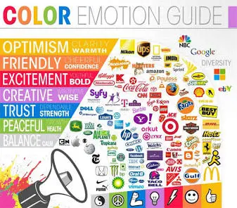
- Increase trust and credibility
- Improve button and call-to-action clicks
- Make products appear more valuable
- Strengthen brand recognition
- Reduce confusion during the buying process
Think of brands like Apple, Coca-Cola, Spotify, or Tiffany & Co. Their colors are so consistent that they are recognizable even without a logo.
Start With Your Brand Personality
Do not begin by asking, “What is my favorite color?”
Instead ask, “How should my customers feel when they see my brand?”
For example, an Ayurvedic skincare brand should not feel visually similar to a fintech startup. When you choose brand colors, your palette should reflect your positioning before a single word is read
The 60–30–10 Rule for Color Palette Design
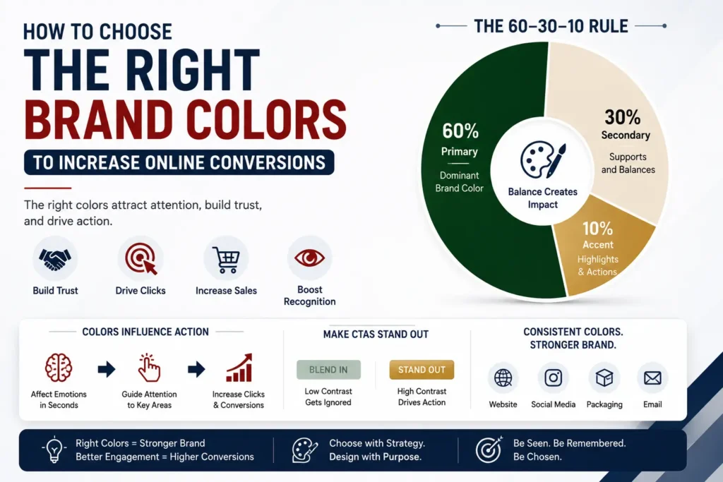
One of the easiest ways to build a premium-looking palette when you choose brand colors is the 60–30–10 rule:
60% Primary Color: The dominant brand color used across your website layout and packaging background.
30% Secondary Color: Supports the primary color and adds visual depth.
10% Accent Color: Used for action buttons, highlights, offers, and important calls-to-action.
Example for a Premium Wellness Brand:
- Deep forest green (60%)
- Warm cream (30%)
- Soft gold (10%)
This creates balance, sophistication, and clarity across your store.
Choose Colors That Improve Clicks
The color of your Call-to-Action (CTA) button matters more than many businesses realize.
Buttons such as “Buy Now,” “Book a Consultation,” “Get a Quote,” or “Add to Cart” should stand out clearly from the rest of the page.
A common mistake when you choose brand colors is using the same hue everywhere. If your entire website is blue, a blue button disappears visually. The CTA should create high contrast.
High-Converting Color Contrasts:
- Green website → Orange CTA
- White website → Blue CTA
- Dark website → Gold or bright accent CTA
The goal is not to search for a single “magic” color, but to make the action unmistakably visible.
According to digital marketing studies by HubSpot’s Conversion Rate Research, testing high-contrast call-to-action buttons against low-contrast designs can increase conversion rates by over 21%.
Consider Your Target Audience
Different audiences respond differently to visual cues when you choose brand colors:
Luxury Buyers: Often prefer restrained, minimal, and monochromatic palettes.
Health-Conscious Customers: Respond well to greens, warm creams, whites, and natural earth tones.
Parents Shopping for Children: Engage more with brighter, friendly, and energetic colors.
Corporate Decision-Makers: Usually prefer cleaner blues, dark greys, and structured palettes.
If your customers are professionals between 30–55, a sophisticated navy-and-neutral palette may convert far better than a loud multicolor design.
Keep Colors Consistent Everywhere
Many businesses use one set of colors on their website, another on Instagram, another on packaging, and another on digital advertisements.
This weakens brand recognition.
Once you choose brand colors, they should remain strictly consistent across:
- Website and landing pages
- Logo variations
- Product packaging design
- Social media creatives
- WhatsApp marketing graphics
- Email newsletter templates
- Printed brochures and flyers
- Exhibition stalls and signage
- Digital ad campaigns
Consistency builds familiarity, and familiarity builds long-term customer trust. Learn how establishing a comprehensive brand style guide for growing e-commerce businesses ensures color accuracy across every platform.
Test Before You Finalize
Even experienced branding agencies test palettes before making final commitments.
Run simple A/B experiments on your storefront such as:
- Blue CTA button vs Green CTA button
- White background vs Light beige background
- Dark premium theme vs Bright minimal theme
Key Metrics to Measure:
- Click-through rate (CTR)
- Add-to-cart rate
- Lead form submissions
- Page bounce rate
- Average time on page
Small improvements in how you choose brand colors can create significant revenue growth over time.
Common Color Mistakes That Reduce Conversions
Avoid these frequent branding errors when you choose brand colors:
- Using too many conflicting colors in one layout
- Low contrast between text and background elements
- Bright neon colors for heritage or luxury products
- Inconsistent color shades across different devices and print platforms
- Trend-based color choices that do not match the brand identity
- CTA buttons blending directly into the page background
A premium brand usually feels intentional, not decorative.
A Practical Color Formula for Indian D2C Brands
For many premium Indian consumer brands, this combination performs exceptionally well when you choose brand colors:
- Primary: Deep green / Navy blue / Charcoal grey
- Secondary: Ivory / Warm white / Sand beige
- Accent: Gold / Terracotta / Rich saffron
This palette communicates heritage, quality, authenticity, and trust—especially for wellness, Ayurveda, luxury retail, fashion, gifting, and lifestyle brands.
Cholanadu Takeaway
When you choose brand colors, you make one of the few business decisions that influence every customer interaction—from the first Instagram impression to the final checkout page.
The right palette makes your brand easier to remember, easier to trust, and easier to buy from.
If your website is getting traffic but not enough conversions, the problem may not be your product or pricing. It may be the visual language your brand is speaking.
Choose colors that reflect your positioning, create contrast where action is required, and remain consistent across every platform. The result is not just a better-looking brand—it is a brand that performs better online.
Need help choosing the right brand identity for your business?
At Cholanadu, we help businesses create brand identities that combine strategy, design, and customer psychology to improve visibility, trust, and conversions. Because great branding is not only about being seen—it is about being chosen.
