


The $35 Nike Swoosh Story: How a Cheap Logo Became a Billion-Dollar Icon
Table of Contents
Toggle5 Visual Identity Secrets: The $35 Nike Swoosh Power Story
A strong visual identity built around a simple curve can create a bold, billion-dollar asset.
There are logos that identify a company. And then there are logos that become the company in the public imagination through strategic visual identity choices.
The Nike Swoosh belongs to the second category. Today, the curved symbol is recognised across the world. It represents movement, ambition, performance and aspiration.
But the story behind it is remarkably simple. The original Nike Swoosh was designed in 1971 by graphic design student Carolyn Davidson, who was paid $35 to create a visual identity mark.
That tiny design fee eventually became one of the most fascinating stories in branding history.
But here’s the real lesson: A logo doesn’t become valuable because it is expensive. It becomes valuable because a brand gives that visual identity real meaning.
The Beginning: A Brand Needed a Visual Identity
In the early 1970s, Nike was still a young company operating under the name Blue Ribbon Sports. The company needed a distinctive visual identity for its new Nike brand.
The brief was surprisingly simple: Create a symbol that communicates movement. Carolyn Davidson developed several concepts.
Among them was the now-famous curved mark. The Swoosh wasn’t complicated. It didn’t contain the company’s name. It didn’t explain what Nike sold. It was simply a fluid, dynamic shape. And that’s precisely what made its visual identity so powerful.
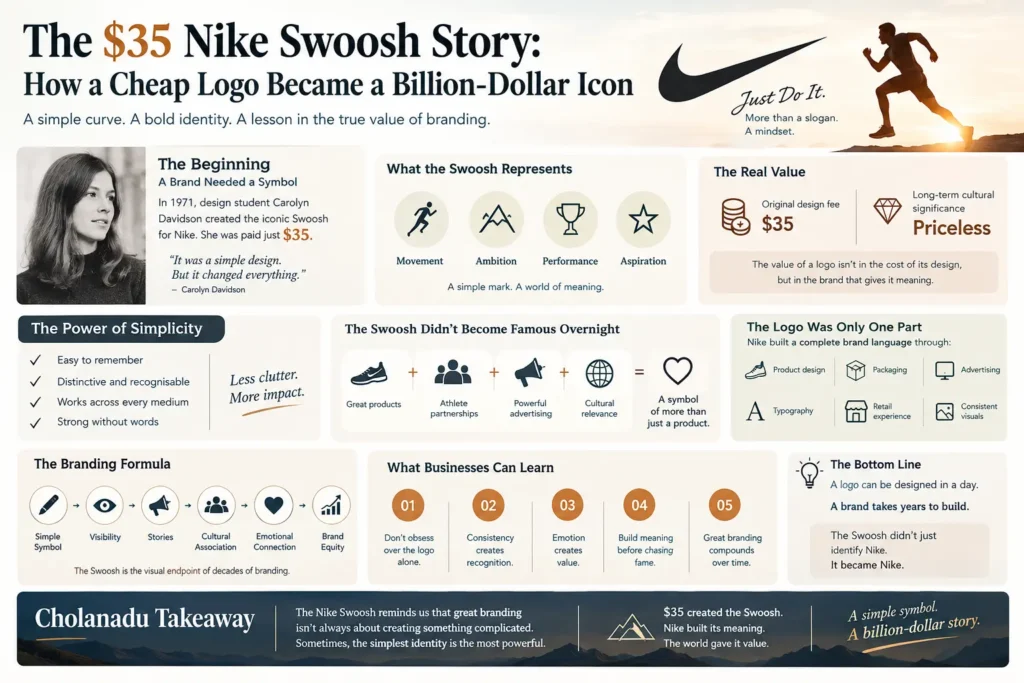
$35 for a Design That Changed Visual Identity Forever
Davidson was reportedly paid $35 for creating the Swoosh. At first glance, that sounds almost unbelievable today.
But there’s an important distinction. The $35 was the fee for the original design work, not a prediction of what the visual identity symbol would eventually become worth. And this is where the story gets interesting.
Years later, Nike recognised Davidson’s contribution with additional compensation, including company stock and a diamond-and-gold Swoosh ring. The gesture reflected something the original payment could never capture: the long-term value of a timeless visual identity idea.
A Great Visual Identity Doesn't Become Famous Overnight
This is one of the biggest misconceptions about iconic logos. A great logo does not automatically create a great visual identity. Nike had to build the meaning behind the Swoosh.
Every advertisement. Every athlete. Every product. Every victory. Every campaign. Every customer experience.
Slowly, the Swoosh became associated with something much bigger than footwear. It became associated with performance and possibility through consistent visual identity presence.
The Secret: Nike Sold a Feeling Through Visual Identity
Nike’s greatest branding achievement wasn’t making people recognise the Swoosh. It was making people feel something when they saw its visual identity.
The Swoosh began to represent:
Movement
Confidence
Competition
Discipline
Achievement
“Just Do It”
The symbol didn’t need to communicate these ideas visually.
Nike’s marketing communicated them repeatedly until consumers began attaching those meanings to the visual identity mark themselves.
That’s powerful branding.
When a Symbol Becomes a Visual Identity Language
Think about how little information the Swoosh actually contains. There is no word. No product description. No slogan. No explanation.
Yet place it on a pair of shoes, a sports jersey, a billboard or a storefront, and millions of people immediately understand what its visual identity represents. That’s when a visual mark stops functioning merely as an identifier. It becomes a complete visual identity language.
The Power Was Never in the Shape Alone
Here’s the most important branding lesson from the Swoosh: The shape didn’t create Nike’s reputation. Nike’s reputation created the visual identity value.
Imagine the same Swoosh belonging to an unknown company. Would it be worth billions? Probably not. The symbol gained enormous commercial power because Nike continuously invested alongside its visual identity:
Product innovation
Athlete partnerships
Advertising
Storytelling
Sponsorships
Cultural relevance
Consistent visual communication
The Swoosh became the shortcut for all of that accumulated brand equity.
Explore professional positioning insights on Cholanadu Brand Architecture and strategic growth frameworks on Cholanadu Strategy. Learn more about design history on Nike About and graphic communication analysis on Harvard Business Review.
From $35 Design to Global Visual Identity Recognition
This creates an interesting contrast. Original design fee: $35 Long-term cultural significance: Priceless The lesson isn’t that every $35 mark can become a billion-dollar asset. The lesson is much more important:
The commercial value of a symbol is determined by the brand equity attached to it, not the invoice that created the visual identity. A beautifully crafted mark attached to a weak brand can remain invisible.
A simple symbol attached to a powerful visual identity can become unforgettable.
Why Simplicity Won in Visual Identity
The Swoosh is an excellent example of visual simplicity in visual identity.
It is:
Simple enough to remember.
Distinctive enough to recognise.
Flexible enough to use everywhere.
Strong enough to work without words.
This matters in a world where a visual identity appears across hundreds of touchpoints from mobile screens and packaging to products, stores and social media.
A strong identity should survive all of them.
The Branding Formula Behind the Swoosh
Nike’s journey toward an iconic visual identity can be understood through a simple formula:
Simple Symbol
↓
Consistent Visibility
↓
Powerful Stories
↓
Cultural Association
↓
Emotional Connection
↓
Brand Equity
The Swoosh is therefore not merely a mark. It is the visual endpoint of decades of visual identity excellence and strategic marketing.
5 Visual Identity Lessons Businesses Can Learn From Nike
01 Don’t Obsess Over the Logo Alone
A mark is an entry point into a brand. Your positioning, personality, customer experience and communication must give that visual identity meaning.
02 Consistency Creates Recognition
Repeated exposure builds familiarity. Changing your visual identity every few months makes it harder for customers to remember you.
03 Emotion Creates Value
People rarely build strong relationships with a visual identity because of colours and shapes alone. They connect with what the brand makes them feel.
04 Build Meaning Before Chasing Fame
Nike didn’t make the Swoosh valuable simply by displaying it everywhere. It built a powerful story around what the visual identity represented.
05 Great Branding Compounds
A visual identity asset can become more valuable over time. Every campaign, customer interaction and successful product can add another layer of meaning.
That’s the power of long-term brand equity.
The $35 Visual Identity Lesson
The fascinating part of the Nike Swoosh story isn’t actually the $35. It’s what happened after the $35. A simple mark was repeatedly placed alongside extraordinary athletes, ambitious campaigns, innovative products and powerful cultural moments.
Eventually, people stopped seeing a curved line. They saw Nike’s visual identity.
And that is the ultimate achievement of branding.
When customers can see your symbol and instantly recall your story, your values and your promise, you have created a visual identity asset far more valuable than the initial sketch.
Cholanadu Takeaway
The Nike Swoosh reminds us that great visual identity work isn’t always about creating something complicated. Sometimes, the most powerful visual identity is the simplest one.
The real work begins after the mark is created. Because a mark can be created in a day.
A brand takes years to build.
And once that meaning becomes deeply embedded in culture, a simple symbol can elevate an entire business.
$35 created the Swoosh.
Nike built its meaning. The world gave it value.
Cholanadu — Where Brands, Ideas & Business Stories Come Together.
