


Apple’s Minimalist Design Philosophy: How Steve Jobs Revolutionized Brand Aesthetics
Table of Contents
ToggleMinimalist Design Secrets: 7 Power Lessons From Apple
Apple did not simply make technology beautiful. It changed what the world expected technology to look, feel, and communicate through minimalist design.
Before Apple became synonymous with sleek products, clean interfaces, iconic packaging, and minimalist advertising, technology was often presented as something complicated, technical, and intimidating. Steve Jobs challenged that idea.
His philosophy was remarkably simple: Great minimalist design should make complexity feel effortless. That principle eventually became one of the most powerful competitive advantages in modern branding.
Apple’s story is not merely about computers, smartphones, or consumer electronics. It is a story about how minimalist design can become a brand’s language.
And perhaps more importantly, it demonstrates a lesson every modern business can learn: When minimalist design becomes consistent, intentional, and recognizable, it stops being decoration and starts becoming identity.
The Beginning: Design Was Never Just About Appearance
Steve Jobs viewed minimalist design differently from the conventional definition of “making something look good.”
For him, minimalist design involved the entire experience:
How does the product feel when you hold it?
How easily can you understand it?
How does the packaging open?
How does the website communicate?
How does the advertisement make you feel?
How does the product fit into your life?
This broader understanding of minimalist design became central to Apple’s identity. Instead of asking “How can we add more?”, Apple increasingly asked “What can we remove?” That distinction would become revolutionary.
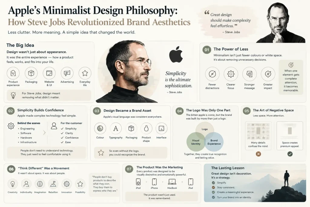
01 The Power of Less
Minimalist design is often misunderstood as simply using fewer colours, fewer words, or more white space. Apple’s approach went deeper. It was about removing unnecessary decisions. A complicated product might have dozens of features competing for attention.
Apple’s minimalist design philosophy was to identify what mattered most and allow that element to dominate. Think about Apple’s product advertisements: a product, a clean background, a short message, and a carefully controlled visual. Very little distraction. The result? The product becomes the advertisement.
This is an important branding lesson. When everything is highlighted, nothing feels important. But when one element receives complete attention, it becomes memorable.
02 Steve Jobs Understood the Psychology of Simplicity
People naturally associate complexity with effort. If a product looks complicated, customers may assume that using it will also be complicated. Apple reversed this perception. Its visual language communicated: “You don’t need to understand technology to use technology.” That was powerful.
The technology could be extraordinarily sophisticated behind the scenes. But the customer did not need to see all that complexity. This created an important separation:
Behind the product: Engineering, software, hardware, manufacturing, algorithms, infrastructure.
In front of the customer: Minimalist design, simplicity, clarity, confidence, beauty, ease.
That contrast became one of Apple’s greatest branding strengths.
03 Minimalist Design Became a Brand Asset
Many businesses think of branding as a logo. Apple demonstrates why that definition is incomplete. A brand can be recognized through:
Colour & Typography
Packaging & Product shape
Photography & Interface
Advertising & Tone of voice
Retail environment & Customer experience
Apple connected these elements into one coherent visual ecosystem. So even without seeing the Apple logo, a consumer could often recognize an Apple advertisement. That is the ultimate achievement of visual identity: recognition without explanation.
04 The Apple Logo Was Only One Piece of the Identity
The bitten apple is one of the world’s most recognizable symbols. But Apple’s brand equity was never created by the logo alone. Imagine removing the Apple logo from a modern Apple product advertisement.
The combination of minimalist design composition + product photography + typography + negative space + restrained messaging can still communicate the brand.
A logo identifies a brand. A visual identity expresses a brand. A complete brand experience makes the brand memorable. Apple mastered all three through disciplined minimalist design.
05 The Art of Negative Space
One of Apple’s most recognizable minimalist design techniques is its use of negative space. Instead of filling every available area with information, Apple often allows visual space to surround the subject. Why does this work? Because empty space creates attention.
Consider two advertisements:
Advertisement A: Product + ₹ Price + 20 features + 5 benefits + 3 offers + Customer testimonials + Multiple colours + Several icons + Long headline.
Advertisement B: Product + One powerful statement + Nothing else competing for attention.
Which one feels more premium? Usually, the second. This is not accidental. Premium minimalist design often communicates confidence through restraint.
06 "Think Different" Was More Than a Campaign
Apple’s “Think Different” campaign became one of the most influential examples of brand positioning. The campaign did something particularly clever. It didn’t focus primarily on technical specifications.
Instead, it connected Apple with creativity, individuality, imagination, rebellion, innovation, and possibility.
Apple wasn’t simply saying: “Our computers are powerful.” It was communicating: “Our customers are different.”
And that subtle shift is incredibly powerful. Because people don’t always buy products to describe what they own. They buy products that help express who they are or who they want to become. Learn more about legendary campaigns on Apple’s Official Newsroom or explore classic design roots at Design Museum.
07 Product Design Became Marketing
One of Apple’s greatest strategic achievements was turning the product itself into a marketing asset. Consider the Apple iPod, then the iPhone, then the MacBook, then the iPad. The products were built around minimalist design to be visually distinctive while remaining relatively restrained.
That meant customers didn’t simply consume the brand through advertisements. They carried the brand, placed it on their desks, opened it in cafés, photographed it, discussed it, and recommended it. The product became a mobile brand billboard.
08 The Unboxing Experience
Apple also transformed something many companies previously treated as secondary: packaging. Opening an Apple product became part of the experience. The box, the spacing, the arrangement, the materials, the reveal, and the placement of accessories—everything communicated control and precision through minimalist design.
Every customer touchpoint is an opportunity to reinforce positioning. If your brand claims to be premium but delivers an ordinary experience, the customer notices the contradiction. Apple understood that the brand doesn’t end at checkout.
09 The Apple Store Was Designed Like a Brand Experience
Apple’s retail stores extended the same minimalist design philosophy into physical space. Instead of creating a crowded electronics-store atmosphere, Apple stores emphasized open spaces, clean architecture, product accessibility, simple displays, natural interaction, and consistent visual language.
The objective wasn’t simply “Come here and buy a computer.” It was closer to “Come here and experience the Apple ecosystem.” A retail store can be a sales location or a physical expression of the brand. Apple chose the second.
10 The Genius of Consistency
One of Apple’s greatest branding advantages is consistency. The same minimalist design philosophy appears across Hardware → Software → Packaging → Advertising → Website → Retail → Photography → Typography → Communication.
Everything feels related. This creates what designers call visual coherence.
Design → Recognition → Trust → Preference → Loyalty
And visual coherence creates familiarity. Familiarity creates recognition. Recognition creates trust. Trust creates preference. And preference can ultimately create loyalty. That is how minimalist design aesthetics can become business strategy.
11 Apple Didn't Remove Complexity. It Hid It.
This is perhaps the most important lesson. Minimalist design does not mean minimal functionality. The iPhone is a perfect example. Underneath its clean interface exists enormous technological complexity.
But the user doesn’t need to experience that complexity directly. Apple’s philosophy can therefore be summarized as: Complexity belongs behind the experience. Simplicity belongs in front of it.
For businesses, this is an extraordinary principle. Your company may have complex operations, advanced technology, multiple departments, complicated processes, and extensive product capabilities. But your customer shouldn’t have to understand your internal complexity just to understand your value.
12 Why Apple's Minimalist Design Feels Premium
Why does minimalist design often feel expensive? Because restraint suggests confidence. Luxury brands frequently avoid shouting. They don’t necessarily need: MORE! NEW! BEST! SALE! LIMITED! BUY NOW!
Instead, they allow the product, material, craftsmanship, and visual environment to communicate value. Apple adopted a similar minimalist design principle in technology:
Less visual noise → More perceived confidence.
Less explanation → More curiosity.
Less clutter → More focus.
This is why minimalist design can create a premium perception when executed correctly.
13 The Danger: Minimalist Design Without Strategy
However, there is an important warning. Minimalist design is not simply making something empty. A white background does not automatically create premium branding. A simple logo does not automatically create sophistication. Using fewer words does not automatically create clarity.
True minimalist design requires strategic editing. You must know:
What matters?
What doesn’t?
What should the customer notice first?
What should the customer remember?
What emotion should the design create?
What action should the design encourage?
Without strategy, minimalist design becomes decoration. With strategy, it becomes communication.
14 What Businesses Can Learn From Apple
The Apple philosophy can be applied far beyond technology:
Fashion brand: Instead of showing 15 products, highlight one signature piece using minimalist design.
Skincare company: Instead of listing 25 claims, communicate one clear promise.
Restaurant: Instead of overwhelming customers with visual clutter, create a refined environment where the food becomes the hero.
Consulting firm: Instead of filling every presentation slide with information, communicate one powerful idea at a time.
The principle remains the same: Make the important thing impossible to ignore. For more branding ideas, explore our internal insights on Cholanadu Strategy and Cholanadu Brand Architecture.
15 The Minimalist Design Framework
If you’re building or refreshing a brand, try this simple framework:
STEP 01 Define: What is the one thing your brand should be known for?
STEP 02 Remove: What visual or verbal elements are unnecessary?
STEP 03 Prioritize: What should customers notice first?
STEP 04 Simplify: Can your message be communicated more clearly through minimalist design?
STEP 05 Standardize: Can the same minimalist design language work across every platform?
STEP 06 Repeat: Can customers recognize your brand without seeing your logo?
That final question is critical. Recognition is the real test of identity.
16 Interactive Thought: Remove One Thing
Here’s a simple exercise for your brand. Look at your homepage, your Instagram profile, your brochure, your packaging, your presentation, or your advertisement.
Now ask: “If I had to remove 20% of this design, what would I remove?”
Don’t immediately add anything. Just remove. Then ask: “Does the message become clearer?”
If yes, you’re moving toward intentional minimalist design. If no, continue editing. Great minimalist design is often less about adding creative elements and more about knowing what deserves to remain.
17 From Product Design to Brand Philosophy
Steve Jobs’ influence on minimalist design went far beyond Apple’s products. He helped popularize a broader idea: Design is not the final layer applied to a business. Design is part of how the business thinks.
That idea changed the relationship between Business × Technology × Minimalist Design × Marketing. Apple demonstrated that these disciplines don’t have to operate separately. When they work together, they can create something much more powerful: a recognizable brand experience.
The Bigger Lesson
Apple’s minimalist design philosophy wasn’t successful because Apple used white space. It wasn’t successful because its products were sleek. It wasn’t successful because its logo was famous. It succeeded because every design decision reinforced a larger brand idea.
That idea was clarity, simplicity, innovation, confidence, human-centered technology, and above all: Don’t make the customer work harder than necessary to understand your value. That is the real legacy of Apple’s minimalist design approach.
Final Thought
In a world where brands compete for attention by becoming louder, faster, brighter, and more complicated, Apple’s approach offers a compelling alternative. Be clearer. Be intentional. Be recognizable. Be disciplined enough to remove what doesn’t matter. Because the strongest brands don’t always say more. Sometimes, they say less better through minimalist design.
And when that simplicity is backed by strategy, consistency, and a powerful idea, it can become something much bigger than aesthetics. It becomes a brand people recognize before they even see the name.
The Cholanadu Perspective
At Cholanadu, we believe great branding is not about making a business look impressive for a moment. It is about creating a visual and strategic identity that remains recognizable, relevant, and memorable over time.
Apple’s story demonstrates exactly why:
Minimalist design gets attention.
Consistency builds recognition.
Strategy creates meaning.
Brand experience builds value.
The goal isn’t simply to look different. The goal is to become unmistakable.
