


Airbnb’s “Belong Anywhere” Rebrand: Building Global Trust Through Visual Identity
Table of Contents
ToggleBest Airbnb Brand Strategy Lessons: 5 Proven Rebrand Ideas
Executing a long-tail airbnb brand strategy can turn a simple room-sharing platform into an iconic global lifestyle brand.
Airbnb’s “Belong Anywhere” Rebrand: Building Global Trust Through Visual Identity
How a simple symbol, a powerful idea, and a globally consistent identity transformed Airbnb from a room-sharing platform into one of the world’s most recognisable lifestyle brands.
When a Brand Stops Selling a Product ?
Some of the most powerful brands do not become memorable because of what they sell. They become memorable because of what they make people feel.
Airbnb is a remarkable example. It began as a relatively simple idea: help people find a place to stay.
But Airbnb eventually realised that people were not simply booking bedrooms, apartments, or holiday homes. They were looking for something deeper:
A feeling of belonging.
That insight became the foundation of one of the most significant rebrands in modern digital branding through a cohesive airbnb brand strategy.
In 2014, Airbnb introduced a new identity built around the concept: Belong Anywhere.
The rebrand did more than introduce a new logo. It attempted to transform the entire visual and emotional language of the company.
The objective was ambitious: Build a brand that could feel equally natural in New York, Paris, Chennai, Tokyo, London or a small village somewhere in the world.
And that is where the airbnb brand strategy story becomes particularly interesting for businesses today.
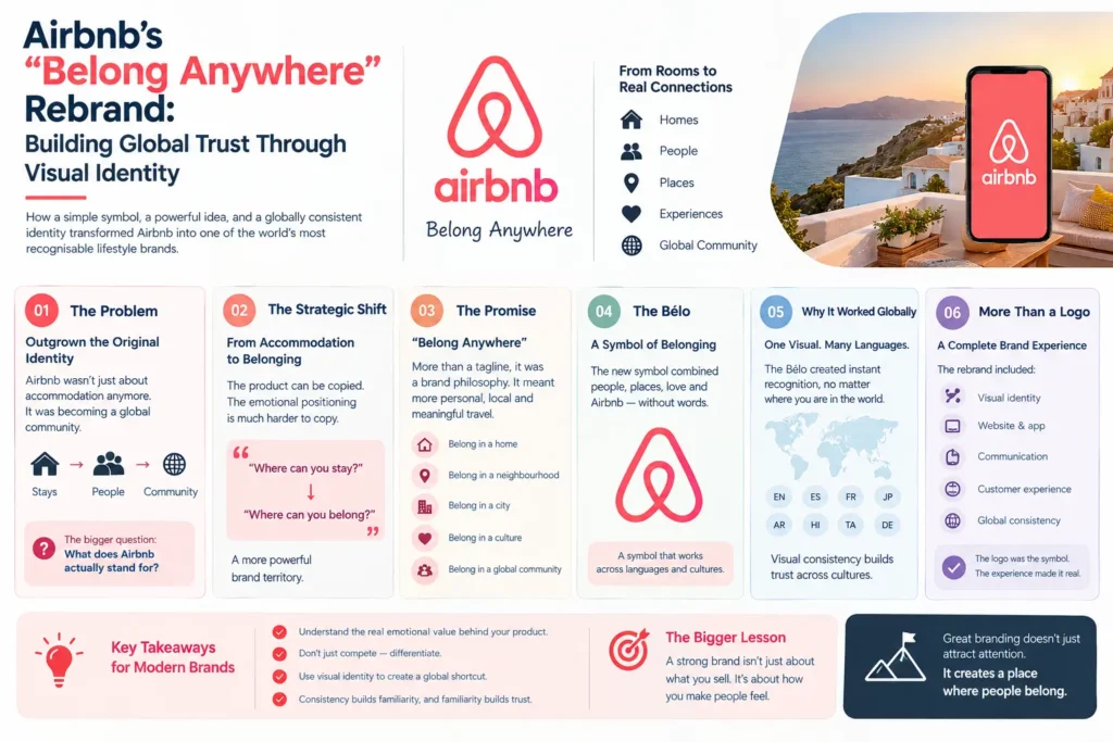
01 The Problem: Airbnb Had Outgrown Its Original Identity
Before the 2014 rebrand, Airbnb had already experienced extraordinary growth. But its visual identity was beginning to feel disconnected from the company it was becoming.
The early Airbnb identity was functional and recognisable, but it did not fully communicate the emotional proposition of the business. Airbnb was no longer simply a website for finding accommodation.
It was becoming a global community connecting:
Hosts → Guests → Homes → Experiences → Cultures → Communities
The brand needed an identity capable of bringing all of these elements together.
The strategic question was simple: What does Airbnb actually stand for?
The answer wasn’t: “Affordable accommodation.” It wasn’t even: “Travel.” The deeper answer was: Belonging. And that became the foundation for every future airbnb brand strategy decision that followed.
02 The Strategic Shift: From Accommodation to Belonging
This is one of the most important lessons from Airbnb’s rebrand. A strong brand does not necessarily position itself around its product. It positions itself around the human need behind the product.
The product can be copied. The emotional positioning is much harder to copy. Airbnb therefore moved the conversation from:
“Where can you stay?” to: “Where can you belong?” That is a much more powerful brand territory for a global airbnb brand strategy.
03 “Belong Anywhere”: A Brand Promise, Not Just a Tagline
“Belong Anywhere” worked because it wasn’t merely a marketing slogan. It expressed a larger brand philosophy. Airbnb wanted to communicate that travel could be more personal.
Instead of feeling like an outsider in an unfamiliar city, travellers could experience destinations through local homes, neighbourhoods and people.
The statement therefore carried multiple meanings. Belong in a home. Belong in a neighbourhood. Belong in a city. Belong in a culture. Belong in a global community.
This gave Airbnb an emotional platform broad enough to work across markets. And that matters enormously for an airbnb brand strategy.
04 Enter the Bélo
Perhaps the most recognisable element of Airbnb’s rebrand was its new symbol. Known as the Bélo, the symbol was designed to represent the idea of belonging.
Its form was intended to combine several meanings, including:
People
Places
Love
Airbnb itself
This was strategically significant for their global airbnb brand strategy.
Instead of relying entirely on the word “Airbnb,” the company created a visual symbol that could potentially communicate the brand without language.
That is the power of a strong visual identity. A word requires reading. A symbol requires recognition.
For a company operating across languages and cultures, that distinction is extremely valuable.
05 Why the Symbol Mattered Globally
Imagine a brand operating across dozens of countries. Its audience may speak: English. Spanish. French. Japanese. Arabic. Tamil. Hindi. German. Portuguese. The brand cannot depend entirely on language to create recognition. It needs a visual shortcut.
That is what a strong symbol can become within an airbnb brand strategy. When people repeatedly encounter the same shape, typography, colours and visual behaviour, recognition gradually develops.
This creates:
Consistency → Familiarity → Recognition → Trust
Airbnb understood that global branding required more than translation. It required visual consistency across cultures.
06 The Logo Was Only One Part of the Rebrand
A common mistake is to think: Rebrand = New Logo Airbnb’s transformation demonstrates why that is incomplete.
A complete airbnb brand strategy involves much more. Airbnb’s visual ecosystem included:
Logo → Typography → Colour system → Photography → Illustration → Digital interfaces → Advertising → Packaging and physical touchpoints → Social media → Brand voice → Customer experience
The logo became the signature. But the entire system created the identity. This is an important distinction for businesses considering a rebrand.
07 Building a Brand That Could Travel
A global brand faces a unique challenge. It must feel: Consistent enough to be recognisable while also being Flexible enough to feel locally relevant.
Airbnb’s visual identity was designed around this tension. The brand needed to establish a recognisable global framework without making every market look identical. This is where a flexible airbnb brand strategy becomes powerful. Instead of saying:
“Every market must look exactly the same.”
The philosophy becomes:
“Every market should feel like the same brand.”
That difference is subtle but strategically important.
08 The Power of Photography
Airbnb’s brand communication increasingly centred around people and real-world experiences. Rather than presenting travel as a collection of anonymous hotel rooms, the visual storytelling often focused on:
People
Homes
Food
Neighbourhoods
Landscapes
Experiences
Human connection
This supported the “Belong Anywhere” proposition within the airbnb brand strategy.
The photography effectively answered the emotional question: “What does belonging look like?” And the answer was different everywhere. That gave the brand enormous visual richness.
09 From Corporate Identity to Human Identity
Traditional corporate branding often attempts to communicate: Scale. Authority. Reliability. Professionalism. Airbnb needed these qualities, but they were not enough.
A travel platform involving strangers opening their homes to strangers requires something more: Trust.
And trust is emotional.
People need to feel comfortable booking a property they have never physically visited.
Hosts need to feel comfortable allowing strangers into their homes.
Airbnb therefore needed its airbnb brand strategy to reduce psychological distance.
The visual language had to feel: Warm. Human. Approachable. Modern. Global. That is where branding became a business tool rather than simply a design exercise.
10 Trust Is Built Through Repetition
One logo does not create trust. One advertisement does not create trust. One social media post does not create trust. Trust develops through consistent experiences repeated over time.
Think of the equation: Consistency × Time = Familiarity And: Familiarity + Positive Experience = Trust
An effective airbnb brand strategy repeatedly placed its identity across:
Its website
Mobile applications
Emails
Advertisements
Social media
Host communication
Guest communication
Property listings
Campaigns
Events
Physical experiences
The identity therefore became part of the customer’s journey. Not decoration. Recognition infrastructure.
11 The Brand Became Bigger Than the Platform
This is perhaps the most important transformation. Airbnb was no longer simply communicating: “We help you book accommodation.” It was communicating: “We help you experience the world differently.”
That shift allowed Airbnb to expand its brand territory. Accommodation became one part of a larger ecosystem involving:
Travel
Community
Culture
Hospitality
Experiences
Discovery
Connection
This is what happens when a brand successfully moves from product positioning to a purpose-driven airbnb brand strategy.
12 The Rebrand Created a Visual Language
A mature brand does not simply have a logo. It has a visual language. Think of language as a system. A single word does not create a conversation.
Similarly, a logo does not create a brand identity. The airbnb brand strategy visual system worked through the combination of:
Symbol: The Bélo created recognition.
Typography: Typography established personality and consistency.
Colour: Colour created visual distinction.
Photography: Photography communicated humanity.
Layout: Layout created consistency across platforms.
Illustration: Illustration added flexibility and storytelling.
Digital design: Digital interfaces brought the brand into everyday interaction.
Together, these elements created a recognisable world.
13 Why This Was Particularly Important for a Digital Brand
Airbnb was born digitally. That meant its customers often encountered the brand through screens.
Website
Mobile
Search
Social media
Email
Digital advertising
For digital-first businesses, the visual identity must work at multiple sizes. To explore how leading design firms build dynamic visual assets, review documented case studies on DesignStudio Agency.
It needs to look effective:
As a tiny app icon
As a website header
On a mobile screen
Inside an advertisement
On a billboard
On merchandise
Across social media
This is why modern airbnb brand strategy and identity design need to be systematic and scalable.
14 The Hidden Business Value of Visual Consistency
Imagine seeing a brand once. You may forget it. See it again. Recognition begins. See it repeatedly. Familiarity develops. Experience the brand positively. Trust strengthens. This is why consistency has economic value in an airbnb brand strategy.
A consistent identity can reduce the cognitive effort required for customers to recognise a company.
In crowded markets, that matters.
Because consumers are constantly exposed to:
Thousands of logos
Hundreds of advertisements
Multiple competing platforms
The brands that become mentally available have an enormous advantage.
15 Airbnb's Rebrand as a Case Study in Brand Equity
Brand equity is not created overnight. It accumulates. Every interaction contributes to the overall airbnb brand strategy. A customer sees the logo. A host receives an email. A traveller opens the app. A friend shares an Airbnb listing. Someone watches an advertisement. Someone posts a travel experience. Each interaction reinforces the mental association. Eventually:
Symbol → Airbnb
Airbnb → Travel
Travel → Belonging
That is brand equity.
The visual identity becomes a mental shortcut.
16 The Strategic Lesson: Don't Design for Today
One of the strongest lessons from Airbnb is the importance of designing for the brand you are becoming, not only the company you are today.
A small startup may need only:
Logo
Business card
Website
But a growing company executing an ambitious airbnb brand strategy may eventually need:
Digital products
Social media
Advertising
Packaging
Events
Video
Presentations
Internal communications
International expansion
Partnerships
A brand identity designed without scalability can become a limitation. A strong identity system becomes an asset for growth.
The Bigger Idea Behind Airbnb's Rebrand
Airbnb’s “Belong Anywhere” story ultimately demonstrates something fundamental about branding:
People remember meanings more powerfully than features.
A feature tells people what your product does.
A brand tells people what your product means.
Airbnb could have built its identity around:
Homes
Rooms
Bookings
Destinations
Instead, its airbnb brand strategy built its identity around:
Belonging.
That gave the company a much larger emotional territory.
From Visual Identity to Business Strategy
This is where professional branding becomes truly valuable. A comprehensive airbnb brand strategy should not begin with:
“What colours should we use?”
It should begin with:
“What should the market believe about us?”
Then:
Positioning → Purpose → Personality → Messaging → Visual Identity → Customer Experience → Brand Recognition → Brand Equity
This is the strategic chain behind memorable brands.
The Cholanadu Perspective
Airbnb’s transformation offers a powerful lesson for Indian businesses, startups and growing brands. You do not need to become a global company to think globally.
You need to build a brand that is:
Strategic
Distinctive
Consistent
Scalable
Emotionally relevant
Visually memorable
A logo may identify your business. But a strong airbnb brand strategy framework and brand identity can make people recognise you, remember you and trust you.
That is the difference between having a logo and having a brand. To learn how our agency develops these positioning roadmaps, visit our Cholanadu today.
CHOLANADU
Brand Strategy • Brand Identity • Digital Branding • Marketing • Creative Communication
Building brands that are not merely seen but remembered.
