


- Prepared for: KALIMARK
- Prepared by: Cholanadu Media Corporation pvt, ltd
- Date: 25-11-2025
1.BRAND OVERVIEW
1.1 BACKGROUND
Kalimark is an Indian beverage company founded in 1916 by P.V.S.K. Palaniappa Nadar in Virudhupatti (now Virudhunagar), Tamil Nadu. It began as a small soda-making venture and later introduced its most famous product, Bovonto. The company, now managed by the fourth generation of the founding family, has expanded its portfolio beyond soft drinks to include juices, dal, and sunflower oil, while still primarily known for its Bovonto brand
1.2 MISSION
“To make locally loved, affordable beverages that reflect Tamil Nadu tastes and culture, while scaling responsibly.” (Derived from repeated public statements about local roots, product consistency and expansion plans)
1.3 VISION
Become a ₹1,000-crore regional FMCG player with wider South-India reach, diversified portfolio (non-carbonates, juices) and modernised manufacturing. This is supported by Kalimark’s stated investment/expansion plans and PE-raising reports.
1.4 BRAND VALUES
- Local pride & cultural authenticity — brand seen as “Tamil soda” and tied to local rituals and nostalgia.
- Consistency of taste — keeping the same flavor profile (Bovonto’s grape-cola hybrid) over decades.
- Independence / Self-reliance — refusal to sell out historically; emphasis on family ownership and control.
- Value & distribution focus — deep presence in semi-urban and rural retail, price-sensitive positioning.
1.5 MARKET POSITIONING
- Category: Regional soft-drink (carbonated & non-carbonated) leader in Tamil Nadu and select neighbouring markets.
- Value proposition: “A uniquely local flavour and cultural beverage that is affordable, widely available across small retail, and emotionally resonant with Tamil consumers.”
- Target audience: Mass market in Tamil Nadu — strong pull in Tier-2 / Tier-3 towns and rural areas; growing appeal with urban Gen Z via nostalgia marketing.
2. BRAND IDENTITY
- Product identity: Distinctive purple/ grape-cola taste (mildly carbonated, tangy grape-cola). This taste differentiator is core to Bovonto’s identity.
- Visual identity: Historically low-key packaging; recent premiumisation and packaging modernisation efforts reported alongside expansion plans.
- Emotional identity: Nostalgia + “local pride” — Bovonto is described by consumers as a cultural marker, not a commoditised global soda.
2.1 VISUAL IDENTITY
Here’s a Brand Distinctiveness Evaluation Table for Kalimark & bovonto, based on the three logo evolutions shown. The scoring follows global brand audit standards (Interbrand/Landor style) — rating each subtopic on a 1–10 scale.
2.2 KALIMARK — BRAND DISTINCTIVENESS EVALUATION
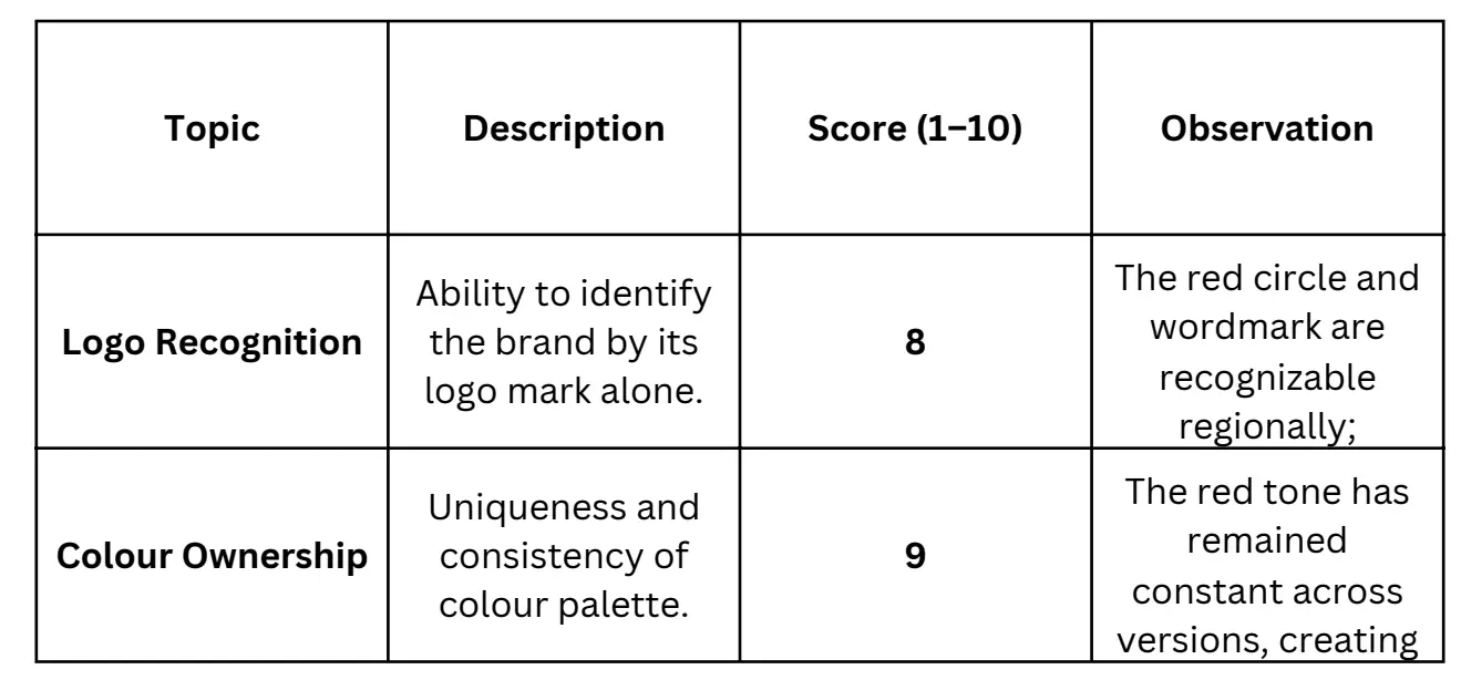
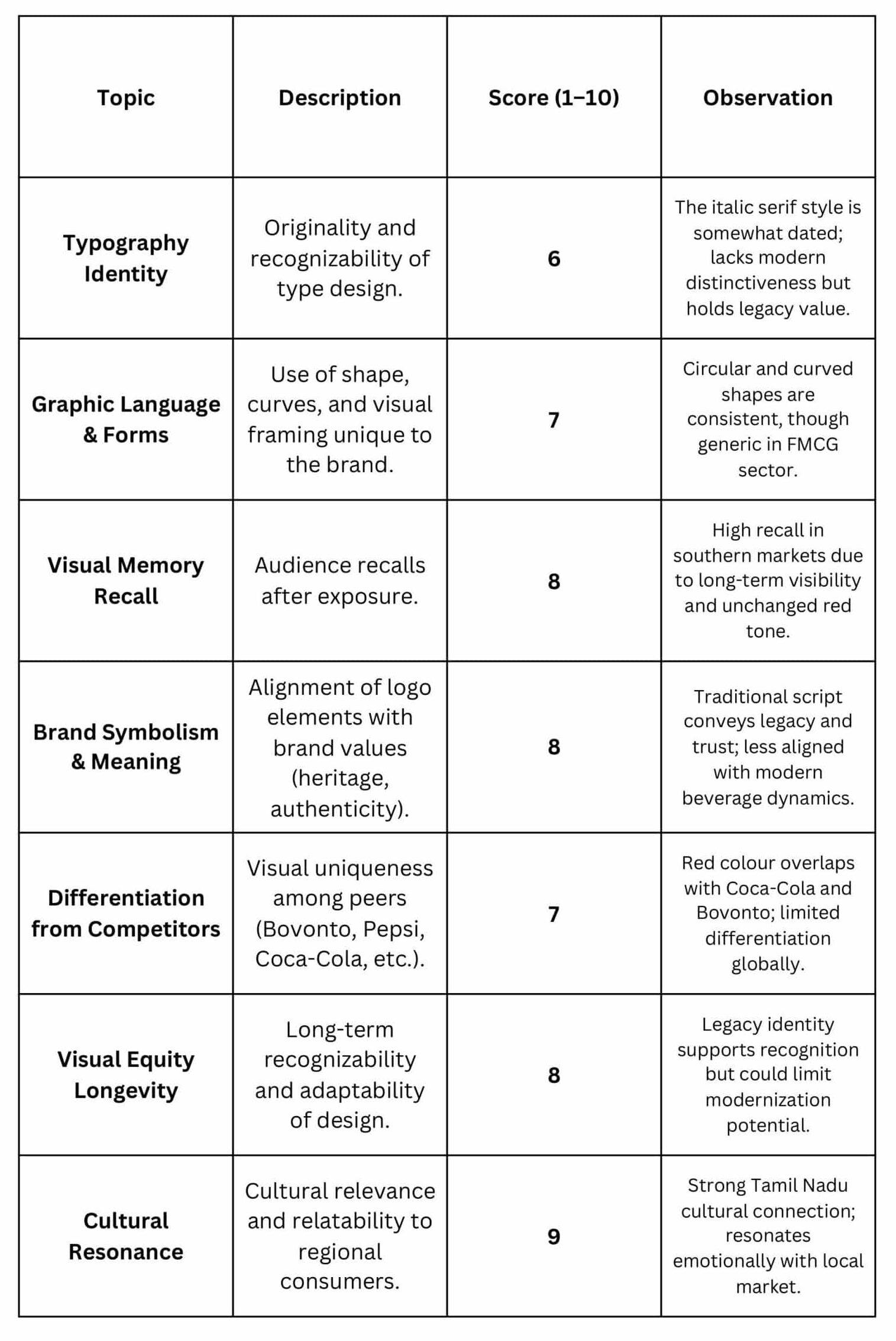
AVERAGE DISTINCTIVENESS SCORE: 7.8 / 10
Summary Insight
- Strengths: Strong colour consistency, high recall, deep cultural roots.
- Weaknesses: Typography and layout feel outdated; limited adaptability to global aesthetics.
- Recommendation: Retain colour and core form; update typography and composition for modern scalability while preserving legacy cues.
BRAND BENCHMARKING REPORT (CONSISTENCY & DISTINCTIVENESS SCORING OVERVIEW
1. EXECUTIVE SUMMARY
This benchmarking report evaluates the brand’s visual and strategic performance across two global-standard criteria sets:
- Brand Distinctiveness
- Brand Consistency & Cohesion
Each criterion was scored on a 1–5 scale based on industry benchmarks, competitive positioning, recognizability, and overall execution quality.
The results clearly highlight where the brand excels and where structured improvements are required to achieve a strong, modern, and competitive identity.
2. SCORING FRAMEWORK EXPLAINED
Score Range Meaning
- 1 = Very Weak (highly inconsistent or non-distinct)
- 2 = Weak (below average, needs major improvement)
- 3 = Moderate (acceptable but not yet competitive)
- 4 = Strong (globally competitive level)
- 5 = Excellent (industry-leading execution)
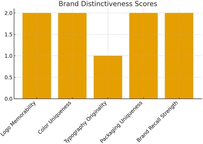
3. BRAND DISTINCTIVENESS BENCHMARKING
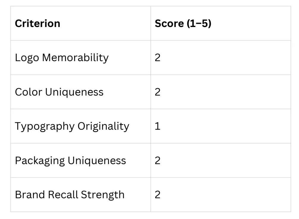
This evaluates how unique, recognizable, and ownable the brand’s visual and strategic identity is within its competitive category.
3.1 SCORING TABLE — DISTINCTIVENESS
KEY INSIGHTS
Strengths
- Slight recognizability due to long-term market presence.
- Packaging has some category familiarity, making products easy to identify.
Weaknesses
- Visual elements lack unique signatures that separate the brand from rivals.
- Typography and color palette are easily replicable and not ownable.
- Low recall performance indicates weak emotional or visual anchors in consumers’ minds.
4. BRAND CONSISTENCY & COHESION BENCHMARKING
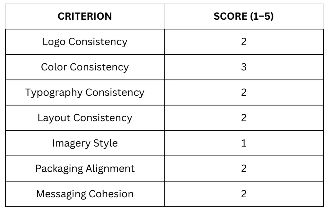
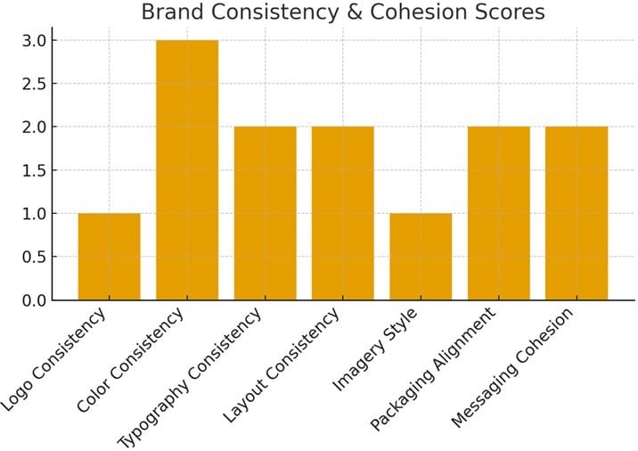
This evaluates how consistently the brand applies its identity across touchpoints, ensuring a unified and professional perception.
4.1 Scoring Table — Consistency & Cohesion
KEY INSIGHTS
Strengths
- Colour use is relatively consistent across products.
- Some aspects of packaging follow a recognizable pattern.
Weaknesses
- Logo appears in multiple variations with no strict usage rules.
- Typography changes between products and campaigns.
- Imagery style is not standardized (varies in tone, lighting, and storytelling).
- Messaging lacks a unified verbal tone across channels.
5. VISUAL CHARTS SUMMARY (PROVIDED ALONGSIDE REPORT)
This report is accompanied by two visual analytics:
- Distinctiveness Bar Chart
- Consistency & Cohesion Bar Chart
These visuals help the brand team understand performance gaps instantly and identify which categories need urgent improvement.
BENCHMARK INTERPRETATION & WHAT IT MEANS FOR THE BRAND
Areas Requiring Immediate Attention
- Logo usage standardization
- Typography guideline creation
- Unified imagery system
- Packaging design alignment
Areas Requiring Strategic Redesign
- Colour palette modernization
- Brand-driven storytelling
- Revisiting the identity for distinctiveness without losing heritage
Opportunity Zones
- Trademarkable visual devices
- Stronger packaging architecture
- Unique type system
- Cohesive campaign-level messaging
RECOMMENDATIONS FOR IMPROVEMENT (BASED ON SCORES)
7.1 Build a Robust Brand Identity System
- Define logo variations, safe zones, and usage rules.
- Establish a unique typography system that carries brand personality.
- Create an updated color palette with distinct primary and secondary tones.
7.2 Improve Brand Distinctiveness
- Introduce proprietary shapes, icons, and graphic devices.
- Strengthen packaging architecture with recognizable layouts and typography.
- Create a signature photography style that becomes the brand’s visual hallmark.
7.3 Improve Brand Consistency
- Develop a complete brand guideline PDF.
- Use templates for banners, packaging, posters, and digital communication.
- Align all sub-brands and product extensions under a unified visual theme.
8. FINAL CONCLUSION
The benchmarking clearly shows that the brand has strong market heritage but lacks visual discipline and distinctiveness required to compete at a global standard. Strengthening consistency and increasing uniqueness will dramatically improve recall, desirability, and perception.
A structured rebranding or refinement process is recommended to elevate the brand from Category Familiar to Category Leader.
3. INTERNAL AUDIT
1. ORGANIZATIONAL ALIGNMENT
2. LEADERSHIP & CULTURE
3. BRAND UNDERSTANDING
4. STRENGTHS
5. WEAKNESSES
4. EXTERNAL AUDIT
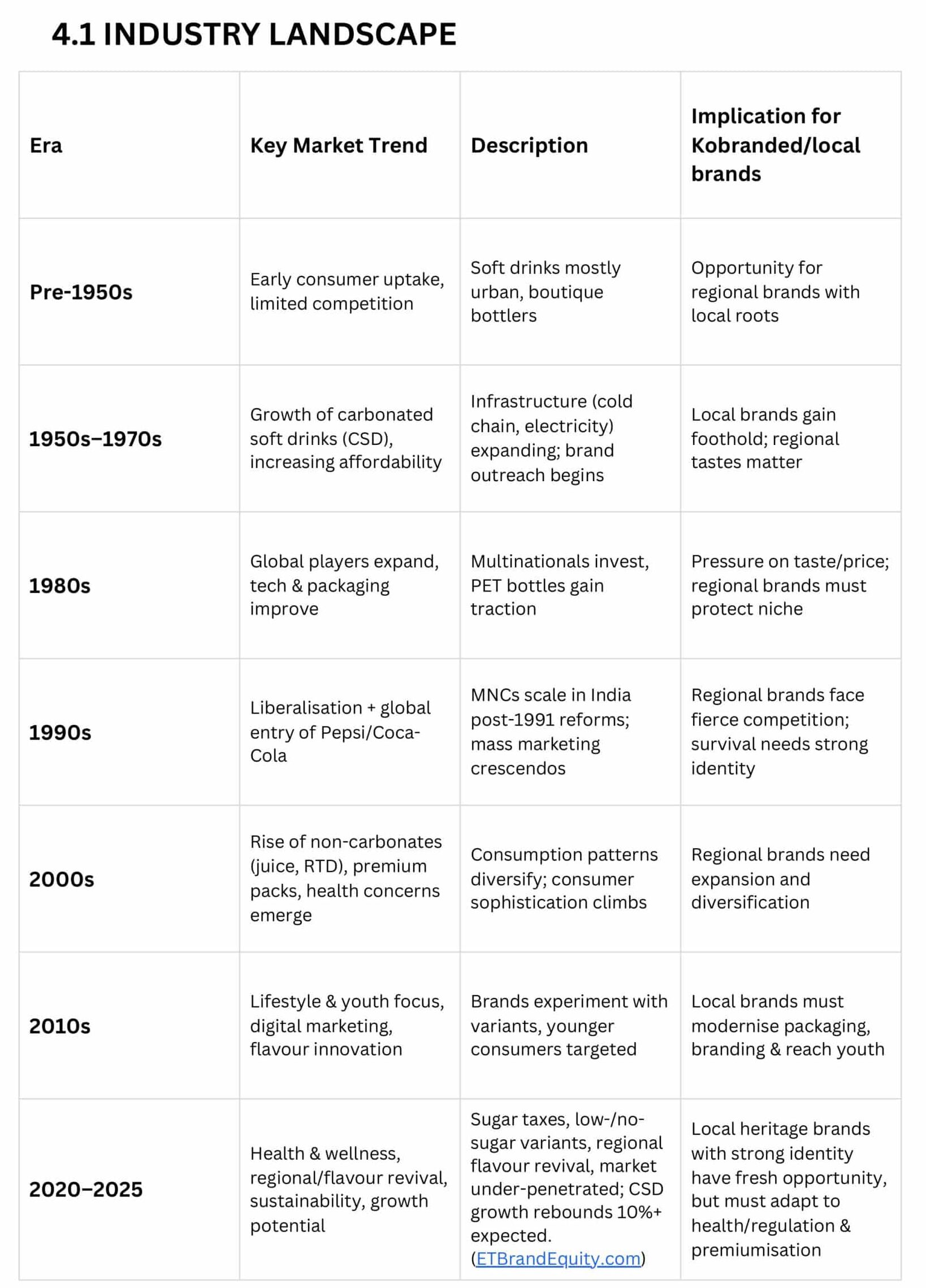
4.2 MARKET TRENDS
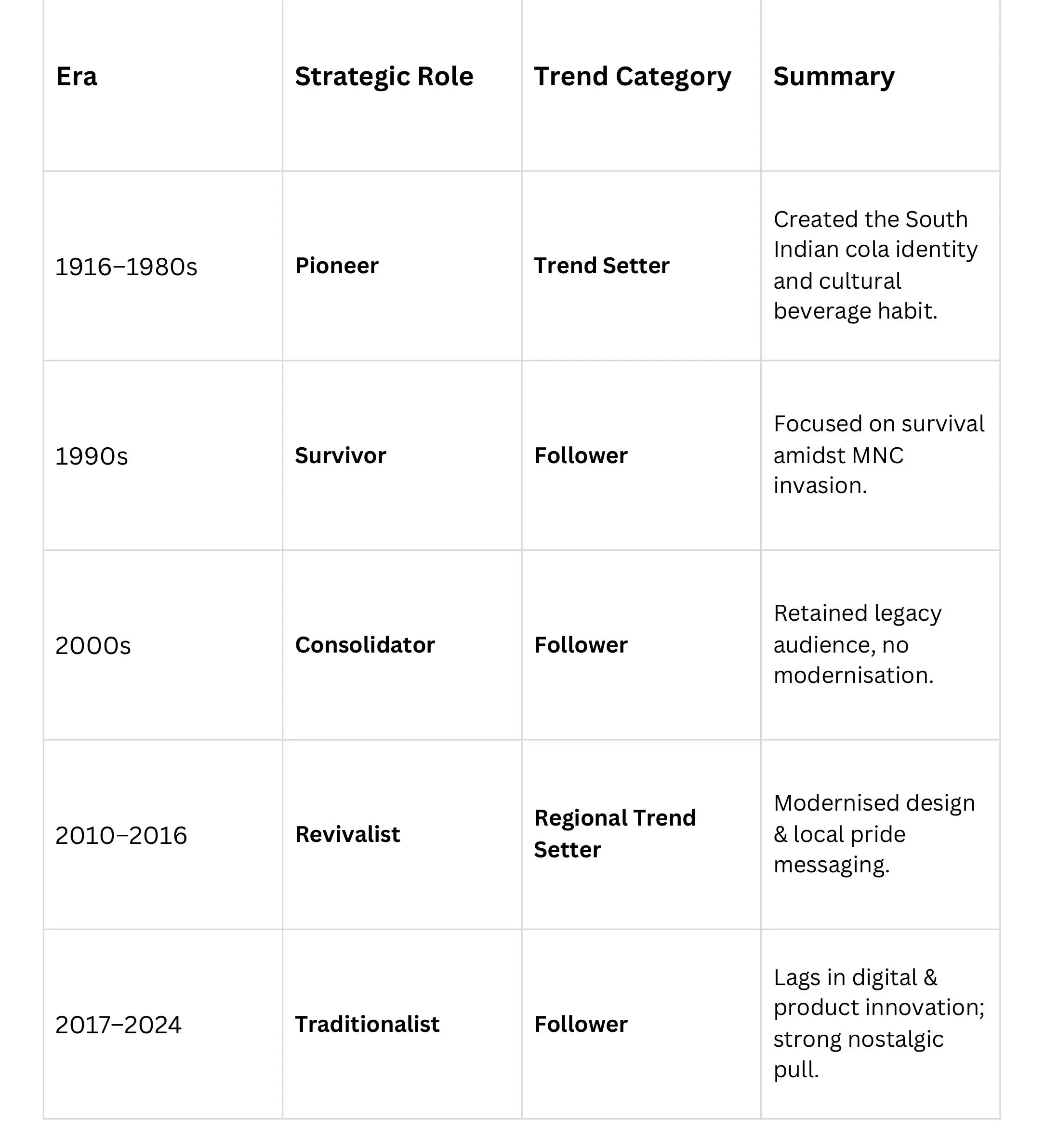
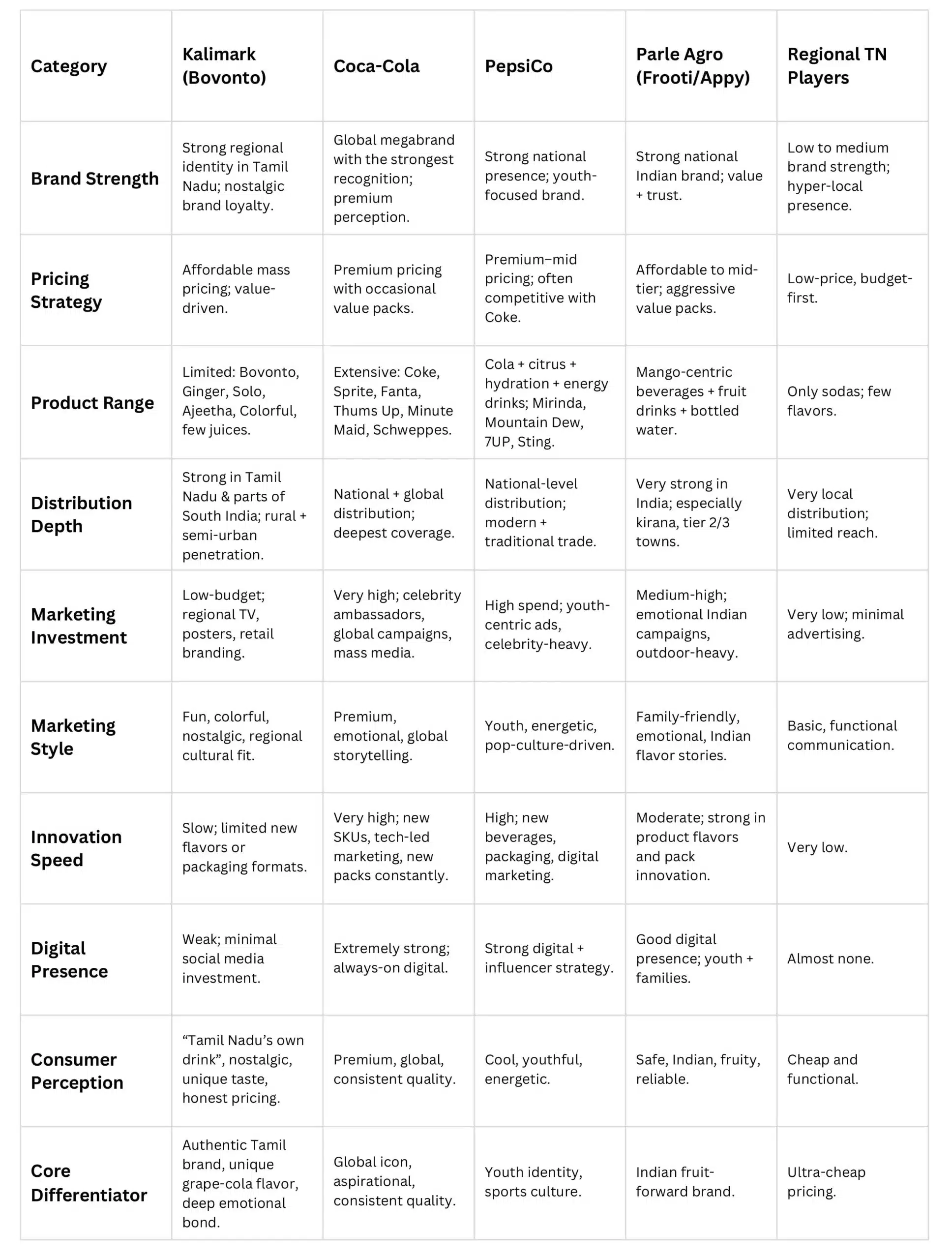
- Kalimark’s strength lies in cultural authenticity, emotional connection, and taste legacy, but its weakness lies in modern brand communication.
- They were trend-setters in heritage, but followers in modernisation
- To reclaim leadership, Kalimark needs to blend its “local pride” with “global storytelling” — updating packaging, tone, and product strategy while staying rooted in Tamil identity.
4.3 COMPETITOR BENCHMARKING
4.4 BRAND CONSISTENCY
Kalimark is consistent in:
- Taste & product identity (very strong)
- Regional presence & emotional legacy
- Cultural relevance in Tamil Nadu
Kalimark is inconsistent in:
- Visual identity
- Voice tone & messaging
- Marketing strategy
- Digital presence
- National expansion
- Brand system and brand world
Conclusion
- Kalimark is operationally consistent but strategically inconsistent.
- They have a strong cultural backbone but no unified brand system.
- Their identity has stayed emotionally stable — but not visually or communicationally stable.
4.5 EMOTIONAL APPEAL
Kalimark’s emotional power comes from its deep-rooted Tamil identity, generational nostalgia, and authenticity. It evokes memories of childhood summers, festivals, and local celebrations, creating strong feelings of comfort and familiarity. Consumers see it as an underdog that represents regional pride and cultural ownership, a drink that is accessible and honest without corporate polish. These emotional triggers make Kalimark more than a soft drink — it is a symbol of Tamil Nadu’s local heritage and community spirit.
4.6 SWOT ANALYSIS
- Strengths: Taste differentiation, cultural loyalty, distribution depth.
- Weaknesses: Low national brand marketing; limited digital presence until recently.
- Opportunities: Stretch into healthier RTD, exports and nostalgia-led marketing to Gen Z.
- Threats: MNC competition via price & distribution, regulatory changes (sugar taxes), shifting health preferences.
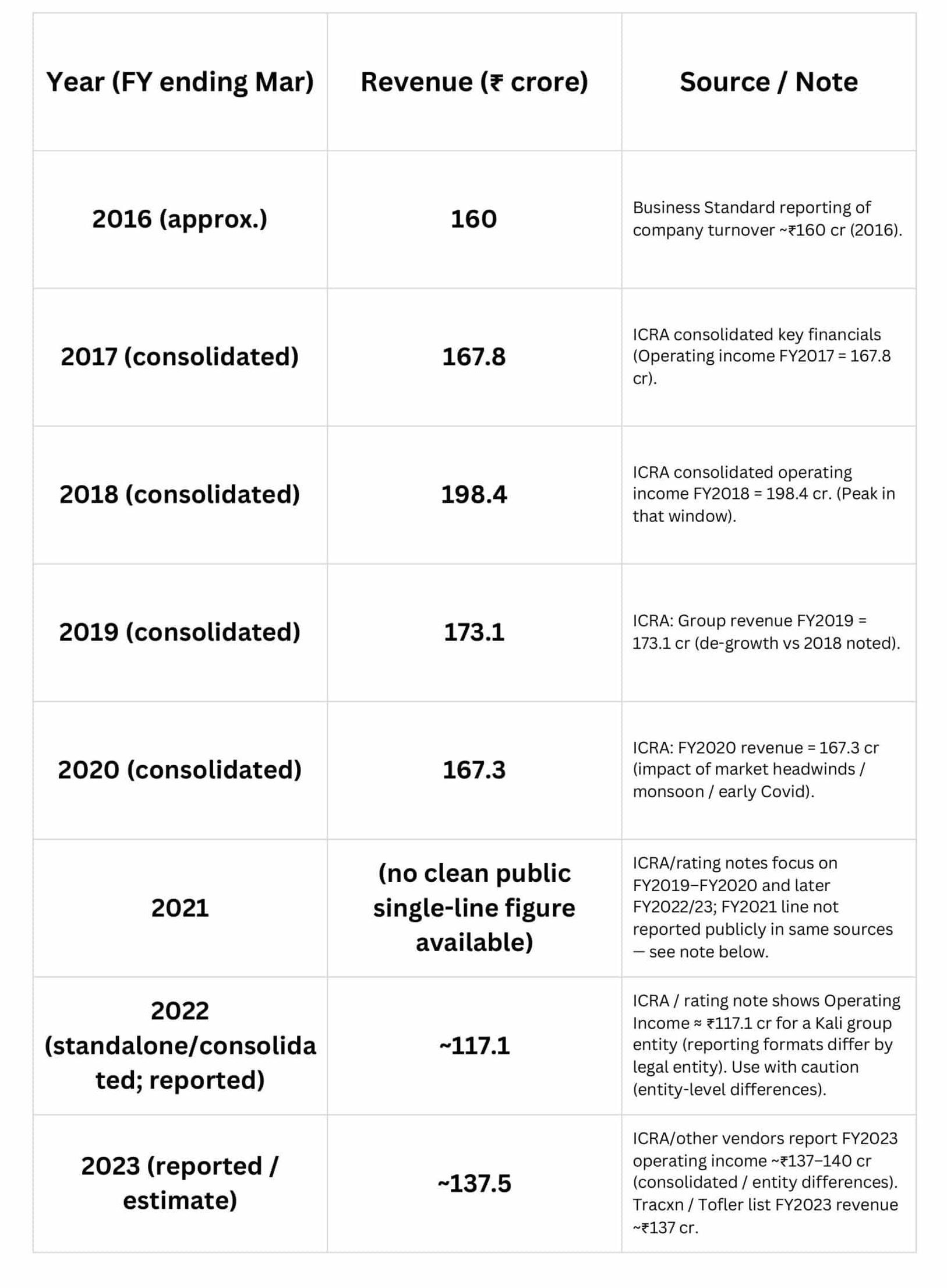
4.7 REVENUE (APPROX.)
5. GAPS AND OPPORTUNITIES
5.1 IDENTIFIED GAPS
- Inconsistent Brand Identity: Messaging, packaging, and tone vary across regions and product lines, creating a fragmented brand image.
- Weak Digital Presence: Minimal engagement on social platforms, limited storytelling, and no strong digital-first campaigns.
- Limited Product Innovation: Core products remain largely unchanged; slow adaptation to modern beverage trends (low-sugar, zero-calorie, premixed flavors).
- Restricted Distribution & Visibility: Strong in Tamil Nadu but limited presence outside; fewer modern retail tie-ups.
- Low Youth Engagement: Brand perception remains nostalgic/traditional, not aspirational or trendy for Gen Z/Millennials.
5.2 WHY THESE ARE GAPS
- Legacy-Driven Growth: The brand historically relied on strong regional loyalty and distributor relationships, reducing the push for modernization.
- Conservative Marketing Strategies: Focus on traditional advertising and organic growth instead of aggressive branding or digital campaigns.
- Resource Constraints Compared to MNCs: Competing with giants like Coca-Cola and Pepsi restricts large-scale innovation and national marketing.
- Late Digital Adoption: Competitors embraced digital storytelling early; Kalimark only recently attempted modern campaigns.
- Operational Priorities Over Branding: Focus on manufacturing quality and regional presence overshadowed brand building and design consistency.
5.3 OPPORTUNITIES
- Rebrand for Modern Relevance: Refresh visual identity, tone, and digital presence while retaining heritage.
- Heritage Storytelling: Use “100+ years of Tamil tradition” as a powerful emotional differentiator across all touchpoints.
- Youth-Centric Campaigns: Create bold, humorous, pop-culture-aligned campaigns similar to Old Spice, Frooti, Thumbs Up, or Paper Boat.
- Product Innovation: Introduce low-sugar variants, energy beverages, seasonal flavors, and premium glass-bottle experiences.
- Digital-First Growth: Influencers, short-form video content, regional memes, AR filters, community-driven challenges.
- Geographical Expansion: Move beyond Tamil Nadu to South India and diaspora communities through modern retail and e-commerce.
- Consistent Brand System: Unified color palette, typography, tone, and packaging to strengthen recall and brand trust.
