Lays Got a Makeover! But Why? A Deep Dive into the Strategy Behind the Fresh Rebranding

Have you looked at a pack of Lays recently and felt something… different?
The colors seem bolder.
The logo feels cleaner.
The packaging speaks fun, freshness, and modern simplicity.
Lays didn’t just refresh a design — it evolved its entire brand identity.
As branding specialists here at Cholanadu (Chennai), we understand that rebranding is never a random decision.
For a global FMCG giant like Lays, this transformation reflects a deeper, strategic shift rooted in consumer perception, visual identity trends, and emotional brand connection.
This is not just a packaging redesign.
It’s a brand repositioning move designed to stay relevant in a future that values simplicity and authenticity.
Why Did Lays Rebrand? Understanding the Strategy Behind the New Identity
We live in a world where consumer expectations evolve faster than product innovations. Today’s buyers don’t just choose products — they choose brands that reflect who they are.
Modern consumers prefer:
- Minimalist brand approach
- Visual storytelling over flashy elements
- Authentic messaging that feels personal
Lays recognized that to maintain its spot as a global snack leader, it needed to refine the emotional connection with its audience.
The new branding communicates:
“We’re still the Lays you love — only fresher, lighter, and more in rhythm with your lifestyle.”
This change aligns with:
- Youth engagement strategy
- Snack industry marketing evolution
- Flavor-focused visuals and emotional brand connection
What’s New in the Lays Rebranding?
✅ A Sleeker, Modern, and Minimal Logo
The refined Lays logo features:
- Smoother typography
- Cleaner lines
- Balanced, minimalist composition
The new logo maintains the classic yellow and red identity but feels effortlessly modern.
This is not a reinvention — it’s a brand identity shift that communicates maturity without losing its playful heritage.
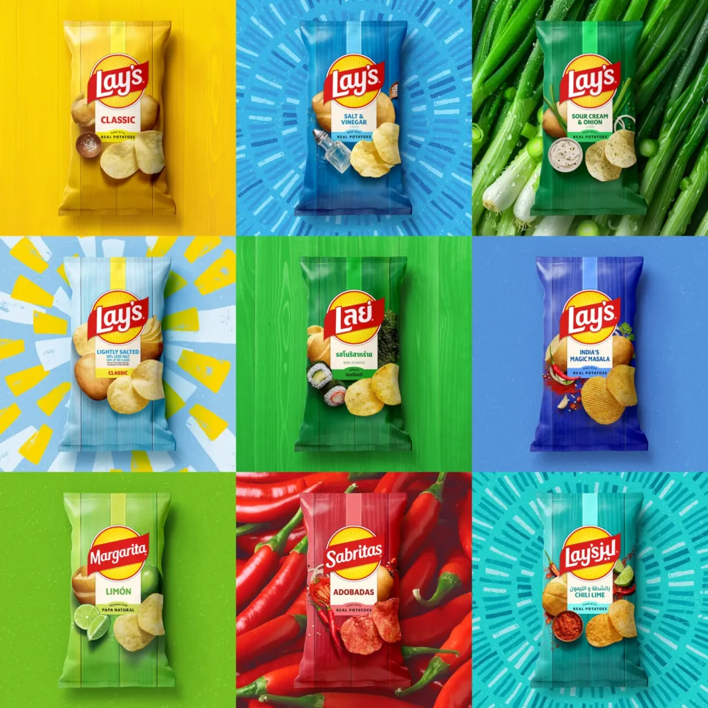
✅ Vibrant Visuals that Pop Off the Shelf
The latest packaging design uses:
- Brighter color psychology
- Flavor-focused visuals
- Bold typography
- Minimal layout design
Each element is intentional — designed with shelf appeal enhancement in mind.
Research shows that consumers visually process brands within 1.5 seconds on a shelf.
Lays now captures that fleeting attention with color dominance and visual clarity.
✅ Unified Global Design Language
Previously, Lays design differed by region — the U.S., Europe, and Asia each had their own visual identity.
Not anymore.
Now, Lays has adopted a single global visual direction, ensuring:
- Easy recognition
- Streamlined global marketing
- Consistent brand experience
This strengthens the brand on a global scale and reduces consumer confusion.
How the Rebranding Enhances Consumer Perception
Every detail of the redesign has a purpose.
| Element | Old Perception | New Perception |
|---|---|---|
| Busy packaging | Traditional | Modern & premium |
| Multiple regional designs | Inconsistent | Global identity |
| Flashy visuals | Mass-market | Lifestyle-driven brand |
This move shifts Lays from just a snack to a lifestyle product — rooted in joy, simplicity, and visual delight.
People don’t just buy chips.
They buy the emotion associated with the brand.
The Psychology Behind Lays’ New Look
The redesign aligns perfectly with global visual identity trends:
- Limited color palette
- Minimal clutter
- Bigger imagery, fewer words
- Emphasis on storytelling through packaging
Color plays a major role here:
- Yellow → Happiness, warmth, approachability
- Red → Appetite stimulation and energy
- Bold accent colors → Flavor cues and visual attraction
Every color choice is based on color psychology in snacks, pushing instant impulse-buy behavior.
How Lays Uses Lifestyle & Emotional Branding
Today’s consumers connect with brands that:
- Fit into their daily lifestyle
- Reflect their choices and aspirations
- Speak their language
Lays does this through:
- Minimalist design that feels premium
- Emotion-driven messaging
- Visual storytelling that is universal
Instead of shouting “Buy me”, Lays communicates:
“Take a break, enjoy the moment.”
That emotional positioning is far stronger — and more memorable.
Competitor Comparison: A Strategic Advantage
The snack industry has become visually aggressive with brands like:
- Pringles (bold typography restructuring)
- Doritos (gen-Z focused edgy positioning)
- Kettle Chips (premium rustic look)
Lays’ redesign answers competition with:
- Cleaner visuals than Pringles
- More emotional appeal than Doritos
- Stronger mass-market identity than Kettle Chips
This is FMCG innovation done right — emotional clarity over visual noise.
Brand Refresh vs. Full Rebrand — What Lays Actually Did
This wasn’t a rebrand where everything changed.
Instead, it was a refresh — the core brand stays intact, but the expression evolves.
Old identity → Familiar & safe
New identity → Fresh, bold, and future-ready
This ensures:
- No alienation of loyal customers
- Better engagement with younger audiences
- Stronger digital and physical presence
Why This Matters for Businesses and Brands
Rebranding is not about changing a logo.
It’s about changing perception.
Most businesses wait until sales dip or competitors dominate the conversation.
Smart brands — like Lays — evolve before the market forces them to.
Here’s what brands can learn:
- Conduct regular brand audits
- Understand how consumers perceive your visual identity
- Refresh before your brand feels outdated
- Stay emotionally relevant to your audience
When you stop evolving,
someone else grabs the spotlight.
How Cholanadu Helps Brands Build Powerful Identities (Chennai-based Branding & Strategy)
At Cholanadu (Chennai), we specialize in:
- Strategic brand auditing
- Packaging redesign and visual identity development
- Marketing and brand repositioning
- Lifestyle-driven storytelling for consumer brands
If your brand needs:
- A refreshed brand identity,
- Packaging that stands out on the shelf,
- A strategy that drives emotional connection…
We make it happen.
Because in the world of branding:
Relevance wins. Every single time.
Lays Didn’t Just Update Its Packaging — It Reinvented Its Promise
Lays rebranding is a bold reminder that:
- Evolution is necessary
- Visual identity matters
- Emotional connection drives loyalty
With a cleaner identity, unified global packaging, and modern storytelling, Lays is positioned not just as a snack — but as a culture symbol of joy and togetherness.
The brand didn’t just change how it looks.
It changed how it makes people feel.