


The Visual Illusion Behind Packaging Design That Triggers Impulse Buying
Table of Contents
TogglePackaging Design Psychology: 7 Proven Secrets to Trigger Sales
The Visual Illusion Behind Packaging Design That Triggers Impulse Buying
The Secret Behind Why We Buy Without Planning To
Have you ever walked into a supermarket to buy one product and left with three extra items you never planned to purchase?
Perhaps it was a beautifully designed chocolate box, an elegant skincare bottle, or a snack packet that instantly caught your attention.
That wasn’t always an accident.
Packaging can influence what we notice, how we perceive a product, and whether we feel tempted to buy it through the subtle power of packaging design psychology.
Through colours, shapes, typography, textures, and visual placement, packaging design psychology communicates value before customers even touch the product.
For businesses, understanding this visual psychology and mastering packaging design psychology can turn packaging from a simple protective cover into a powerful branding tool.
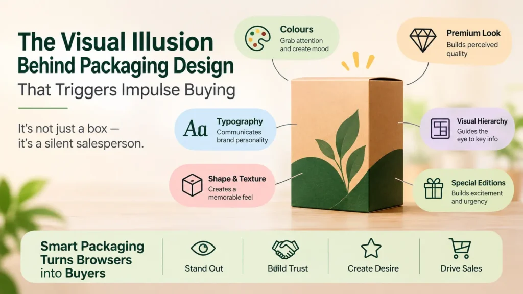
1. Colours Create the First Impression
Colours are often among the first elements customers notice on a shelf, playing a vital role in packaging design psychology.
Different colour choices can create different impressions:
Red and orange: Often used to create energy, excitement, and visual urgency.
Green: Commonly associated with nature, freshness, and sustainability.
Black and gold: Often used to communicate luxury and sophistication.
White and soft neutrals: Can suggest simplicity, cleanliness, and minimalism.
These associations are not universal. Culture, category, context, and personal experience all influence how customers interpret colours through packaging design psychology.
The real branding trick is choosing colours that match the product’s promise while helping it stand out from competitors. Think about it: If every competing product uses bright colours, could a clean, minimal design leverage packaging design psychology to attract more attention?
Sometimes, standing out means doing the opposite of everyone else. To review professional design and visual standards, check guidelines from the AIGA Design Association
2. The Illusion of Premium Quality
Why can two similar products create completely different impressions simply because of their packaging?
The answer lies partly in perceived value, which is heavily shaped by packaging design psychology.
Elements such as matte finishes, embossed lettering, sturdy boxes, balanced layouts, and carefully selected typography can make a product appear more premium through effective packaging design psychology.
Customers may use these visual cues to form expectations about quality before trying the product.
However, attractive packaging cannot replace actual product performance. If the experience fails to meet expectations, customer trust may suffer.
The lesson for brands: Make your packaging reflect the quality you genuinely deliver using smart principles of packaging design psychology.
3. Typography Quietly Influences Buying Decisions
Typography does more than display a product name. It helps establish personality and guides attention as part of overall packaging design psychology.
Consider these examples:
Elegant serif fonts can communicate tradition or sophistication.
Bold sans-serif fonts can create a modern, confident appearance.
Handwritten styles can suggest a personal or artisanal touch.
Clear, simple fonts can improve readability and make product information easier to understand.
But there is a balance. If customers cannot quickly identify the product name, main benefit, or essential information, an attractive package may still fail to communicate effectively.
Good packaging makes the important information easy to find—not difficult to decode—by respecting core rules of packaging design psychology.
4. Visual Hierarchy: Guiding the Customer's Eyes
Imagine looking at a package with ten competing messages, multiple fonts, and several bright colours. Where would your eyes go first?
Effective packaging creates a visual path. It helps customers notice the most important information in the right order using visual cues derived from packaging design psychology.
A useful hierarchy might be:
Brand name – Who made the product?
Product name – What is it?
Key benefit – Why might it be useful?
Supporting details – What else should the customer know?
This reduces visual clutter and makes product selection easier. When shoppers face many choices, clarity driven by packaging design psychology can be a competitive advantage.
5. The Power of Shape, Texture, and Structure
Packaging isn’t just about what customers see. Its physical design can influence how they perceive and experience a product through tactile packaging design psychology.
A distinctive bottle shape may improve recognition. A textured box may create a more tactile experience. A well-designed opening can make the product feel more considered and convenient.
Even the packaging structure can communicate something about the brand. For example, a carefully designed reusable container may reinforce a brand’s sustainability positioning—provided its environmental claims are accurate and supported by solid packaging design psychology.
The objective is not to add expensive features unnecessarily. It is to make every design choice serve a purpose.
6. Why Limited Editions and Special Packaging Attract Attention
Special editions, festive boxes, and seasonal designs can make familiar products feel new by leveraging emotional triggers within packaging design psychology.
They introduce novelty and can create a sense of occasion, particularly when customers are shopping for gifts or celebrations.
However, urgency should be genuine. False scarcity, misleading claims, and exaggerated promises may encourage a short-term purchase but damage long-term trust.
Smart brands create excitement without manipulating customers through ethical applications of packaging design psychology.
The Cholanadu Perspective: Packaging Is Your Brand's Silent Salesperson
Packaging often creates the first physical impression of a product. Its colours, typography, structure, and visual hierarchy can influence whether customers notice it, understand it, and consider buying it through the lens of packaging design psychology.
But effective packaging is not about making a product look expensive or adding more decorative elements. It is about combining visual appeal, clear communication, genuine product value, and a memorable brand identity.
At Cholanadu, we believe great packaging design is a strategic business decision—not merely a creative exercise. When design and brand positioning work together, packaging can help businesses stand out in crowded markets and create stronger customer connections via packaging design psychology.
The next time a product catches your eye, look beyond its appearance. That is the visual power every business should understand.
