


How Colours Influence Customer Psychology in Branding ?
Table of Contents
ToggleColour Psychology in Branding: The Silent Language Every Brand Speaks
Discover how successful businesses use colour psychology in branding to shape customer emotions, build immediate trust, and strategically drive purchasing decisions.
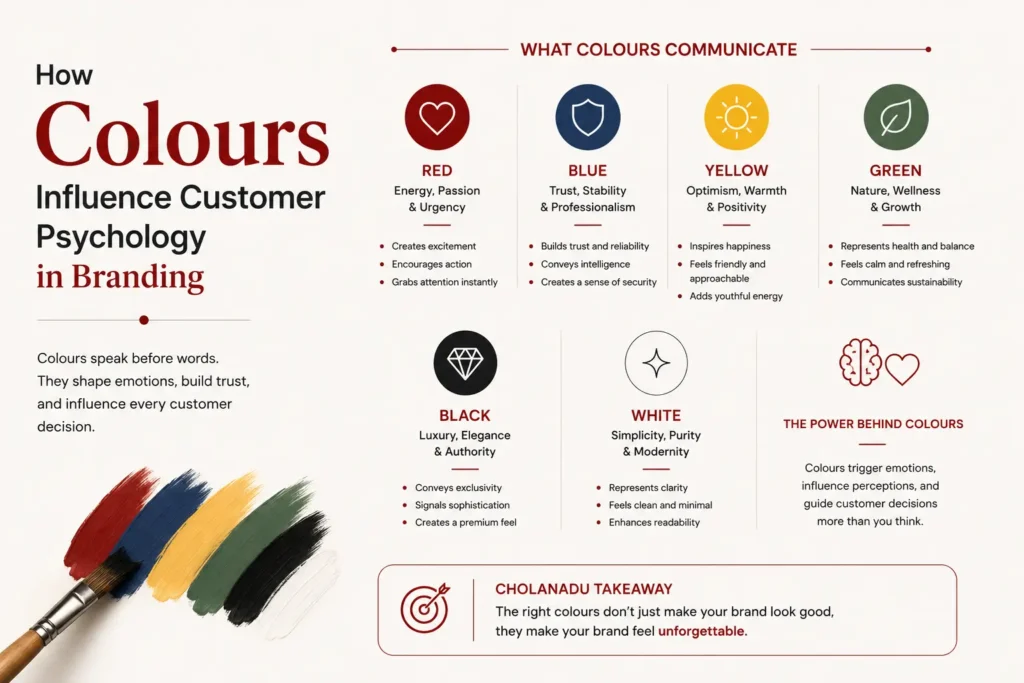
Before a customer reads your tagline, understands your services, or experiences your product, they notice one thing instantly: colour. Utilizing colour psychology in branding is the foundational step in capturing consumer attention.
Colours are far more than visual decoration. In branding, they act as emotional triggers, influencing how people feel, think, trust, and ultimately purchase. A carefully selected colour palette can make a brand appear luxurious, energetic, reliable, youthful, or sophisticated within seconds.
In today’s highly competitive marketplace, successful brands understand that colour psychology is not merely a design choice, it is a strategic branding tool.
At “Cholanadu” we believe every colour tells a story, and the right story creates lasting customer relationships.
Why Colour Psychology Matters in Branding ?
Research consistently shows that visual perception heavily influences buying decisions. Customers often form subconscious opinions about a brand almost immediately, and colour plays a major role in shaping those impressions. According to foundational data compiled by the HubSpot Marketing Blog regarding visual identity patterns, a powerful colour strategy can help brands achieve critical performance benchmarks.
A powerful colour strategy can help brands:
Build instant recognition
Create emotional connections
Improve customer trust
Influence purchasing behaviour
Differentiate from competitors
Strengthen brand identity
Think about globally recognised brands. Many are remembered not only for their logos, but for their colours. The emotional response created by colour becomes deeply associated with the brand experience itself.
Understanding What Different Colours Communicate
Red — Energy, Passion & Urgency
Red is bold, attention-grabbing, and emotionally intense. It stimulates excitement, appetite, urgency, and action.
Brands commonly use red to:
Encourage quick decisions
Create energetic brand personalities
Convey confidence and passion
Increase visual impact
Industries such as food, entertainment, fashion, and retail frequently use red to create dynamic engagement. However, excessive use can feel aggressive, which is why balance and strategic application are essential.
Blue — Trust, Stability & Professionalism
Blue is one of the most trusted colours in branding psychology. It creates feelings of reliability, intelligence, calmness, and security.
This is why many:
Corporate brands
Financial institutions
Technology companies
Healthcare businesses
gravitate toward blue-focused branding systems.
Lighter blues communicate calmness and openness, while darker shades create authority and sophistication. For businesses seeking long-term customer trust, blue remains one of the strongest strategic colour choices.
Yellow — Optimism, Warmth & Positivity
Yellow naturally evokes happiness, warmth, creativity, and optimism. It attracts attention quickly and creates cheerful emotional associations.
Brands often use yellow to:
Appear approachable
Communicate friendliness
Inspire positivity
Add youthful energy
When combined thoughtfully with darker tones, yellow can also create a premium and modern visual identity.
Green — Nature, Wellness & Growth
Green represents balance, freshness, health, and sustainability.
It is especially powerful for:
Organic products
Wellness brands
Eco-conscious businesses
Natural skincare companies
Sustainable organisations
Green psychologically creates feelings of relaxation and harmony, making customers perceive brands as healthier and more environmentally responsible.
Different shades also carry different meanings:
Bright greens suggest freshness and energy
Dark greens communicate luxury and prestige
Black — Luxury, Elegance & Authority
Black is timeless, powerful, and sophisticated.
Luxury brands frequently use black because it symbolizes:
Exclusivity
Prestige
Elegance
Confidence
Modern sophistication
Minimalistic black branding often creates a premium perception even before customers interact with the product itself. When paired with gold, white, or metallic accents, black becomes even more visually commanding.
White — Simplicity, Purity & Modern Minimalism
White represents clarity, cleanliness, simplicity, and sophistication.
Modern brands use white space strategically to:
Improve readability
Create premium aesthetics
Deliver minimalist elegance
Enhance user experience
In luxury branding, simplicity often communicates confidence. White allows other design elements to breathe while maintaining a refined visual identity.
The Emotional Connection Between Colour and Consumer Decisions
Customers rarely purchase products based purely on logic. Emotions strongly influence decision-making, and colour becomes a silent psychological guide throughout the customer journey.
For example:
Warm colours can stimulate excitement and impulse purchases
Cool colours can create feelings of trust and comfort
Premium palettes can increase perceived product value
Natural tones can improve authenticity perception
When colour psychology aligns with brand messaging, customers experience stronger emotional consistency and emotional consistency builds brand loyalty. To explore how these elements fit into a broader corporate growth model, you can review our full suite of creative production options on the Cholanadu Media Services Page.
Cultural Influence on Colour Perception
An important aspect of branding strategy is understanding that colours may carry different meanings across cultures and regions.
For example:
White may symbolize purity in some cultures but mourning in others
Red can represent celebration, energy, or caution depending on context
Gold often communicates luxury and prosperity globally
Brands targeting diverse audiences must thoughtfully adapt their visual identity while preserving consistency. A successful branding strategy considers both universal psychology and cultural interpretation.
How Successful Brands Use Colour Strategically ?
Strong brands do not choose colours randomly. Every shade, contrast, and combination is selected intentionally to support the brand’s positioning. For deeper analytical proof regarding consumer behavior variations, a comprehensive study on the subject can be referenced through the Journal of Business Research.
Effective colour strategies include:
Consistent brand palettes
Emotion-driven design systems
Audience-focused colour research
Industry relevance
Competitive differentiation
Digital and print adaptability
Colour consistency across websites, packaging, social media, advertising, and interiors strengthens recognition and improves customer recall. Over time, customers begin associating certain colours directly with specific brand experiences.
Choosing the Right Colours for Your Brand
Selecting a branding colour palette should involve more than personal preference.
Businesses should ask:
What emotions should customers feel?
What personality should the brand communicate?
Who is the target audience?
Which colours align with industry expectations?
How will the colours appear across platforms?
A well-designed colour system balances psychology, aesthetics, functionality, and brand identity. The most successful brands create visual harmony that customers instantly recognise and emotionally connect with. If your company requires an objective evaluation of your current assets, consider scheduling a comprehensive Cholanadu Brand Audit to realign your visual presence with market demands.
Cholanadu Takeaway
In branding, colours are never “just colours.”
They shape perception, influence emotions, create trust, and silently guide customer behaviour. From luxury sophistication to energetic excitement, every shade communicates something meaningful.
Brands that understand colour psychology gain a powerful competitive advantage because customers remember how a brand makes them feel long before they remember what it says.
At “Cholanadu Media” we help businesses build visually compelling brand identities that connect emotionally, communicate strategically, and leave lasting impressions.
Because in the world of branding, the right colour can become the voice of your brand before a single word is spoken.
