


- Prepared for: TVS Motor
- Prepared by: Cholanadu Media Corporation pvt, ltd
- Date: 11-12-2025
BRAND OVERVIEW
A full-scale brand identity + visual ecosystem evaluation
Introduction
TVS Motor is one of India’s most respected mobility brands with a strong legacy, solid engineering credibility, and a growing global presence. In a category dominated by visual giants like Hero, Honda, Yamaha, and Bajaj, TVS stands out through performance-focused sub-brands (Apache, NTorq, Jupiter), motorsport involvement, and premium aspirations.
This visual audit evaluates TVS Motor’s brand assets, digital presence, and visual communication system. It identifies gaps, strengths, and future opportunities while benchmarking TVS against category leaders. The goal is to outline a future-ready visual identity built for the next generation of mobility users.
Scope of the Audit
Brand Assets
- Logo system
- Colour palette
- Typography
- Brand voice
Visual Assets
- Social media creatives
- Promotional graphics
- Photography style
- Motorsports + product visual language
Competitor Benchmarking
- Hero MotoCorp
- Bajaj
- Honda
- Yamaha
- TVS (baseline comparison)
Scoring & Evaluation
Each category rated on a 10-point consistency, recall, and effectiveness scale.
1. Brand Asset Audit
1.1 Logo System
Findings
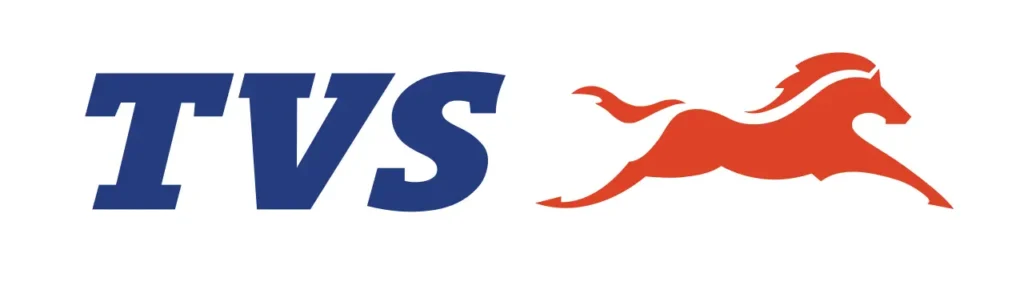
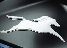
- The core TVS wordmark + horse emblem is iconic but visually rigid.
- Multiple sub-brands (Apache, NTorq, Raider, Jupiter, Ronin) create a fragmented ecosystem.
- No unified lockup logic for parent brand + sub-brand.
- Inconsistent usage across dealerships, ads, and social.
Impact
Reduced master-brand recall. Sub-brands overshadow the parent brand.
Score: 6/10
Opportunities
- Create a unified logo architecture:
Primary (TVS) → Category (Motor) → Sub-brand → Variant - Standardize clear space, sizes, and co-branding rules.
- Refresh the horse icon with cleaner geometry to feel more premium and “performance-tech.”
1.2 Typography
Findings
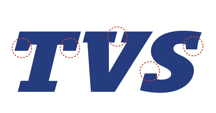
- Brand uses conventional sans-serif fonts with no distinct personality.
- Each sub-brand has its own custom type, creating segmentation rather than unity.
- Promotional posts mix sharp techno fonts, condensed bolds, and generic sanses → low consistency.
Impact
Weak signature personality across touchpoints.
Score: 5/10
Opportunities
- Build a unified typography system:
- Brand Display: for power + performance messaging
- Brand Sans: for clean corporate communication
- Introduce a consistent type scale across social, web, and product communication.
1.3 Colour Palette
Findings
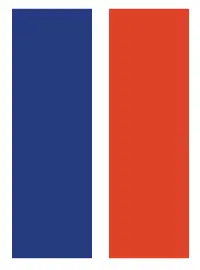
- TVS colours: Blue, Red, White — strong but used inconsistently.
- Sub-brands bring their own palettes (Apache black/red, NTorq neon yellow, Ronin earthy tones).
No clear hierarchy between corporate blue and sub-brand colours.
Impact
Brand architecture visually feels disjointed.
Score: 6/10
Opportunities
- Define a master palette where:
- TVS Blue = trust, engineering
- TVS Red = performance, energy
- Sub-brand colours = accents with clear rules
- Create usage ratios for corporate vs product-led visuals.
Brand Voice
Findings
- Tone varies heavily across products:
- Apache → aggressive, performance
- Jupiter → family-focused
- Ronin → lifestyle/café-racer
- NTorq → youth gaming vibe
- TVS master-brand tone is subtle, almost invisible.
Impact
Brand doesn’t present a unified cultural personality.
Score: 5.5/10
Opportunities
- Establish an overarching voice:
“Human-centered performance mobility.” - Use short, empowering, tech-forward lines.
Anchor sub-brand voices under one larger brand philosophy.
Visual Asset Audit
Social Media Creatives
Findings
- Strong visual output for Apache Racing, NTorq Squad, Ronin Tribe.
- Master TVS feed is less dynamic, visually conservative.
- Inconsistent layout styles.
- Heavy dependency on product renders → less lifestyle relatability.
Impact
Strong sub-brand fandom, weaker master-brand identity.
Score: 6/10
Opportunities
- Use a modular design grid for all posts.
- Set consistent CTA styles and text hierarchy.
- Build a unified motion graphic style for reels + launches.
Illustration & Graphic Language
Findings
- No unified illustration system.
- Motorsport content is high adrenaline but stylistically disconnected from commercial posts.
- Promo graphics for dealers vary significantly.
Impact
Mixed personality, less brand-level recall.
Score: 4.5/10
Opportunities
- Create brand-specific graphic devices:
speed lines, angular cuts, dynamic shapes, neon edge glows - Build a simple 2D/3D illustration system for infotainment, safety features, and app experiences.
Photography Style
Findings
- Product photography is world-class.
- Lifestyle imagery inconsistent across sub-brands and geographies.
- Lighting styles differ: high-contrast for Apache, soft for Jupiter, stylized for Ronin.
Impact
Strong visuals but little cohesion.
Score: 7/10
Opportunities
- Create a master photography style guide:
- Color grading rules
- Model styling
- Angle logic (hero shot, dynamic, detail)
- Introduce more youth-led, candid, street-culture aesthetics for Gen-Z alignment.
Competitor Benchmarking
Hero MotoCorp
- Safe, mass-market, consistent
- Strong red/white recall
- Moderate performance cues
Score: 7.5/10
Honda
- Premium tone, polished consistency
- Technological sophistication
Score: 8/10
Yamaha
- Strong performance identity
- Dark, sporty visuals
Score: 8.5/10
Bajaj
- Bold, aggressive, masculine tone
Score: 7/10
TVS Motor
- High potential, strong sub-brands
- Weak overarching system
Score: 6/10
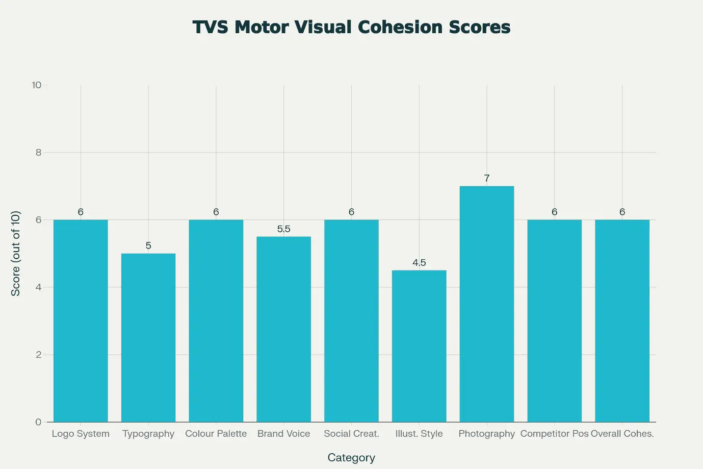
Visual Cohesion Score
Category | Score |
Logo System | 6/10 |
Typography | 5/10 |
Colour Palette | 6/10 |
Brand Voice | 5.5/10 |
Social Creatives | 6/10 |
Illustration Style | 4.5/10 |
Photography | 7/10 |
Competitor Position | 6/10 |
Overall Brand Cohesion | 6/10 |
TVS performs well individually but lacks a unified system elevating the master brand above its sub-brand ecosystem.
Key Strategic Opportunities for TVS Motor
- Build a Unified Master-Brand Identity
- Create a refreshed, future-forward visual system.
- Strengthen parent-brand imprint across touchpoints.
- Standardize Logo + Sub-brand Architecture
- Introduce scalable systems, spacing rules, lockups.
- Create a Cohesive Typography Framework
- A hero display font + modern sans to unify voice.
- Rework the Colour Logic
- Make TVS Blue the signature identity anchor.
- Assign clear sub-brand color rules without losing harmony.
- Strengthen Social Media Systems
- Consistent layouts, grids, and typographic hierarchy.
- Stronger storytelling instead of only product highlights.
- Build a Signature Photography Style
- Youth-centric, bold, dynamic, globally sharp.
- Unify Sub-brands Through a Master Narrative
- “Performance engineered for every kind of rider.”
- Keep personality while maintaining visual discipline.
Conclusion
TVS Motor has a powerful foundation: legacy, performance credibility, motorsport DNA, and multiple successful sub-brands. However, the brand operates with a fragmented visual ecosystem. With a structured master-brand system, unified graphic language, and a cohesive digital personality, TVS can evolve into a future-focused mobility brand that resonates deeply with Gen-Z and global markets alike.
