- Prepared for: TEABOY
- Prepared by: Cholanadu Media Corporation pvt, ltd
- Date: 06-12-2025
BRAND OVERVIEW
A comprehensive evaluation of Teaboy’s brand identity and visual communication system
Introduction
Teaboy operates within a rapidly expanding beverage market where visual identity strongly influences brand recall, customer trust, and franchise scalability. Competing with established players such as Chai Kings, Chai Waale, and Tealogy, Teaboy needs a cohesive, modern, and youth-oriented identity system that highlights its cultural relevance and positions it as a next-generation tea brand.
This visual audit reviews the current state of Teaboy’s branding, digital presence, and visual communication assets. It identifies gaps, strengths, and opportunities while benchmarking the brand against major competitors. The final goal is to present a clear path toward a unified, future-ready brand system.
Scope of the Audit
Brand Assets
- Logo system
- Colour palette
- Typography
- Brand voice & messaging
Visual Assets
- Social media creatives
- Promotional graphics
- Illustration system
- Photography direction
- Layout & composition standards
Competitor Benchmarking
- Chai Kings
- Chai Waale
- Tealogy
- Teaboy (baseline comparison)
Scoring & Evaluation
Each element is rated on a 10-point scale for consistency, functionality, and effectiveness.
Brand Asset Audit
1. Logo System
Findings
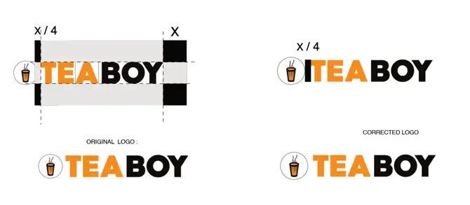
- The original logo is misaligned with inconsistent spacing and imbalance between icon and wordmark.
- The corrected version improves structure, but the brand still lacks:
- Primary logo
- Stacked version
- Horizontal lockup
- Icon-only version
PREPARED BY: CHOLANADU MEDIA CORPORATION PVT LTD.
The icon stroke weight needs refinement for better harmony with type.
Impact
Weak scalability across signage, packaging, and social.
Score: 4/10
Opportunities
- Finalize a 4-part logo system.
- Use a consistent grid (X-based) for spacing logic.
- Redraw the icon with improved geometry.
Typography
Findings
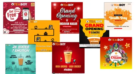
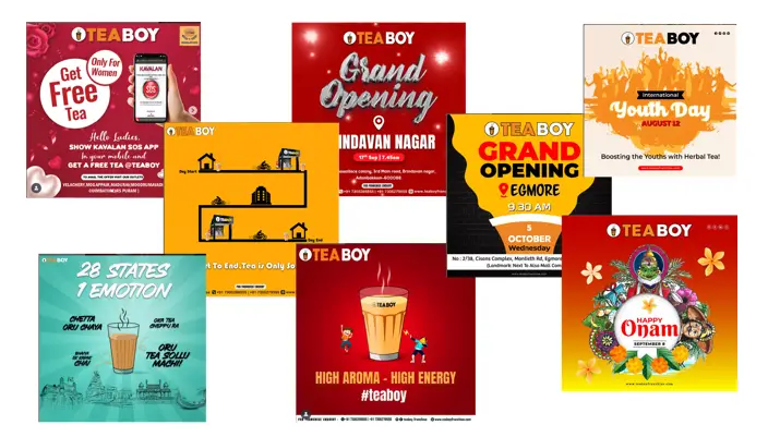
- Each post uses a different typeface: scripts, decorative fonts, condensed fonts, rounded fonts — no consistency.
- No hierarchy structure (H1 → Body → Caption).
Impact
Extremely low recall value; inconsistent tone.
Score: 3/10
Opportunities
- Select one expressive display font and one clean sans-serif.
- Establish a type scale with consistent spacing rules.
Colour Palette
Findings
- Posts frequently jump between bright red, orange, yellow, teal, gradients, black, etc.
- No hero colour or usage logic.
- Contrast balance is inconsistent.
Impact
Unstable brand mood and weak visual memory. Score: 3.5/10
Opportunities
- Finalize a palette with clear roles: primary, secondary, accents.
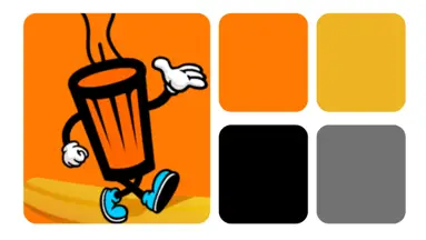
- Use the Teaboy orange as a signature memory color.
Brand Voice & Messaging
Findings
- Tone varies between festive, emotional, promotional, and casual.
- Voice lacks a consistent personality.
Impact
Brand feels disconnected despite having youth appeal.
Score: 4/10
Opportunities
- Craft a modern, upbeat, culture-driven voice.
- Use micro copy and punchy lines to humanize the brand.
Visual Asset Audit
Social Media Creatives
Findings
- No fixed layout system, inconsistent margins and spacing.
- Random illustration styles: cartoon, festival art, clip art, flat vectors.
- No uniform colour logic or CTA style.
- Typography and composition vary drastically between posts.
Impact
The feed lacks brand cohesion and reduces perceived reliability.
Score: 3/10
Opportunities
- Create a modular grid system for all posts.
- Establish reusable layout templates.
- Use consistent iconography and title hierarchy.
Illustration Style
Findings
- Mixed asset styles (kids, clip-art, festival graphics, line drawings).
- No unified stroke weight or visual logic.
Impact
Brand feels fragmented instead of identity-driven.
Score: 2.5/10
Opportunities
- Build a signature illustration style with clear rules for shapes, colors, and proportions.
Photography Style
Findings
- Very few real product/lifestyle images.
- Visuals heavily depend on graphic design.
Impact
Lack of authenticity and lifestyle appeal.
Score: 4/10
Opportunities
- Establish warm, candid, youth-focused photo aesthetics.
- Incorporate product photography with consistent grading.
Competitor Benchmarking
(Chai Kings vs Chai Waale vs Tealogy vs Teaboy)
Brand Positioning Overview
Chai Kings
Urban, hygienic, premium-value tea chain.
Chai Waale
Youthful, bright, metro-focused.
Tealogy
Franchise-heavy, bold promos, affordability-first.
Teaboy
Energetic but un-systemized, visually inconsistent, yet full of raw potential.
5.2 Brand Identity Strength
Brand | Identity Strength | Summary |
Chai Kings | 8/10 | Clean, modern, highly consistent |
Chai Waale | 7.5/10 | Bright, youthful, structured |
Tealogy | 5.5/10 | Functional but inconsistent |
Brand Identity Strength Table
| Brand | Identity Strength | Summary |
|---|---|---|
| Teaboy | 4/10 | Potential is visible but the brand lacks structure |
Social Media Visual Consistency
Ranking:
- Chai Kings – minimal, consistent
- Chai Waale – vibrant, template-based
- Tealogy – mixed but functional
- Teaboy – most inconsistent
Colour Usage Comparison
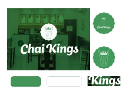
- Chai Kings: Green + white → high recall
- Chai Waale: Yellow + black → bright, visible
- Tealogy: green + yellow (recognizable)
- Teaboy: Orange + black (works well)
Opportunity:
Teaboy can own a punchy orange + black palette with strict usage rules for every visual.
Typography Comparison
- Chai Kings: One clean sans-serif → premium
- Chai Waale: Youth-friendly rounded sans → approachable
- Tealogy: Mismatched fonts → cluttered
- Teaboy: Every post uses a different typeface → lowest consistency
Illustration & Graphics
- Chai Kings: Minimal
- Chai Waale: Light geometric patterns
- Tealogy: Clip-art, heavy promos
- Teaboy: Multiple unrelated styles → unclear identity
Photography Direction
- Chai Kings: Warm, product-focused
- Chai Waale: Youth lifestyle
- Tealogy: Graphic-first
Teaboy: Almost no photographic identity
Market Differentiation Score
Brand | Differentiation |
Chai Kings | 8/10 |
Chai Waale | 7/10 |
Tealogy | 5/10 |
Teaboy | 4/10 |
Visual Cohesion Score
Brand | Cohesion |
Chai Kings | 9/10 |
Chai Waale | 7.5/10 |
| Brand | Cohesion |
|---|---|
| Tealogy | 5.5/10 |
| Teaboy | 3.5/10 |
Overall Scoring Summary for Teaboy
Category | Score |
Logo System | 4/10 |
Typography | 3/10 |
Colour Palette | 3.5/10 |
Brand Voice | 4/10 |
Social Creatives | 3/10 |
Illustration Style | 2.5/10 |
Photography | 4/10 |
Competitor Positioning | 4/10 |
Overall Brand Cohesion | 3.5/10 |
Key Strategic Opportunities for Teaboy
Build a Cohesive Identity System
A refined logo suite, colour palette, and typography framework.
Create a Signature Visual Language
Consistent illustration style, layout system, graphic devices.
Modernize Brand Voice
Youth-centric, energetic, confident, culturally relevant.
Improve Social Media Consistency
Templates, predictable structure, consistent hierarchy.
Introduce Lifestyle Photography
Real moments + product focus to add authenticity.
Conclusion
Teaboy has strong potential but lacks a unified system. Competitors win through consistency, clarity, and structured visual identities. By building a modern, cohesive, and memorable identity — backed by a clear brand voice and visual rules — Teaboy can evolve into a high-impact, youth-driven tea brand with strong market differentiation.
This report provides the strategic foundation for Teaboy’s next transformation phase.