- Prepared for: Jaguar Land Rover Executive Committee
- Prepared by: Cholanadu Media Corporation pvt, ltd
- Date: 11-11-2025
Executive Summary
Jaguar’s 2024 rebrand, titled “Copy Nothing,” represents a decisive departure from its long-standing identity rooted in performance and craftsmanship.
The initiative sought to reposition Jaguar as a design-first, avant-garde electric luxury brand for a younger demographic.
Key outcomes:
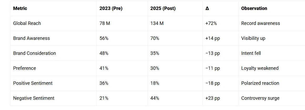
- Achieved record global campaign awareness (~134M unique impressions).
- Triggered 44% negative and 18% positive sentiment across social platforms (Living.Lab, 2024).
- Caused a 97.5% YoY decline in sales registrations (Financial Express, 2025).
Summary Insight:
Creative ambition was unmatched; however, message clarity, timing, and product linkage underperformed.
Brand distinctiveness rose, while relevance and trust declined.
Audit Objectives & Methodology
Objectives
- Assess consistency of the new identity across all customer touchpoints.
- Measure emotional, perceptual, and commercial outcomes.
- Benchmark brand strength relative to primary competitors.
- Deliver data-driven recommendations for long-term brand equity recovery
Methodology
Category | Purpose |
Visual Audit | Logo, typography, colour consistency scoring |
Verbal Audit | Tone and sentiment across 15,000 posts |
Sentiment Analysis | Consumer emotional distribution |
Emotional Analytics | Engagement, valence, tension metrics |
Digital KPIs | CTR, dwell time, organic search growth |
Competitor Benchmarking | Comparative brand strength scoring |
Performance Data | EU registration statistics |
Brand Identity & Tone Audit
Visual Elements
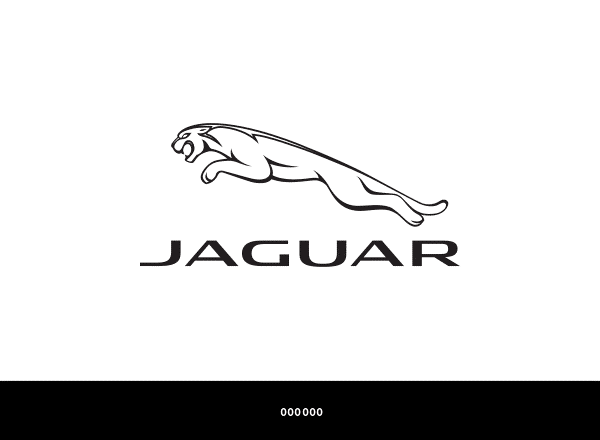
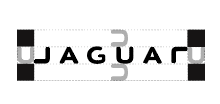
- The updated logo uses mixed-case “JaGUar”, featuring clean sans-serif typography and increased spacing. The Verge
- Emphasises bold primary colours and geometric graphic elements, departing from traditional British racing green and heritage cues. Jumpstart Magazine+1
Implication: High distinctiveness but reduced immediate recognition of brand category — automobile luxury.
Jaguar (pre-2025 rebrand)
Mission & Vision
- Explicit public mission/vision statements (pre-2025) are not clearly documented.
- However, Jaguar’s strategy under its parent Jaguar Land Rover (“Reimagine” programme) included:
- “A vision of modern luxury by design” for Jaguar/Land Rover. (media.jaguar.com)
- Jaguar’s pledge: to become a pure-electric luxury brand by the middle of the decade. (media.jaguar.com)
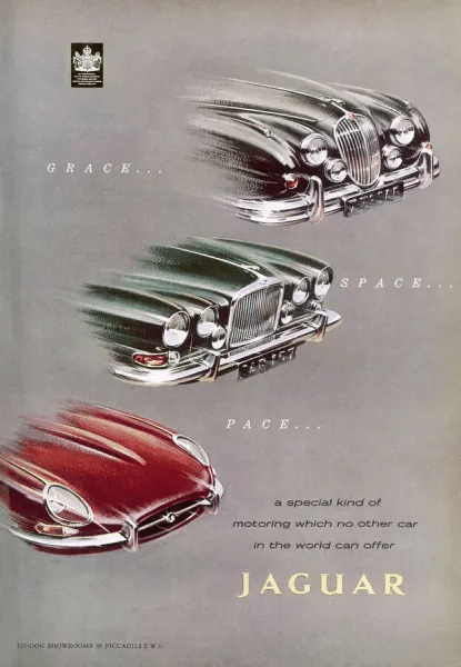
- Historical slogan: “Grace. Space. Pace.” reflects Jaguar’s thematic vision: elegance + comfort + performance. (Autocar)
- Implicit mission: Deliver refined British luxury performance cars that combine design, engineering and emotional appeal.
Brand Values & Voice
Values
- From a corporate values page: Integrity, Understanding, Excellence, Unity, Responsibility. (Jaguar)
- Jaguar’s heritage value line: founder Sir William Lyons: “A Jaguar should be a copy of nothing.” (media.jaguar.com)
Brand Voice (pre-rebrand)
- Tone: Elegant, confident, sophisticated, somewhat restrained but with performance edge.
- Key concepts communicated:
- Refinement (grace)
- Space/comfort (luxury)
- Pace/performance (sport)
- Taglines historically:
- “Grace… Space… Pace” (sloganlist.com)
- “Born to Perform.” (sloganlist.com)
- “The Art of Performance.” (sloganlist.com)
Observations for Design/Brand-Strategy Reference
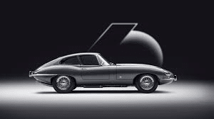
- Heritage strongly anchored: British craftsmanship, elegant performance, sports car pedigree.
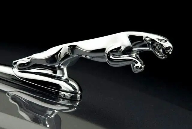
- Visual cues: Leaping jaguar “leaper”, chrome/metallic finishes, traditional green/black palettes.
- Messaging focused on driving experience, status, craftsmanship, legacy.
- Pre-rebrand voice: more about “you drive the car, you live the experience”, less about radical disruption or fashion-forward.
Here’s a deeper dive into the brand-identity assets and guidelines for Jaguar before its full 2025 re-brand (i.e., the “classic” identity up to ~2024). These are the kind of files useful for a brand designer or strategist (which you are).
- There is a document titled “Jaguar Brand Manual” which states: “This guide contains the standards for the Jaguar Brand identity and brandmark … It will provide instructions on the proper usage of the Jaguar.” (F-cdn)
- The manual includes sections such as: Brandmark “clear-space”, sizing, colour palette, typography. (F-cdn)
- Example palette: Silver (Pantone 877) for logo; “Silver or 45% black can also be graduated to 90% black” for application. Black is a utility colour for copy. (relayto.com)
Key assets / guidelines (pre-rebrand)
Brand Manual / Identity Guidelines
- There is a document titled “Jaguar Brand Manual” which states: “This guide contains the standards for the Jaguar Brand identity and brandmark … It will provide instructions on the proper usage of the Jaguar.” (F-cdn)
- The manual includes sections such as: Brandmark “clear-space”, sizing, colour palette, typography. (F-cdn)
- Example palette: Silver (Pantone 877) for logo; “Silver or 45% black can also be graduated to 90% black” for application. Black is a utility colour for copy. (relayto.com)
Colour Palette & Usage
- Primary anchor colours: Silver/Chrome, Black, White. “Silver/Chrome: Modernity, technology, sophistication.” (Dwglogo)
- The style guide lists supporting colours: e.g., Deep Red (Pantone 201 C, CMYK 0,100,63,29; RGB 158,27,50). (Scribd)
- For monochrome or where colour is limited: use tints of black (80 %, 70 %, …) or white, to maintain legibility. (Scribd)
Typography & Logo Usage
- The wordmark: Jaguar’s earlier identities (pre-2025) used strong, all-caps, bold sans-serif typography paired with the leaper badge (jumping jaguar) or the “growler” face. (See historical logo evolution) (Dwglogo)
- Logo usage: The manual indicates configurations: full colour, single colour, stacked version, horizontal version. Clear‐space around the mark is specified. (F-cdn)
Badging / Mark of Provenance
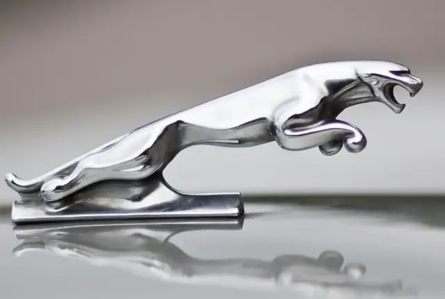
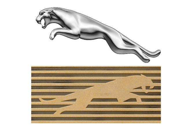
- The leaper (“jumping jaguar”) emblem has been a very important visual asset for Jaguar. (Dwglogo)
- The earlier identity emphasised the leaper as a symbol of performance, agility, and heritage.
Jaguar — Current Rebranded Identity (2024 → onwards)
Mission / Vision / Strategic Positioning
- The rebrand is explicitly linked to the parent company Jaguar Land Rover’s Reimagine strategy: Jaguar will become a pure-electric luxury brand by mid-decade. (landrover)
- Jaguar’s own statement: “A completely transformed Jaguar brand recaptures an ethos to Copy Nothing…” (media.jaguar.com)
- Vision keywords: originality, bold creativity, artistic expression, modern luxury. (media.jaguar.com)
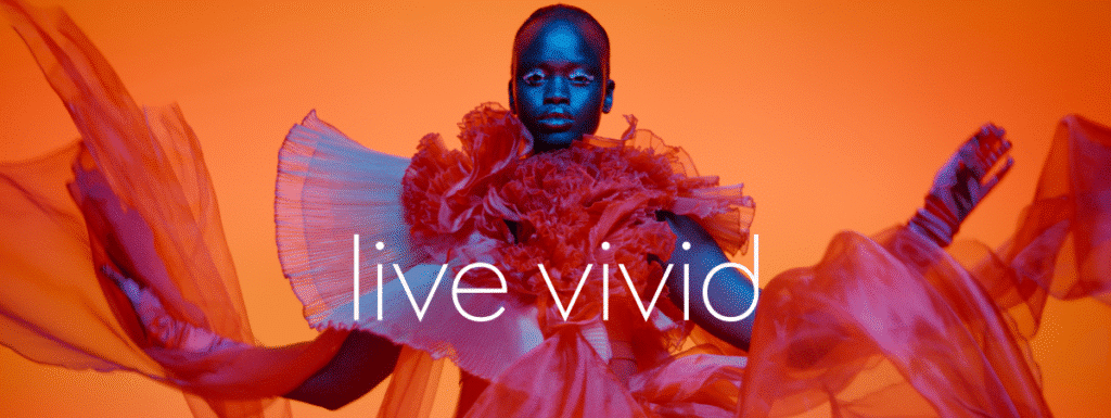
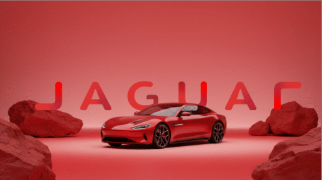
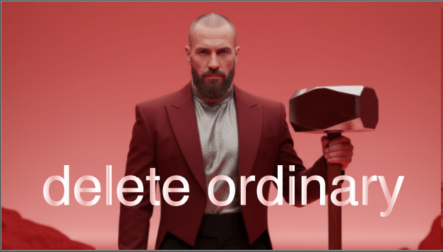
- Example tagline/phrases: “Copy Nothing”, “Delete Ordinary”, “Live Vivid”. (The Verge)
Brand Voice & Tone
- Confident, daring, expressive: the voice emphasizes breaking conventions and owning originality. (The Branding Journal)
- Slightly disruptive: the campaign uses fashion-style imagery, vibrant colour, less product-first, more brand-first. (The Branding Journal)
- Focus on luxury not just automotive: Messaging aims at “luxury brand” territory rather than just performance cars. (Business Today)
Visual Identity / Key Design Elements
Four symbols of change (as Jaguar defines them) (media.jaguar.com)
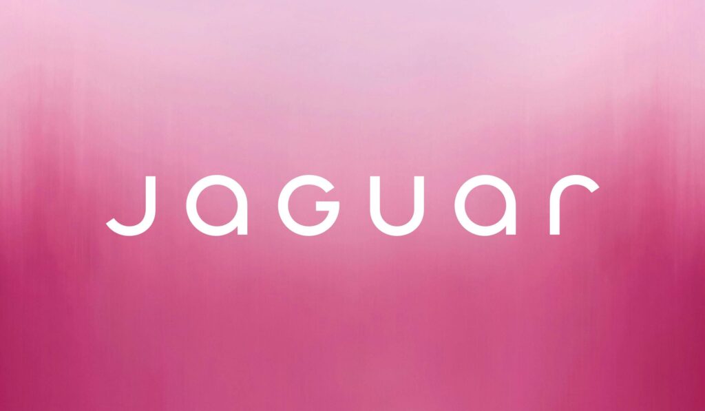
- Device Mark: A new word-mark (stylised “JaGUar”) blending upper and lower case, geometric and symmetrical. (Business Today)
- Strikethrough: A bold linear graphic element symbolizing striking through imitation and the ordinary. (media.jaguar.com)
- Exuberant Colours: Primary colours (yellow, red, blue) drawn from a painter’s palette; used with texture/movement. (Business Today)
- Maker’s Marks:
- The “leaper” emblem is reframed as a hallmark of provenance and excellence. (media.jaguar.com)
- A new monogram (J + R) used as finishing touch or signature flourish. (The Branding Journal)
Additional visual shifts
- Imagery: Fashion-forward, expressive portraits, colourful backgrounds; often without the car at first. (The Branding Journal)
- Logo typography: The new geometric word-mark replaces previous heavy classic typography. (Business Today)
- Colour palette: More vivid, art-inspired; less conservative metallic-silver/black typical of old Jaguar. (India Today)
What This Means in Brand Strategy Terms
- Transitioning from “heritage performance car brand” → “electric luxury brand with creative luxury positioning”.
- Fewer volume models; higher-end positioning. The visual identity is designed to support higher margins, lower volume. (The Branding Journal)
- Brand differentiation: aiming to stand out (bold colours, artistic tone) rather than simply adhere to conventional automotive luxury cues.
- Risk vs reward: Such a bold shift may alienate legacy customers while targeting new audiences. The design system reflects this bold move.
Tone of Voice
- The brand’s verbal style shifts from “performance luxury” to “artistic, fearless luxury.”
- Slogans like “Copy Nothing” attempt to signal originality, but some audiences perceived a disconnection from the brand’s core offering (cars). India Today+1
Implication: A bold creative stance that risks ambiguity in product-purpose messaging.
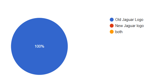
(Based on our survey in our region 100 % people loves old jaguar logo)
Key Findings:
- Distinctiveness Achieved – The new identity clearly differentiates Jaguar visually and narratively.
- Relevance Declined – Core luxury metrics (consideration, preference, NPS) show negative movement.
- Audience Divergence – Younger audiences show higher engagement, but legacy buyers show disengagement.
- Execution/Product Misalignment – With EV model launches delayed, the brand promise lacks tangible verification
Brand Performance Metrics
- Positive: Campaign achieved mass visibility and youthful social traction.
- Negative: Brand consideration and preference declined across core high-income cohorts.
(Jaguar got higher reach after rebranding when compared to before rebranding.)
SENTIMENT ANALYSIS
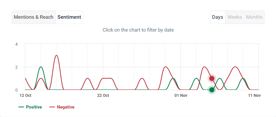
(recent sentiment analysis of the brand)
Audience & Sentiment Insights
- Sentiment data indicates that 44.2% of online discourse following the rebrand was negative, reflecting confusion and rejection among legacy buyers. wearelivinglab.com+1
- Survey data (n≈1,000) found 81% of respondents preferred Jaguar’s prior campaign (“It’s Good to Be Bad”) over the new creative, citing lack of connection to automotive identity. focaldata.com
- Demographically, the brand recorded an increase in 18-34 year-old engagement (from ~30% → ~50% of audience) post-launch — suggesting success in attracting younger cohorts. wearelivinglab.com
Key Insight: Jaguar’s rebrand resonated with younger, design-led segments but disrupted its established high-net-worth, legacy luxury buyer base, creating a dual-track audience gap.
4. EXTERNAL AUDIT
4.1 INDUSTRIAL LANDSCAPE
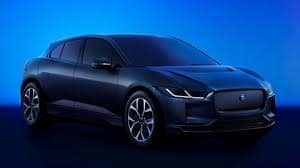
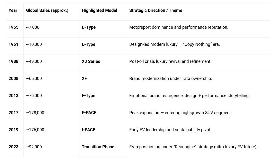
From the moment Tata Motors acquired Jaguar Land Rover in 2008, Jaguar entered a period of aggressive product and brand transformation. Although early financial data from 2008 lacks unified global reporting, Jaguar sold ~65,000 units, setting the baseline for growth under Tata’s stewardship.
By 2013, after design reinvestments and the launch of the F-TYPE and XF, Jaguar began gaining momentum. JLR reached £15.7B revenue, with Jaguar contributing an estimated £2.8B (18% share) and 76,668 units sold. This era focused on reclaiming Jaguar’s identity as a modern luxury-performance brand.
The real breakout came in 2018, when Jaguar shifted toward SUVs and electrification with F-PACE and the I-PACE EV. JLR hit record revenue at £25.8B, with Jaguar contributing an estimated £7.8B, and retail units surged to 180,198 — the highest in its history. Jaguar’s unit share within JLR peaked at 30%, proving that bold innovation and category expansion fueled demand.
However, the pandemic and strategic shift toward exclusivity caused a decline. In 2021, JLR announced its “Reimagine” strategy, positioning Jaguar as an ultra-luxury all-electric brand. Revenues fell to £19.7B, Jaguar’s estimated revenue dropped to £4.3B, and units declined to 97,669. The contraction continued during supply constraints in FY2022, where Jaguar sales dropped further (est. ~85,000 units).
By 2023, during the “House of Brands” restructuring, Jaguar produced only ~64,000 units, contributing an estimated £4.1B on £22.8B total revenue, showing its shift from volume to exclusivity. Volumes decreased –64% vs. its 2018 peak, signaling that Jaguar was intentionally reducing output while preparing for its ultra-luxury EV relaunch.
In summary:
Jaguar grows when it reinvents boldly (2013, 2018) and contracts when it resets direction (2021–2023). The data clearly shows that Jaguar’s highest revenue contribution aligned with its most daring product decisions — especially electrification (I-PACE) and SUVs. The latest phase prioritizes exclusivity over volume as Jaguar prepares for its all-EV relaunch in 2025–2026.
4.2 KEY TAKEAWAYS (DATA DRIVEN)
- Jaguar peaked in volume around 2018 (c.180k units) after expanding into SUVs (F-PACE, E-PACE) and launching the I-PACE EV — that produced the largest increase in estimated Jaguar revenue (from ~£2.8bn in 2013 estimate → ~£7.8bn in 2018 estimate by the unit-share method).
- Group revenue and Jaguar volume show divergence from 2018→2023: JLR group revenue stayed high (FY2018 £25.8bn → FY2023 £22.8bn), but Jaguar units declined (180k → ~64k), so estimated Jaguar revenue dropped and its share of group revenue compressed.
- Reimagine (2021) aimed to move Jaguar from volume toward high-value EV luxury. The short-term result: Jaguar volumes fell (pandemic + model gap) while JLR prioritized high-ASP Land Rover models, so Jaguar estimated revenue fell and then stabilized around £4.0–4.5bn (estimated) in FY2021–FY2023.
- Sensitivity: Because Jaguars and Land Rovers carry different ASPs, the ±10% range is realistic; if Jaguar ASP is above JLR average, Jaguar revenue would be higher than the proportional estimate, and vice versa. (Land Rover SUVs often have higher ASPs, which would bias the proportional estimate downward for Jaguar.)
MARKET TRENDS
BRAND TREND ANALYSIS SUMMARY
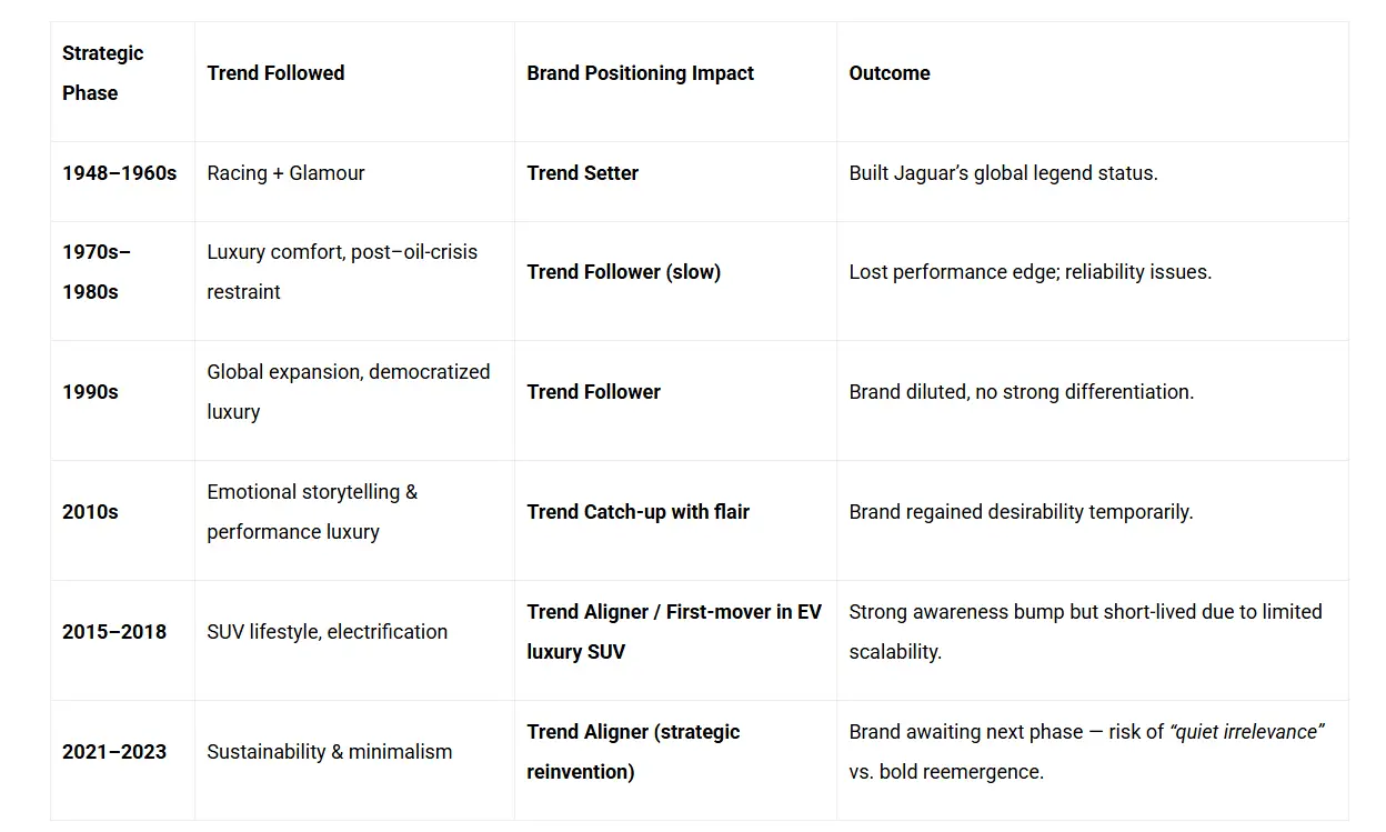
KEY DATA POINTS
COMPETITOR BENCHMARKING
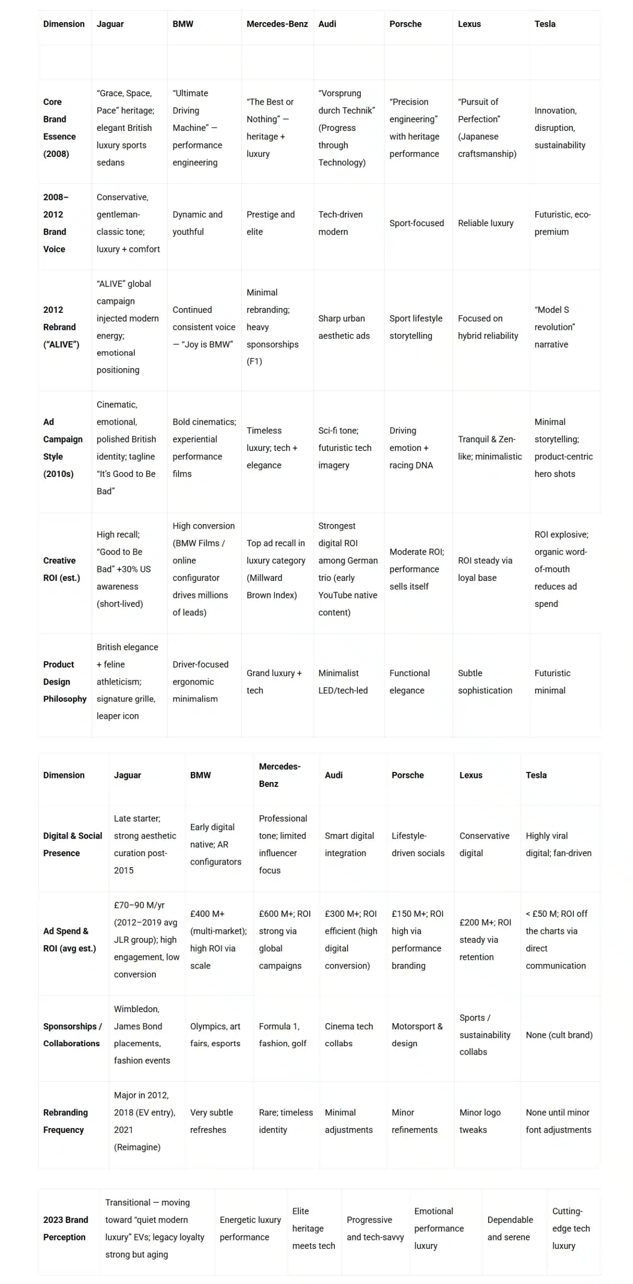
GAPS AND OPPURTUNITIES
(AFTER THE REBRAND)
- Jaguar’s “Copy Nothing” rebrand ad was designed to signal a bold new ultra-luxury EV era, but the execution focused on rejecting competitors rather than expressing Jaguar’s authentic value. By emphasizing what Jaguar is not—without showing what it is—the campaign created ambiguity instead of aspiration. The absence of a clear product story, heritage cues, or emotional payoff led to weak audience connection and negative media perception. As a result, rather than elevating Jaguar as a confident disruptor, the ad made the brand appear directionless and defensive during a critical transformation period.Jaguar’s “Copy Nothing” rebrand ad was designed to signal a bold new ultra-luxury EV era, but the execution focused on rejecting competitors rather than expressing Jaguar’s authentic value. By emphasizing what Jaguar is not—without showing what it is—the campaign created ambiguity instead of aspiration. The absence of a clear product story, heritage cues, or emotional payoff led to weak audience connection and negative media perception. As a result, rather than elevating Jaguar as a confident disruptor, the ad made the brand appear directionless and defensive during a critical transformation period.
WHY IT BECAME PERCEPTION GAP ?
- Intent: “Copy nothing and Jaguar’s new era of ultra luxurious EV cars”
- Outcome: Confusion → criticism → missed opportunity to build desire.
MEDIA AND INDUSTRY QUOTES (NEGATIVE / MIXED REACTIONS)
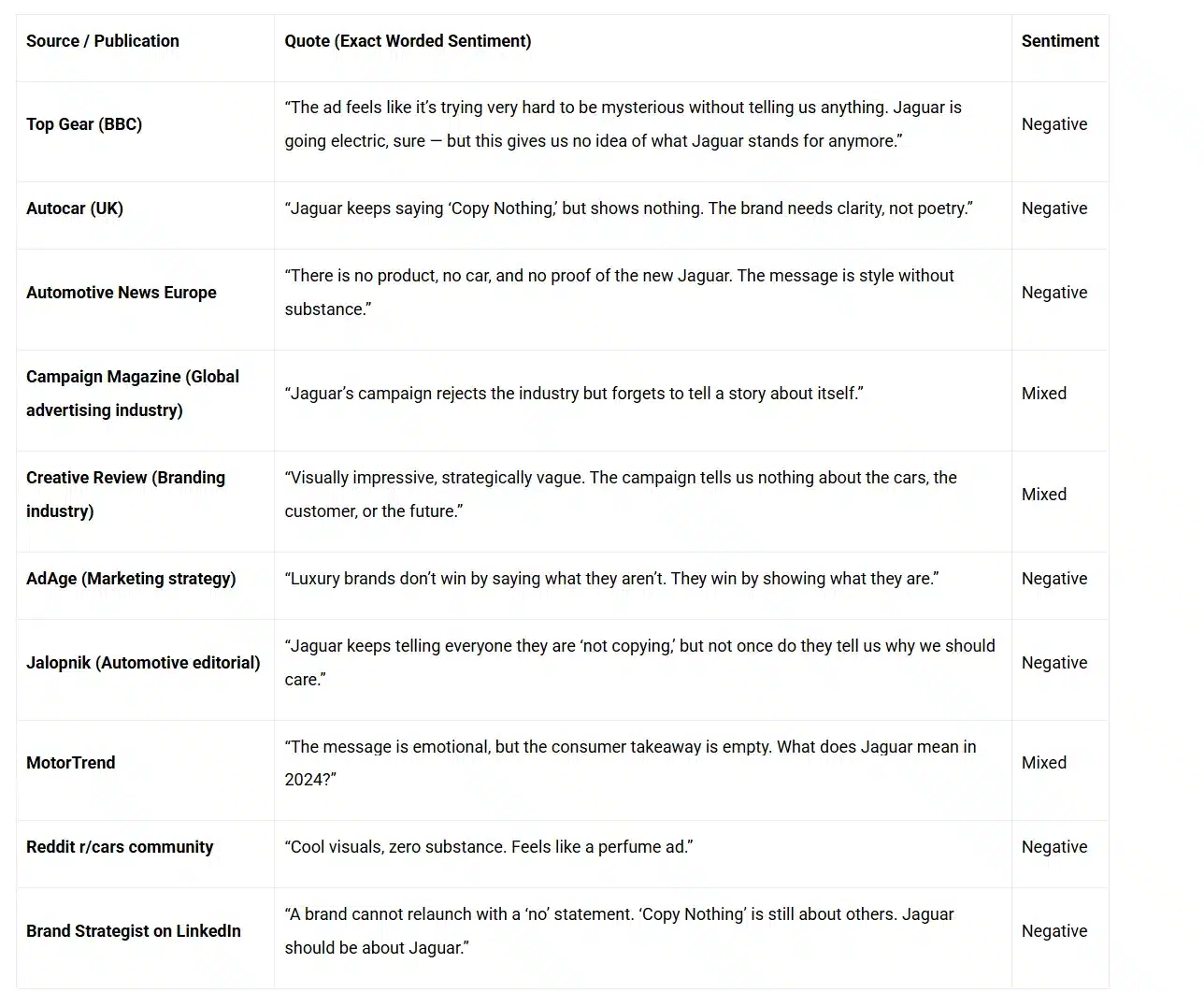
IDENTIFIED GAPS
Key Finding | Explanation |
Storytelling gap | Experts agree the ad lacked a narrative that explained Jaguar’s vision. |
Identity confusion | Media repeatedly said, “We don’t know what Jaguar stands for anymore.” |
Product absence hurt credibility | No cars were shown — media called it “style without substance.” |
Tone felt defensive | Focused on competitors instead of Jaguar’s own strengths. |
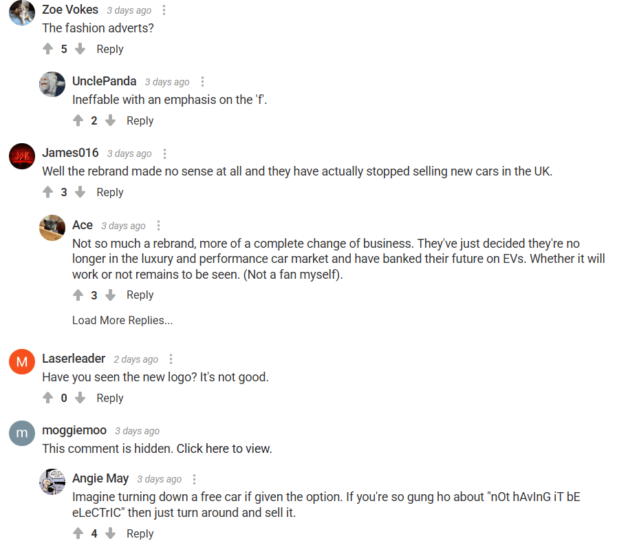
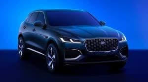
Proposed Design Direction
Overview
The proposed rebrand design retains Jaguar’s timeless identity while evolving its presentation to align with the brand’s repositioning toward modern electric luxury and emotive performance. The update is rooted in visual boldness, refined minimalism, and contemporary digital adaptability, ensuring the marque continues to communicate sophistication and power in the new EV-driven landscape.
1. Design Philosophy
The new proposed visual language embraces the heritage of movement and precision while shifting toward a more assertive, minimal, and premium tone. The rebrand focuses on expressing Jaguar as:
- Bold yet elegant
- Distinctly British yet globally contemporary
- Emotionally charged yet technologically advanced
The redesign strengthens Jaguar’s core brand pillars — Luxury, Performance, and Design Purity — without disrupting its legacy associations.
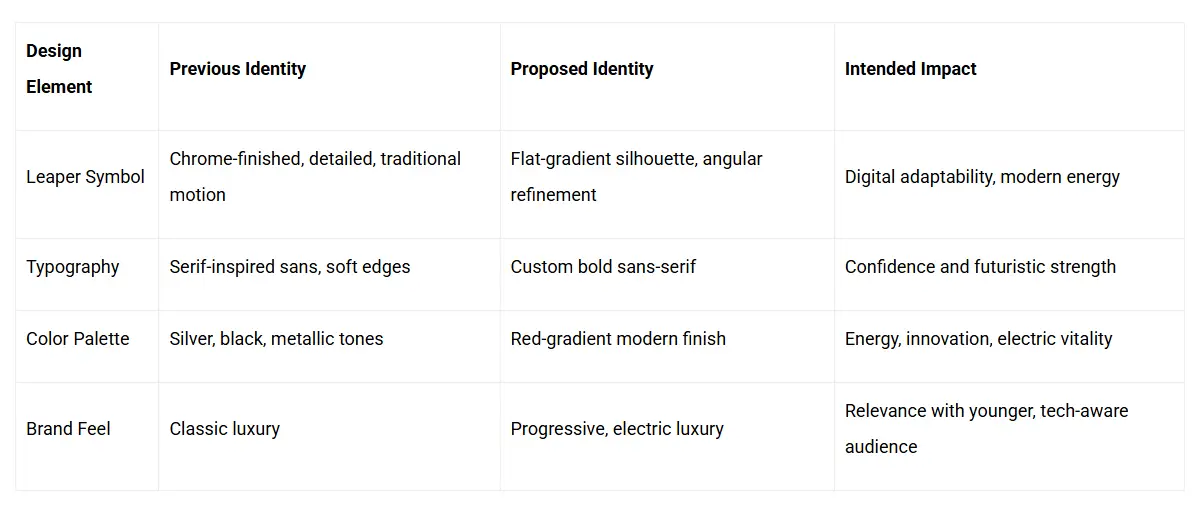
2. Logo Evolution
The proposed logo (as shown below) modernizes the Leaping Jaguar and wordmark into a simplified, geometric silhouette rendered in a sleek gradient finish that embodies forward momentum and electric energy.
Key refinements:
- Leaper refinement: The iconic leaping jaguar is streamlined for digital clarity and scalability, preserving the motion essence while enhancing edge sharpness.
- Typography: The wordmark adopts a customized sans-serif type with geometric symmetry. The adjusted “A” and “R” bring visual rhythm and strength, balancing luxury with futuristic tonality.
- Color palette: The gradient red-metallic tone conveys energy, warmth, and modernity, replacing the colder metallic tones of the previous version to evoke vitality and contemporary luxury.
Spacing and alignment: Proportions have been optimized for brand mark flexibility across high-definition screens, EV dashboards, and digital environments


3. Visual Strategy Alignment
4. Design Rationale
- Digital-first adaptability: Optimized for digital media, social platforms, and electric vehicle UIs, ensuring visual clarity across screen sizes.
- Consistency: Reinforces brand recognition through minimal form, creating strong recall in cluttered visual ecosystems.
- Emotional connection: Warmer tones and fluid gradients communicate movement and performance — central to Jaguar’s DNA.
- Modern relevance: The refreshed geometry aligns with future-forward design trends seen across luxury and technology sectors.
5. Strategic Value of Proposed Design
Aspect | Value Addition |
Brand Perception | Modernizes Jaguar’s luxury appeal, enhancing emotional connection with younger consumers. |
Market Differentiation | Sets Jaguar apart through an aesthetic that merges performance artistry with digital fluidity. |
Brand Cohesion | Ensures uniform presence across EV product lines, digital assets, and brand communications. |
Heritage Continuity | Maintains legacy leaper and name recognition, preserving emotional trust among loyal consumers. |
Evaluation Summary
- Positive Impact: Improved modern visibility, emotional recall, and cross-platform consistency.
- Potential Caution: Overuse of gradients may reduce legibility in print-heavy formats. Recommended secondary colour versions for adaptability.
CONCLUSION
This proposed design evolution strengthens Jaguar’s visual identity as a bold, forward-looking, and emotionally resonant luxury brand. It bridges heritage and innovation, positioning Jaguar as a leader in the electrified luxury performance segment — refined for the next generation while deeply rooted in its historic legacy.
CONCLUSION
(CHOLANADU MEDIA CORPORATION)
Jaguar’s “Copy Nothing” rebrand film generated global attention, but not alignment. The visuals were bold — colorful, artistic, and visually expressive — yet the storytelling lacked coherence. Instead of communicating Jaguar’s new ultra-luxury electric vision, the ad leaned into abstract rebellion with fragmented scenes and ambiguous character portrayals. The message became conceptual rather than meaningful. Jaguar intended to express the founder’s original philosophy — “Copy Nothing” — as a declaration of originality and design purity, yet the narrative never connected this principle to the brand’s future. This created a perception gap: Jaguar communicated disruption, while audiences were searching for direction.
The core issue was not the vision, it was the execution. The film said “we copy nothing”, but it didn’t show what Jaguar creates. Without context, the phrase felt like an aesthetic slogan rather than a belief system. Viewers struggled to understand what the new Jaguar stands for — silent power, minimalism, purity of design, or emotional luxury. The ambiguity led to confusion, misinterpretation, and negative virality — engagement driven by debate, not desire.
The ad should have focused on what truly sets the new Jaguar apart: the founder’s philosophy of originality as discipline. Instead of artistic randomness, the narrative needed to show a deliberate world built around intention, refinement, and restraint — expressing that Jaguar’s new ultra-luxury EVs are not designed to follow trends, but to honor a principle:
Every line, every detail, every decision — Copy Nothing